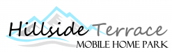
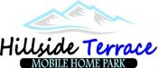
Hey guys, just looking for some opinions on these 2 proofs I have for a customer, Customer really liked the writing though the mountains but also keeps mentioning having the writing below so i tried that and i personally prefer the first. Thanks for your help.
-
I want to thank all the members that have upgraded your accounts. I truly appreciate your support of the site monetarily. Supporting the site keeps this site up and running as a lot of work daily goes on behind the scenes. Click to Support Signs101 ...
You are using an out of date browser. It may not display this or other websites correctly.
You should upgrade or use an alternative browser.
You should upgrade or use an alternative browser.
Looking for some critique
- Thread starter rcrotty82
- Start date
GaSouthpaw
Profane and profane accessories.
- Since you asked, I'd change that font on Hillside Terrace.
- Consider a different font for "Mobile Home Park" and correct the kerning.
- Your colors (on the mountains) are going to be tough to see on a white background, so keep that in mind.
My .02.
- Consider a different font for "Mobile Home Park" and correct the kerning.
- Your colors (on the mountains) are going to be tough to see on a white background, so keep that in mind.
My .02.
Johnny Best
Active Member
Give it a tagline

Rick
Certified Enneadecagon Designer
I agree with GaSouthpaw...
I also think...
-- The colors on the mountain are too light...
-- The typefaces look too "signshop"
-- I'm assuming this is going on a sign, the copy running through the mountains would be hard to see
-- Putting MOBILE HOME PARK in an enclosure might work with a different typeface but the enclosure is an odd shape and you are wayyyy too close to the top and bottom edge. Give it some space.
Attachments

Gino
Premium Subscriber
I don't see the need to turn this into a logo contest for you, but let's review some of the things to look out for when doing something like this.
- Don't fritter away 1/2 to a 1/3 of your space with a silly drawing. It's useless wasted meaningless junk.
- Use a type style that can be read at a glance.... or distance.
- Logos will have multiple uses, so keep that in mind.
- Proportion means everything, don't overpower anything.
- Keep a well balanced feel to the entire logo.
Johnny Best
Active Member
C
ColoPrinthead
Guest
That gave me a seizure.another take, no clipart mountains, hills
Johnny Best
Active Member
haha, hope you will be OK.That gave me a seizure.
Johnny Best
Active Member
Gino
Premium Subscriber

equippaint
Active Member
Personally not a fan of clip art in general including this. There has got to be better mountains to use or that you can make that look less like a kids sticker. I do like the text going through the mountains though better than on top or bottom. Would change the font also like others have said.
Bradley Signs
Bradley Signs
Is the chick standing in the door at the trailer park available?
eahicks
Magna Cum Laude - School of Hard Knocks
Is the chick standing in the door at the trailer park available?
If you've got a pack of Pall Mall and a sixer of Schlitz, she is.
Sent from my iPhone using Tapatalk
Johnny Best
Active Member
Only if you are Roger Rabbit.Is the chick standing in the door at the trailer park available?
bob
It's better to have two hands than one glove.
...Consider a different font for "Mobile Home Park" and correct the kerning....
Unfortunately the only thing correct about this mid-air collision is the character spacing of the 'Mobile Home Park'. Since this type face, as do most Roman faces, works far better in upper and lower case the character spacing when it's all caps can look a little strange but typographically it's correct. Just because your can use digital magic to slide things around should not be license to do so.
The entire effort is a sign, not a logo. Regardless, it's dreck.
Marlene
New Member
there's a disconnect between the mountain/hill the name and the band with the park lettering. it looks like three different ideas. try pulling it together, get rid of that font as it doesn't work. I assume this is for a sign so try setting it onto a shape so that you can see how it will look. have you tried a colored background?
BigfishDM
Merchant Member
Give it a tagline View attachment 128412
Your illustrations are great, I love how you put those together on the fly!