stephenj148
New Member
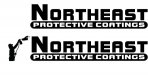
Client owns a protective coatings company, much like Linex and Rhino Lining. He was looking for a new logo because his business is fairly new and he has not yet had anyone to design anything for him. Basically looking for something simple, yet interesting and appealing (as with any logo). Taking some other members advice, I started in black/white design and I just want to see some thoughts of other people on things that I could add, remove, change etc...
Open to any and all comments. Just trying to get a better design, learning experience.
He suggested maybe having a guy spraying. Not sure of how to incorporate it. I was thinking of maybe using a script font and have it appear that the man was spraying out the text. Not sure how I like the idea. This is what I have so far.
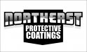