-
I want to thank all the members that have upgraded your accounts. I truly appreciate your support of the site monetarily. Supporting the site keeps this site up and running as a lot of work daily goes on behind the scenes. Click to Support Signs101 ...
You are using an out of date browser. It may not display this or other websites correctly.
You should upgrade or use an alternative browser.
You should upgrade or use an alternative browser.
Making a standing banner for our shop, thoughts?
- Thread starter Peachtree Signs
- Start date
TrustMoore_TN
Sign & Graphics Business Consultant
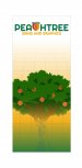
I see on your website and facebook page that this is your logo. I think it could stand a rework, but getting that past the boss man is going to be some work. The tree is unnecessary, the background is very dated, and the grid pattern and fade from wireframe on the tree doesn't translate well for this application. I see that you're located off Peachtree Industrial in Norcross. Having lived in Atlanta and Duluth for 30+ years until I moved to Nashville, I feel that people get beat over the head constantly with peachtree this and that, so much so that it's cliche now.
It's the same with Nashville companies using the image of a guitar, cowboy boots, and the words "Music City" in their logos and literature. Its sooooo overdone.
I'd step back and understand what you want to communicate to customers when they enter the shop. Right now, its just a logo and a peach tree. It doesn't give them any useful information to help them understand what the company does, believes or strives for. Maybe a concise mission statement. Maybe a short testimonial. Start with what you want the customer know in the end after seeing the banner.
Peachtree Signs
New Member
I hear you about the commonality of the whole peachtree thing, I'm not a fan of the logo either but the boss likes it, I've already made suggestions to fix it.
my other idea I had was to use a photo of the Atlanta cityscape and place out logo on that but I can't find a high enough resolution photo of the city
my other idea I had was to use a photo of the Atlanta cityscape and place out logo on that but I can't find a high enough resolution photo of the city
shoresigns
New Member
Pull the peach logo out of PEACHTREE and put the C back in. That would solve the biggest problem with the logo.
I like the illustration with the grid, gradients and the tree, but it doesn't match the vibe of the logo at all. It looks like a company whose designer has gone rogue and kicked the brand guidelines to the curb. It doesn't make sense. If you were an ultra-modern, quirky company posting weird stuff on social media and generally known for being really different, then the illustration is great, but the logo still doesn't reflect that.
I like the illustration with the grid, gradients and the tree, but it doesn't match the vibe of the logo at all. It looks like a company whose designer has gone rogue and kicked the brand guidelines to the curb. It doesn't make sense. If you were an ultra-modern, quirky company posting weird stuff on social media and generally known for being really different, then the illustration is great, but the logo still doesn't reflect that.
Peachtree Signs
New Member
Pull the peach logo out of PEACHTREE and put the C back in. That would solve the biggest problem with the logo.
It looks like a company whose designer has gone rogue and kicked the brand guidelines to the curb.
pretty much what happened I had no say in the logo
They already know where their at, there's no sense in creating a banner stand with just your logo and some graphics...I would lose everything except for the logo
at the top and rework the bottom to include information about your business and services. You want your customers to see your (retractable?) banner stand
and recognize the need to have one in their business's reception area.
at the top and rework the bottom to include information about your business and services. You want your customers to see your (retractable?) banner stand
and recognize the need to have one in their business's reception area.
Last edited:
BIG EASY DOES IT
New Member
I agree with Gino in that it's closer to an orange tree with off shape oranges. The grid pattern bugs me. I don't like how it goes straight up and then fades off at the top of the trees. Just all around not a huge fan.
But instead of convincing them to change the logo. Convince them to change the banner. What about doing just a small logo center on top and then making the rest of the banner about the other signs that you sell in the shop. More of an ad for your shop then just a logo. Then the logo wouldn't be as big of an issue.
But instead of convincing them to change the logo. Convince them to change the banner. What about doing just a small logo center on top and then making the rest of the banner about the other signs that you sell in the shop. More of an ad for your shop then just a logo. Then the logo wouldn't be as big of an issue.
Texas_Signmaker
Very Active Signmaker
Orange tree?? Ya'll ever been to Florida? those look like grapefruits.
With a name like Peachtree I thought you were in Peachtree City... never would of guessed Norcross. I used to live in ATL and was tired of all the peachtree crap too... oddly enough I've NEVER seen a real peachtree growing in or around north GA........................
With a name like Peachtree I thought you were in Peachtree City... never would of guessed Norcross. I used to live in ATL and was tired of all the peachtree crap too... oddly enough I've NEVER seen a real peachtree growing in or around north GA........................
Last edited:

Johnny Best
Active Member
Keep it up to times...

Texas_Signmaker
Very Active Signmaker
Is that Adam?Keep it up to times... View attachment 144537
Last edited:
greysquirrel
New Member
I know Peachtree makes accounting software...
GAC05
Quit buggin' me
I think this particular 'm'peach cobbler' is now done - at least in the house.Keep it up to times... View attachment 144537
Texas_Signmaker
Very Active Signmaker
I think this particular 'm'peach cobbler' is now done - at least in the house.
It was nice for them to make that cobbler... the folks in the Senante have been waiting 3 years for that mmmmm peach cobbler, they are starving and will eat it all up before Trump gets it...wont be nothing but crumbs for him.
C
ColoPrinthead
Guest
that's Jerry NadlerIs that Adam?
Peachtree Signs
New Member
Texas_Signmaker
Very Active Signmaker
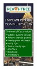
Looks better... but something is off center about that logo.this was my other idea, probably looks too busy
my boss likes the tree yes i know it's not anatomically correct