-
I want to thank all the members that have upgraded your accounts. I truly appreciate your support of the site monetarily. Supporting the site keeps this site up and running as a lot of work daily goes on behind the scenes. Click to Support Signs101 ...
You are using an out of date browser. It may not display this or other websites correctly.
You should upgrade or use an alternative browser.
You should upgrade or use an alternative browser.
Need Billboard design feed back ASAP!!
- Thread starter HulkSmash
- Start date
Typestries
New Member
Too
Much
Copy
Much
Copy
briankb
Premium Subscriber
I'd loose the word professional. It shouldn't have to be stated.
good one! I didn't even notice it. that's one word you could loose without much thought
")
neato
New Member
I would do just like Bill suggested above, except I would even remove the lines above and below. Just a huge van. It has all your info you need on it already. Your name and website. A customer isn't going to dial your number more than likely on the highway, but they'll remember your name and look you up later. That's the way I do it anyway.
BTW, I think the tear/roll away effect is great as is. It's not the focal point anyway, your van/logo is.
BTW, I think the tear/roll away effect is great as is. It's not the focal point anyway, your van/logo is.
300mphGraphics
New Member
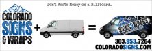
Better. Except the "don't waste money on a billboard" has me scratching my head because your company obviously did..
If you're going to pay for something to come off the frame of the billboard make it a really vibrant wrapped vehicle image, not text. Agreeing with everyone here about copy but you seem to have gotten that point .
I'd probably do something like
VEHICLE WRAPS (or VEHICLES WRAPPED)
[Image of awesome vibrant wrapped vehicle with your logo on it]
WEBSITE
and that's it. Don't get cute with the messaging (plus no one would be able to read that don't waste money line at that size, and it restricts your audience to billboard buyers).
.I'd probably do something like
VEHICLE WRAPS (or VEHICLES WRAPPED)
[Image of awesome vibrant wrapped vehicle with your logo on it]
WEBSITE
and that's it. Don't get cute with the messaging (plus no one would be able to read that don't waste money line at that size, and it restricts your audience to billboard buyers).
skyhigh
New Member
You guys are all sexy, thanks.
working on a 2nd hit now
Thanks.....oh wait, I just saw this thread (I'm always late).
Looking forward to the new layout. I agree with the masses.....way too much copy.

sar bossier
New Member
New direction
does this idea completely blow? im going to redesign the wrap on the sprinter, and make it cleaner.. but the idea...thoughts?
My .02 - Change the "billboard" line to, MAYBE: "Mobile Billboards"
@ the bottom of the sign - lose the phone #, center and enlarge the web addy.
Typestries
New Member
Hire neato to finish out his concept.....he's good fast and reasonable. And he's on to something.
mikefine
New Member
You might want to consider just putting a picture of your van wrap ...and you are done. The other stuff is just redundant. The website and name are on the van, why repeat it? Put a contrasting color behind the van, so it stands out.
The van wrap is a billboard, so I would think it should stand on its own...
The van wrap is a billboard, so I would think it should stand on its own...
GAC05
Quit buggin' me
If you have time you can go here and get an idea of what is trending with international ad agency billboards - some brilliant some not so much:
http://adsoftheworld.com/taxonomy/media/outdoor
wayne k
guam usa
http://adsoftheworld.com/taxonomy/media/outdoor
wayne k
guam usa
