• I want to thank all the members that have upgraded your accounts. I truly appreciate your support of the site monetarily. Supporting the site keeps this site up and running as a lot of work daily goes on behind the scenes. Click to Support Signs101 ...

Need logo help, please

WI

New Member
This any better?

I think that's a hell of a lot better. You're not fighting the natural lines of the font, and you don't have any odd little pockets of negative space in or around the logo.

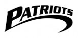
Now personally, if this weren't stitched onto a lacrosse player's jersey, I wouldn't immediately know that it was a logo for a lacrosse team, but you could likely say that about most major sports brands, so it's probably not a deal-breaker. That said, would it be such a bad idea to move towards more general imagery with your flavor-graphics? Things like stars and eagles are totally overused and played out, but they read really well and it's not like this is the first team that every called itself "The Patriots," either. ;)

Any idea of what colors you're going to be working with?
 

GoodPeopleFlags

New Member
I came up with this yesterday. I like it except for the weird negative space under the swoosh...need something there. My apologies for still sticking with Serpentine! I'll work on looking for something else today. I like the spikey serifs, though. I'm so disappointed that Lobster is beginning to be overused; I really like it. :)
 

Attachments

  • Patriots4.jpg
    Patriots4.jpg
    37.9 KB · Views: 96

GoodPeopleFlags

New Member
Bump. Just wanted to see if I could get any feedback on the one above. It still needs something in the negative space. Yep, serpentine and a swoosh... I know you guys are gonna love it!
:thumb:
 

WI

New Member
I came up with this yesterday. I like it except for the weird negative space under the swoosh...need something there. My apologies for still sticking with Serpentine! I'll work on looking for something else today. I like the spikey serifs, though. I'm so disappointed that Lobster is beginning to be overused; I really like it. :)

I think it's a pretty big step backwards, honestly. It's not just the space under the swoop, either. The problem with using a cap or a big cap at the front end of an arched word is that it jams you up at the tail end. How do you fill the space over "IOTS" now?

Still, this is your work and you'll take whatever path you're going to take, but remember that your favorite fonts aren't the keys to every lock. Right tool for the job, as the old saying goes.
 

Caitlin

New Member
I liked the direction it was going with the abstract-y lacrosse stick and ball. I thought it looked like it was in motion.

and I have to agree with everyone else, try digging for something a bit less overdone font-wise. good luck!
 

GoodPeopleFlags

New Member
Thanks, everyone! Hopefully I'll get a chance to work on it tomorrow.

Tiki - very nice, as always! But I'm not sure if it would be embroider-able. ?
 

GoodPeopleFlags

New Member
For what it's worth, this is the first design I came up for him, thinking it was just for helmet decals. Then I found out that it had to be embroidered. It's tough coming up with something simple enough to be embroidered and that expresses lacrosse.
 

Attachments

  • Patriots.jpg
    Patriots.jpg
    122 KB · Views: 111

SignManiac

New Member
I don't see a problem with embroidering John's version. Do the hat in two solid shades of blue. I think it looks good!
 
Top