Silvertip
Silvertip Graphics Signs & Designs, Inc.
Hello creatives!
We purchased this business 3 years ago and since it was established and working we did not want to do an fast changes until we got a better grip on OUR new business. Well, then we decided that we would be in the market for a new building so we decided to wait to change it. Then it sort of got put on the back burner until we had "time."
Well, now we have a new building and a whole lot less time but it is the perfect time to change it up! I have never really liked the name but there are two things going for it that I do like.
1-It is well known and established
2-Ok one thing!
But changing the name would be a paperwork nightmare so Silvertip it is! In fact, the whole name is "Silvertip Graphics Signs & Designs, Inc."
The original owner back in the early 90's was a hell of a signmaking gal and a great designer but she did have a flair for the cutesy. I can no longer find the original logo but it had a bear paw with claws lol. I guess grizzly bears are sometimes called a silvertip bear. Now, you have a lot of meaningless back story!
I was given a tip from clockwork and I am looking for some feedback because in all honesty I don't have a big place (just me and the hubby) with no team of designers to bounce off of so I am here for the help!
As I progress with this I will try to check in and keep you all posted and get your opinions. Hopefully soon!
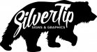
Attached is the current logo with tag line-no need to tell me how icky it is I am not fond of it either!
I am working out the checklist of things that I ask my own customers to think about and I can post that if you are interested in my answers lol!
We purchased this business 3 years ago and since it was established and working we did not want to do an fast changes until we got a better grip on OUR new business. Well, then we decided that we would be in the market for a new building so we decided to wait to change it. Then it sort of got put on the back burner until we had "time."
Well, now we have a new building and a whole lot less time but it is the perfect time to change it up! I have never really liked the name but there are two things going for it that I do like.
1-It is well known and established
2-Ok one thing!
But changing the name would be a paperwork nightmare so Silvertip it is! In fact, the whole name is "Silvertip Graphics Signs & Designs, Inc."
The original owner back in the early 90's was a hell of a signmaking gal and a great designer but she did have a flair for the cutesy. I can no longer find the original logo but it had a bear paw with claws lol. I guess grizzly bears are sometimes called a silvertip bear. Now, you have a lot of meaningless back story!
I was given a tip from clockwork and I am looking for some feedback because in all honesty I don't have a big place (just me and the hubby) with no team of designers to bounce off of so I am here for the help!
As I progress with this I will try to check in and keep you all posted and get your opinions. Hopefully soon!
Attached is the current logo with tag line-no need to tell me how icky it is I am not fond of it either!
I am working out the checklist of things that I ask my own customers to think about and I can post that if you are interested in my answers lol!