-
I want to thank all the members that have upgraded your accounts. I truly appreciate your support of the site monetarily. Supporting the site keeps this site up and running as a lot of work daily goes on behind the scenes. Click to Support Signs101 ...
You are using an out of date browser. It may not display this or other websites correctly.
You should upgrade or use an alternative browser.
You should upgrade or use an alternative browser.
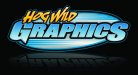
new logo
- Thread starter Hog Wild graphics
- Start date
SignManiac
New Member
Now I REALLY like that
J
john1
Guest
Damn, i'll admit. When i seen "new logo" i cringed but this looks sweet!
How did you do the tiny bevels if you will inside the letters?
How did you do the tiny bevels if you will inside the letters?
Tim Aucoin
New Member
Very nice!
TyrantDesigner
Art! Hot and fresh.
Good enough for government work.
laserman70
New Member
Like it, simple to read and has style
high impact
New Member
Excellent work!
JoshLoring
New Member
I'll have I say.. Much much better
Craig Sjoquist
New Member
Let me 1st say it is way better and looks great.
Am I missing something here lately seeing alot of .. Advertising ..A good example is this were Graphics is blue on a blue background with enough outlines you can read it to point it likes nice.
Is this a trend in advertising. ?
Am I missing something here lately seeing alot of .. Advertising ..A good example is this were Graphics is blue on a blue background with enough outlines you can read it to point it likes nice.
Is this a trend in advertising. ?