-
I want to thank all the members that have upgraded your accounts. I truly appreciate your support of the site monetarily. Supporting the site keeps this site up and running as a lot of work daily goes on behind the scenes. Click to Support Signs101 ...
You are using an out of date browser. It may not display this or other websites correctly.
You should upgrade or use an alternative browser.
You should upgrade or use an alternative browser.
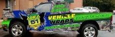
New Shop Truck Layout
- Thread starter pgettys
- Start date
SignManiac
New Member
Way too many effect fills. I don't mind seeing one theme but three is overkill and distracting.
"Deposit Please"
New Member
Way too busy. Bothered by how vehicle lands right on the door handle.I like the lime-green tho.
Gino
Premium Subscriber
What is 'the' handle ?? A handle to what ?? A frying pan or a handle on what you are trying to convey ??
Do you realize that green lettering on a green background will barely show up, if at all, just because it's outlined with black and a slight glow ??
Your background is more active than your foreground. Everything is competing with each other to be seen and all anyone will see in the real world is a smear driving by.
You obviously have some background in doing wraps. Are you purposely throwing all the rules out on your own project ?? When you look and study a monitor, just about anything will look alright. You're only 18" from the screen. However, in the real world.... your smallest of mistakes become 2500% larger, this making more of an impact on your lack of cleverness rather than your actual message. Over 1/2 of your design is a mistake. That's a lot of bad going out there... representing you.
pgettys
New Member
with that being said do you think the text VEHICLE WRAPS needs to be on there?
I am not going for a standard corporate look this is something that will stand out going down the road and will be sitting attached to my 6x12 hallmark enclosed trailer.
Camo around here is very HOT! since everything seems to get camo-ed
we do the hydro graphic printing also and it helps allot.
Ive been around for a while give me some suggestions don't just criticize i take it both.
Again i don't want anything BORING with basic CRAP. looking at targeting another industry and it is LOUD, COLORFUL, AND CRAZY!
i can design boring corp. crap all day long GOING BY K.I.S.S
You have to step outside the box that is where i get my business always have because noone wants to do the stuff i do .
Give me suggestions on which way you would go keeping that in mind!
skyhigh
New Member
do you really have to say "WRAP" 3 times on each side?
EDIT:
Guess I should have read all your posts. Guess the answer to your question would be NO
Question.....Is that a "headless" bird with a shield? Anyways I'd move that back so the wing goes up the rear door. Enlarge it, and lose everything else.
WTF is camo dipping?
EDIT:
with that being said do you think the text VEHICLE WRAPS needs to be on there?
Guess I should have read all your posts. Guess the answer to your question would be NO
Question.....Is that a "headless" bird with a shield? Anyways I'd move that back so the wing goes up the rear door. Enlarge it, and lose everything else.
WTF is camo dipping?
Gino
Premium Subscriber
Want a good suggestion. Take that whole image into photoshop and turn it into greyscale and print it on an 8-1/2" x 11" piece of paper.
Scotch-tape that piece of paper to a wall and walk about 20' to 25' away. Look at it for 3 seconds and then look away. Don't study it... no one else will, so don't be the only one to do so. Could you honestly read anything in that time span ?? If this was a billboard or a large sign, you might have a small chance of someone remembering some of it, but I highly doubt it.
You want BOLD, LOUD, COLORFUL and CRAZY ?? Do it without effects. Effects only are to add dimension and some perspective to elements of a design.... not be the sole common denominator of making something pop.
If you can't draw or doodle, find someone that can get your thoughts down on a piece of paper and go from there. Too many people just think by adding this effect or that color combination without knowing how to do it professionally, they are creating masterpieces. It just don't work thata way. You need someone that understands the color wheel, weight, balance, negative space, font usage, depth perception, elements, foreground & background concepts and most of all good creative skills without being crude.
pgettys
New Member
Gino
Premium Subscriber
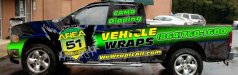
Pretty neat.

AUTO-FX
New Member
do you really have to say "WRAP" 3 times on each side?
Yes, lose the "vehicle wraps" text , lessen the angle, and slide the winged 51 sheild back. Please.
if anything, then maybe someone could catch the "area 51" and know who to call!!!
artsnletters
New Member
i think you need to know what the rules are before you break them. Do what the others suggested...squint and look at it. I don't think it looks THAT bad but i think the door handle/vehicle wraps placement is bad. Lower it and relocate the other tag line. Like previously stated, this should represent the best you can be...something that inspires customers to have you do the work.i like breaking the rules on purpose that's the point!
Tim