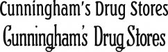
Do any of you sign painters recognize the font used in this old drug store sign (up at the top of the building, not the neon).
http://www.phillipdriscoll.com/cunninghams.gif
I don't know if it was a document style or an invention of the sign painter, but if any of you have seen it and could point me to a name or reference, I would appreciate it.
Thanks for looking.
http://www.phillipdriscoll.com/cunninghams.gif
I don't know if it was a document style or an invention of the sign painter, but if any of you have seen it and could point me to a name or reference, I would appreciate it.
Thanks for looking.
 .
.