OK so what would Joe do? That would be good to see. Honestly. I would be very interested in his take, or his changes to existing samples.
I'm not going to just do it for him for a few different reasons. The first being that the OP has stated on multiple occasions that he doesn't want someone to design it for him, and I learned a while back that doing so doesn't work out so well on here. Also, it's doesn't seem right to promote that design work should have value, but then just give it away for free. So I don't do that anymore, but I have no problem with others that choose to do it for whatever reason.
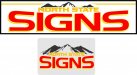
I was just going to point out that distorting the font like he did made
signs a little harder to read, especially on the upper parts of the letters. They appear a little on the thin side. I don't really see a reason to have it dented in from the top. I'm assuming it was done to make space for North State, but it looks forced and awkward to me. If room was needed for North State, perhaps the stars and stripes below "
signs" can be removed or modified. I feel like "North State" could be larger, since that is the unique part of the name. I also feel like the grunge/distressed look doesn't work for this type of business, it doesn't matter where they are located. It works for some businesses, but not a
sign business imo. It's like your advertising that the graphics you install will fail or unintentionally age early.
I think what Pat has is a great direction though.