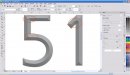
I did this in X4, but am not completely pleased with the result. You can see in the picture the bevel is rounded where it should be straight, like in the corners. I've seen users that had the opposite effect, 'straight' bevels (node-to-node) where a curve was supposed to be, but not this.
Does anybody know how to get a proper bevel? For what it's worth, this is not the exact font I am using (needing) but it is very similar, a "blocky" font. Thanks.
EDIT- circled the "curvy" areas in question.....
Does anybody know how to get a proper bevel? For what it's worth, this is not the exact font I am using (needing) but it is very similar, a "blocky" font. Thanks.
EDIT- circled the "curvy" areas in question.....
Attachments
Last edited:

 Unless I'm missing something.
