-
I want to thank all the members that have upgraded your accounts. I truly appreciate your support of the site monetarily. Supporting the site keeps this site up and running as a lot of work daily goes on behind the scenes. Click to Support Signs101 ...
You are using an out of date browser. It may not display this or other websites correctly.
You should upgrade or use an alternative browser.
You should upgrade or use an alternative browser.
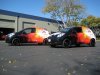
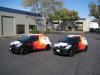
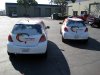
ProWraps Shop Truck Finally Done
- Thread starter ProWraps
- Start date
grafixemporium
New Member
AHHHHHH RED ON BLACK, RED ON BLACK! I can't believe no one has pointed out your usage of red text on a black background! That is a NO NO!
Kidding man. It looks sweet. Great job.
Kidding man. It looks sweet. Great job.
ProWraps
New Member
Grunge ?
Nautical Star ?
Non Conforming Banner ?
Old English ?
Old English On An Arch ?
how do you really feel? i mean i have no idea how you feel.
heh. sorry for the late reply sign works. ive been busy wrapping up this crazy 15 sprinter bus project in south sf. limited email and limited internet in these sh*tty hotels. come by the shop sometime. you are in the neighborhood. i think in person you might, well, kind of like it, and well, learn something.
as far as the tm, we did overlays cause when i did the art transfer it didnt get selected.. UGH! heh. good eye. seriously. good eye. they are there now!
Pat Whatley
New Member
Talk about polarizing....these responses are either love it or hate it.
astro8
New Member
Hi there Prowraps...that design breaks every rule I was ever taught about colour combinations, layout, design elements and typography, but strangely enough, I can't seem to look away...it has a peculiar appeal.
I admire you in that you have the balls to drive that thing around.
I admire you in that you have the balls to drive that thing around.
Brandon708
New Member
that is so sick! great job on the design and install.
racershawn
New Member
I like it!... It is intersting ... I am almost done with my shop truck... wanted to post it here ... almost scared to now.....
Marlene
New Member
I would have to disagree with that statement.
Anyone that keeps up with style and trends will notice the whole grunge/ vintage tattoo look is in and has been for like 5 years with the explosion of Ed Hardy and Affliction
true but my point was that a 40 year old business owner with a fleet of trucks isn't who this is aimed at. it is a niche and that niche is huge so no problem with that. I was asking if that was the niche he was going for as if it was, then it is great, if it is the business owner, the hot tub guy or realtor, then I don't think skulls are the thing that will make them call. it isn't about liking it or not as it is advertising and ads are aimed at a market.
omgsideburns
New Member
looks core.
Just Another Sign Guy
New Member
great point Marlene. i know a sign guy who has his ear lobes stretched out, ring through his nose, full body tattoo, wears bells around his ankles and does some of the most impressive sign work i have ever seen. he wears dickies and a wife beater to chamber of commerce events and he wears the same outfit for every sales call he goes on/ he has asked me point blank why he can not build a client base of more professional businesses.
and i've told him straight up it is because of his image...
and i've told him straight up it is because of his image...
ProWraps
New Member
just to give some kind of perspective on this project. this is my fun truck. a new truck that litterly has sat in my shop for the last year. i have my new ram that is my "unwrapped truck", and we have a fleet of yaris' that are our business wrapped cars. so we have what we have to fit different things. for example the real estate/plumber crowd.
i wanted to do something that was edgy, was fun, and didnt necessarily cater to anyone but myself. i enjoyed it, and i really enjoy driving it. it may not conform to design standards, but i can tell you, it sure as hell turns heads on the road.
i wanted to do something that was edgy, was fun, and didnt necessarily cater to anyone but myself. i enjoyed it, and i really enjoy driving it. it may not conform to design standards, but i can tell you, it sure as hell turns heads on the road.
kstompaint
New Member
I like it, go figure. I guess less is not more to everybody.
Gino
Premium Subscriber
It’s not my cup a tea, but while the design elements are Okay and the use of colors look alright, I don’t see a resemblance to Hardy or Affliction, so I don’t buy into that reasoning.
Personally, I think the back end is lacking and throws the whole balance off. I don’t like low profile tires like that; especially on a truck that is suppose to have that ‘Mean’ look … the tuck looks like it has scurvy with those tires.
The thing I really don’t like is… I’ve never seen a ‘W’ like that in Old English. Call me old fashioned or just not with it…. but that ‘W’ looks like two ‘T’s and some scroll work on the wrong side. If you really don’t care if anyone can read this or not….. why get the name so big on there anyway ?? Why emphasize it as if you were trying to make it part of an advertising plan of sorts ??
Anyway…. to me, it looks as if some effort and time was put into a theme, but lacks layouts skills for this particular vehicle, but like I said, this kinda stuff doesn’t appeal to me or my type of customer base, so I'm probably somewhat biased. However, the installation part of it looks fantastic.
Marlene
New Member
i wanted to do something that was edgy, was fun, and didnt necessarily cater to anyone but myself. i enjoyed it, and i really enjoy driving it. it may not conform to design standards, but i can tell you, it sure as hell turns heads on the road.
there, it works for what you did it for.
synergy_jim
New Member
wellll..... I like it, but the straight banner behind the arced text in the logo makes the logo look silly..... arced words arced banner, or straight words w/ straight banner
Vital Designs
Vital Designs
They all look cool... Wraps break a lot of traditional design rules but marketing is marketing. Be different, get noticed, create a buzz.
My first wrap was my work truck and I hate all the mistakes I made on it both design and install wise. It still is the best form of advertising I have ever done.
My first wrap was my work truck and I hate all the mistakes I made on it both design and install wise. It still is the best form of advertising I have ever done.
Screenanator
New Member
Are you off of Bradshaw or the Elder Creek area?