-
I want to thank all the members that have upgraded your accounts. I truly appreciate your support of the site monetarily. Supporting the site keeps this site up and running as a lot of work daily goes on behind the scenes. Click to Support Signs101 ...
You are using an out of date browser. It may not display this or other websites correctly.
You should upgrade or use an alternative browser.
You should upgrade or use an alternative browser.
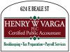
Quick design. Watcha think?
- Thread starter showcase 66
- Start date
showcase 66
New Member
Yes I saw the spelling error as soon as it came up and fixed it. 
I was thinking the same thing on the crowding.
I was thinking the same thing on the crowding.
showcase 66
New Member
That's a lot of stuff crammed right to the edges all in kind of hard to read thinnish lettering.
Try his name in caps and lower case and the accountant part in caps.
Love....Jill
He said his name had to be ALL CAPS. That is how he has his business cards and wants it like that on the sign. I suggested the Cap style but the "HWV" being larger so it looked like it was lower case but he said no, ALL CAPS.

SignManiac
New Member
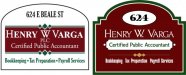
Something in this order with a little more breathing room. I don't really care for his choice of colors. Tough to work with and not look like an Italian flag or Christmas decoration.
Also don't think the street name is necessary. If they don't know what road they're on, then they won't find his place anyway.
Also don't think the street name is necessary. If they don't know what road they're on, then they won't find his place anyway.
Attachments
Jthompson Designs
New Member
Something in this order with a little more breathing room. I don't really care for his choice of colors. Tough to work with and not look like an Italian flag or Christmas decoration.
Also don't think the street name is necessary. If they don't know what road they're on, then they won't find his place anyway.
+1
showcase 66
New Member
Thanks for the input.
Gino: that is what I was thinking for the text but he didn't like the idea.
Signmaniac: really like your layout as usual. Good point about the address. Going to take another look at it a litte later when I have more time.
Gino: that is what I was thinking for the text but he didn't like the idea.
Signmaniac: really like your layout as usual. Good point about the address. Going to take another look at it a litte later when I have more time.

John Butto
New Member
all caps for name
Now you know how I feel about accountants.
Now you know how I feel about accountants.