• I want to thank all the members that have upgraded your accounts. I truly appreciate your support of the site monetarily. Supporting the site keeps this site up and running as a lot of work daily goes on behind the scenes. Click to Support Signs101 ...

Side Layout...

mudmedia

New Member
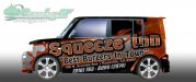
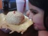
Here is a side I designed of a customers Scion XB..For some that may be wondering what the "splats" are for...This Burger joint has been on tv and is very well known here in Northern California. They put a hand full of cheese and squish it onto the bun to create a cheese blanket. Instead of making cheese balls flying off the car I wanted to keep it simple...Please let me know what you think More to come!

Thanks
Lucky
 

Attachments

  • Scion Driver SideV2s.jpg
    Scion Driver SideV2s.jpg
    41.5 KB · Views: 104

astro8

New Member
I see where you're going with this but I don't see "cheese'...I see white paint or plastic....even if it was yellow, it still doesn't look like cheese....too symmetrical.
 

Dave Drane

New Member
:Sleeping: I'm starting to get over wraps... just like when I got excited back in '85 when computers were born, but I still I saw perfect lettering being used wrong. I am not saying there is anything wrong with your job, but they are starting to look the same everywhere.:popcorn:
 

Marco

New Member
I don't feel like I need to go to this place to buy a cheeseburger which is probably your client's #1 intention. I had to do a doubletake though. I like the graphic side of this more than what it is advertising. Is the color gray neccessary? I didn't like it much here. Well, this is all I can say; I haven't design any car wraps in some time now, good luck.
 

Jillbeans

New Member
Not enough contrast.
Make the name white.
Tagline orange.
Lose the brackets on the area code amd either make it BURG or the digital equivalent, not both.
Is the address 100% necessary?
Love....Jill
 

SignManiac

New Member
Does not make me hungry, I don't even get the sense it says food. All I'm seeing is lettering on a fill background. It needs a big ass pictorial of a burger and less importance on the size of the lettering. A picture is worth a thousand words.
 

rjpjr

New Member
For some that may be wondering what the "splats" are for...

I guess if you need to explain it, it is not working.

I agree with Maniac. Nothing about the design makes me hungry for a burger and I would have a hard time relating this design to food of any kind.
 

Seven Sin Design

New Member
Not enough contrast.
Make the name white.
Tagline orange.
Lose the brackets on the area code amd either make it BURG or the digital equivalent, not both.
Is the address 100% necessary?
Love....Jill


Jill is right about the address and phone number. With a wrap, less is always more.

I think your fonts are way oversized. You have no margin for much of the text, which makes it look like there was no consideration for the body lines of the vehicle. Not to mention text getting cut off by fenders or the rocker panel area below the doors. Losing the address and choosing one phone number will help with some of that crowding.

Also +1 on the suggestions of using an image of a burger.
 

mudmedia

New Member
Thanks for the input ill get back to work! The address was something they asked me to put on the sides but I think if I show it without the address they will like it more...

Thanks Guys & Gal (Jill):rock-n-roll:
 

mudmedia

New Member
I was trying to get a certain effect with the splat but obviously I missed it...The owners of the joint are more modern younger guys who like moto cross and stuff like that so I went with a grunge brush in the background...
 

Brandon708

New Member
I would make the top look like a bun some how and have the cheese melting down over the entire sides of the car.


EDIT:

On second thought don't. Those burgers are not appealing to the eyes.
 

Attachments

  • l.jpg
    l.jpg
    30.1 KB · Views: 95

mudmedia

New Member
Good Idea Sign Maniac!

Brandon your exactly right and thats what kind of stopped me from going in and taking a burger shot...Was because with the cheese skirt they do not look great to the eye although they are amazing..But even clipart or somethin would have been better...Ill try again ! lol...Thanks for the input guys and not beating me up!
 

signmeup

New Member
The owners of the joint are more modern younger guys who like moto cross and stuff like that so I went with a grunge brush in the background...
Doesn't matter what they like. What is the target audience? Find out what they like.
 

Rick

Certified Enneadecagon Designer
This place is an institution... I have never dined there but have been told it's a place I need to try... I remember recently being popped for ADA compliancy.

I think it needs to capture the place better.
 

Craig Sjoquist

New Member
I see where your going with this and have a great idea. the layout in general is good idea and and can improve easily.
try this a bit... the main title extend it out more with both S and N off the edge S on very front N on very back so alot bigger.
Then on phone use a light font for area code and real the 4 digit number also what Jill said.
instead of spatters try real looking flames or just a glow or muted identity logo or you do not have to put effects in.

Restaurants work good with red, orange, yellow, and can also use cool color normally,
blue or black works well with the others.
 
Top