-
I want to thank all the members that have upgraded your accounts. I truly appreciate your support of the site monetarily. Supporting the site keeps this site up and running as a lot of work daily goes on behind the scenes. Click to Support Signs101 ...
You are using an out of date browser. It may not display this or other websites correctly.
You should upgrade or use an alternative browser.
You should upgrade or use an alternative browser.
Tattoo shop logo.
- Thread starter Jillbeans
- Start date
J Hill Designs
New Member
heh you guys both used basically the same fonts.
wierd.
wierd.

") What do think about trying capitalizing the A and H in the black letter one or the top "tattoo" font on bottom? Love the way the tatoo font looks in the top one!
What do think about trying capitalizing the A and H in the black letter one or the top "tattoo" font on bottom? Love the way the tatoo font looks in the top one!I like the 2nd one in the new ones you posted. I really like the moon..
Are these going to just be single colored, or full color?
I personally think after hours seems like neon green, and maybe neon baby blue, or neon red.
You should try selling him on a cool neon sign of his logo. JMO! I LOVE neons!
Are these going to just be single colored, or full color?
I personally think after hours seems like neon green, and maybe neon baby blue, or neon red.
You should try selling him on a cool neon sign of his logo. JMO! I LOVE neons!
Roto
New Member
Have a look at Skin Deep
http://www.linotype.com/425324/SkinDeepBBRegular-ot-cff-non-font.html?showVariation=425325
Roto
http://www.linotype.com/425324/SkinDeepBBRegular-ot-cff-non-font.html?showVariation=425325
Roto

WildWestDesigns
Active Member
He would probably love that font.
In the middle of the night I woke up and thought of the one with the owl (below) but he nixed that.
So here's where we are now. He wanted white, black, and red.
And I liked the owl too.
I just cringe though when I see strokes around a text, but then I can't shut off in my mind the part of thinking about how it would be done in embroidery. Once you start getting more then one stroke around text, I have to start thinking about reaching for the nitro, because the heart really starts to get going.
signmeup
New Member
Marlene
New Member
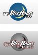
Bottom one post 24. Nice logo. nix the owl... too complicated. The sliver of a moon gets the job done with minimal fuss.
totally agree.
the last ones are too over done. the word tattoo is almost unreadable. the bottom one in post #24 is so nice and clear. signs for tat shops are usually horrible piled with skulls, roses and old English. it would make us all proud to see a nice tat sign and if anyone can do that, you can