-
I want to thank all the members that have upgraded your accounts. I truly appreciate your support of the site monetarily. Supporting the site keeps this site up and running as a lot of work daily goes on behind the scenes. Click to Support Signs101 ...
You are using an out of date browser. It may not display this or other websites correctly.
You should upgrade or use an alternative browser.
You should upgrade or use an alternative browser.
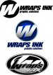
thinking of tweaking my logo (opinions)
- Thread starter Wraps ink
- Start date
Hero Signs
If they let me make it, they will come
I like the top layout, but use the 2nd Oval as the "stamp".
shoresigns
New Member
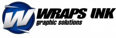
I like the top one. But, I wonder how many customers hear about you and are unable to find you when they search online for "Wraps Inc".
Joe Diaz
New Member
You know what would be cool. If you could some how say or show what you mean by "wraps" in the "w" icon, which right now isn't bad but isn't really all that spectacular either. What if the "w" went out beyond the circle and looked as though it was "wrapping" around the circle. Then you kind of kill two birds with one stone, you don't just say "w" you illustrate what you do in a way.
Last edited:
John Butto
New Member
Last edited by a moderator:
Colorado,yeah we actually are super busy in fact expanding a little hence the logo change. I am slowly morphing into much more than wraps and I'm trying to get rid of the (race car logo look) when I first started in business we probably did 20 different race teams with multiple cars but as the economy slowed so did sponsor money. We have always been known for great design work so we are branching out into branding and other avenues. But right now the wrap business is booming and business is great I'm sure this year will be up at least 40% from the last. I did a few layouts at home in front of the tv on my laptop just playing around and wanted to see what others thought.
signcrafters london
New Member
Exactly what I was going to say (and, I guess, actually am saying).i honestly like your original one without the oval stuff in the background. just the text of the wraps ink.
John Butto
New Member
Dynamic Duo
You could be batman and ProWraps could be Wonder Woman.
Just saved you $10,000.
You could be batman and ProWraps could be Wonder Woman.
Just saved you $10,000.

Craig Sjoquist
New Member
Looks great
Good choice
Nice icon
Likes simple
Good choice
Nice icon
Likes simple
