• I want to thank all the members that have upgraded your accounts. I truly appreciate your support of the site monetarily. Supporting the site keeps this site up and running as a lot of work daily goes on behind the scenes. Click to Support Signs101 ...

This is what I'm working on now, thoughts?

Jillbeans

New Member
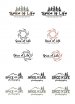
The problem with it is, the lobster/hooves/shrimp/scorpion thing overpowers everything. It's what your eye goes to first, and has nothing to do with photography.
I know I am beating a dead horse here because it's obvious the YOU like it, and your 10 friends :ROFLMAO: what do we know, we are all just sign makers.
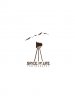
 

peavey123

New Member
I don't mind the trees so much, but the fonts don't seem to be the right choice in any of the layouts. Try some different fonts and post again. Browse myfonts.com for a while. Might inspire you?...

I played with it for a couple minutes on my lunch. Tried to go with fonts that are more legible and professional, but not completely stuffy. Sorry my bird has no feet. ah! lol
 

Attachments

  • spice-of-life-photography.jpg
    spice-of-life-photography.jpg
    209.2 KB · Views: 108

Signmaker1234

New Member
I'm done with this project! I hope!

Customer is a nature photographer, hence the nature stuff! The middle designs (from my original concept) are leaves in the shape of an aperture, so it has does have to do with photography. The bottom design is kinda old fashioned to me, which is ok. As far as fonts, they look "spicy" to me! I'm happy with them all, no more hoofs, shrimp, or lobster tails for me! Unless I'm doing a logo for a seafood company! :) 3rd one down is my favorite, "life" is in the aperture, and that is what he captures, life! But I like them all!

Thanks all, for the comments, inspiration, and laughs!
 

Attachments

  • image.jpg
    image.jpg
    79.8 KB · Views: 134

Gino

Premium Subscriber
I'm liking both the black and green bottom right setups. Actually, other than the color, I don't see a difference.
 

Jillbeans

New Member
The one with the new leaves around Life.
That looks a lot better than your initial stuff.
I'd tighten the space between the words, and make PHOTOGRAPHY a little bigger.
No brown tones or whatever on the leaves.
I don't like having mountains and trees, of those, pick one or the other.
 

Gino

Premium Subscriber
Did this guy take pictures at the Battle of Gettysburg ??

You're getting cold. You have some that are workable, why go on ?? Tweak the ones you have and not invent more headaches.
 

Marlene

New Member
when you look at the thumbnail of the latest design, it looks like oil drill with birds flying over.
 

Gino

Premium Subscriber
:Oops: Oops, I thought it was an abstract of a mountain which happened to look like a buncha sick seagulls. :covereyes:
 

Signmaker1234

New Member
This is what spice of life photography went with! He loves it and
attachment.php
I got paid, so a great day!
 

Attachments

  • image.jpg
    image.jpg
    37.3 KB · Views: 153
Top