-
I want to thank all the members that have upgraded your accounts. I truly appreciate your support of the site monetarily. Supporting the site keeps this site up and running as a lot of work daily goes on behind the scenes. Click to Support Signs101 ...
You are using an out of date browser. It may not display this or other websites correctly.
You should upgrade or use an alternative browser.
You should upgrade or use an alternative browser.
Thoughts on this design
- Thread starter Pat Whatley
- Start date
J Hill Designs
New Member
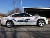
a bit too much going on for police graphics IMO
Gino
Premium Subscriber
Agreed with too much/many effects.
Usually, they want to be noticed immediately and with all those bevels, shadings and other things kinda hide the fact, it's a police vehicle. Also, around these parts, most departments want something reflective like a badge or crest near the front on the fender and near the back. That way at night, especially on a dark vehicle, something will light up to show their presence.
Usually, they want to be noticed immediately and with all those bevels, shadings and other things kinda hide the fact, it's a police vehicle. Also, around these parts, most departments want something reflective like a badge or crest near the front on the fender and near the back. That way at night, especially on a dark vehicle, something will light up to show their presence.
GaSouthpaw
Profane and profane accessories.
Honestly, the only thing I'm sure it says is Police. Everything else appears (to my eye) very difficult to read. I can't decide if it's the gradient, that's it's not spaced well, or some combo. And do they not have their jurisdiction on there, or can I just not see it?
And I, too, would think they'd want reflective for visibility at night.
I like the font you used for police, though.
And I, too, would think they'd want reflective for visibility at night.
I like the font you used for police, though.
Pat Whatley
New Member
I like the font you used for police, though.
I had NOTHING to do with this design. I'm just looking for things to discuss with them when I go meet them about redesigning the fleet.
GaSouthpaw
Profane and profane accessories.
I had NOTHING to do with this design.
My mistake...
I like the font the designer used for police.
Everything else I posted stands.
jfiscus
Rap Master
You can't really read it at all, even the word police is hard to read.
It is also all scrunched up close together in that one area, leaving the rest of the side "empty".
I would go with a secondary color/stroke of white to outline the letters with, and lose the arches(?) along the top.
It is also all scrunched up close together in that one area, leaving the rest of the side "empty".
I would go with a secondary color/stroke of white to outline the letters with, and lose the arches(?) along the top.
Attachments
Gino
Premium Subscriber
Something you hafta or at least should keep in mind...... while it's designed to fit this particular vehicle, once all the tweaks are ironed out, how will it fit a cruiser or a van or some other vehicle ?? Will it be easily broken apart and put back together to fit an entirely different set of parameters ??
Pat Whatley
New Member
Well for consistency Gino a bad design will transfer to any vehicle and still look bad.
Gino
Premium Subscriber
Well for consistency Gino a bad design will transfer to any vehicle and still look bad.
Very well, that's another way of looking at it. I don't usually consider doing things that way, but it could work for you. I think that's something a friend of mine calls "Polishing a Turd"

Craig Sjoquist
New Member
With a design you have no control over,.. I would present with one color white, gold, real gold, & some other lighter color if it calls for.
That fading just does not work well.
Here in Orlando our police cars say ..... PO lice or on other side it says Pol ice ... been that way for 30 years that I know of, & they look like they belong in a parade, the private security cars look better & more intimidating.
That fading just does not work well.
Here in Orlando our police cars say ..... PO lice or on other side it says Pol ice ... been that way for 30 years that I know of, & they look like they belong in a parade, the private security cars look better & more intimidating.
SignManiac
New Member
I find it refreshing and bold. I'm tired of the plain old, easy to read police cars. The only thing I would add is perhaps a little diamond plate or possibly bolts of electricity to add excitement to it. Police cars need to stand out and this certainly does. Great job!