• I want to thank all the members that have upgraded your accounts. I truly appreciate your support of the site monetarily. Supporting the site keeps this site up and running as a lot of work daily goes on behind the scenes. Click to Support Signs101 ...

Website updated. Need advice/critique fresh eyes......

Dan Antonelli

New Member
Looking good, albeit a little bland for me. You do incredible work, but the site feels a little generic to me. Just wish a little more of your personality was integrated.

I'm not a fan of the gallery that pops into a new window that then requires you to close the window. Sort of an old school approach. You could have similar effect but with a lightbox, and that will also give you before/next navigation (see here for example - http://www.houseofsignsco.com/portfolio_freestanding.php ).

Also, SEO needs a lot of help.

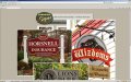
BUT -- overall, this site is functional, easy to navigate, and looks nice. If I'm a town manager, or business owner, I get the idea, and your work speaks for itself.

Also just noted on a Mac in Safari, I have a horizontal scroll bar (even though the site doesn't need it), and the site isn't centered in the browser window.
 

signmeup

New Member
Well thank you Dan. The site does kind of reflect my taste.... I have always strived to simplify things to the absolute. There's a famous saying by someone "When something cannot be simplified any further it is perfect" or something along those lines. Your sites are wonderful and you are a master to be sure but to be honest some of them are a tad flashy for me. I'm just a bland guy I guess. (GG was big help in getting it looking a bit less bland.)

I'm not quite sure what you mean by "the gallery that pops into a new window that then requires you to close the window". Do you mean the business sign page with all the images that pop up when clicked? In my browser the image gets bigger when clicked and returns to its original place and size when clicked again. Also, you can open more than one image at a time and move them arond the page with your mouse. (I thought it was cool) Do you get a new window that you have to close?
 

GypsyGraphics

New Member
Looking good, albeit a little bland for me. You do incredible work, but the site feels a little generic to me. Just wish a little more of your personality was integrated.
Well thank you Dan. The site does kind of reflect my taste.... I have always strived to simplify things to the absolute.

i think here, as is often the case, when a friend or cleint builds their own site, they've already chosen a style or template they like and when they ask for guidance.... i'm not inclined to redesign their site for them, but like to offer suggestion for simple changes that are an improvement with minimal effort.

i can't tell you how many times i've done a complete redesigns for people and gotten a response like WOW that looks great... and then they don't use any of it because they are not able to work it into their Drupal or Wordpress template.

i much prefer to offer a few easy to implement improvements.

with that said...

Adrain, can i suggest one slight modification? take a look at this side by side. in your main content area, i think having more white space or air surrounding the photos and text, is a change worth making. as well as reducing the size of the red box at the bottom. it's already pretty heavy on the page and having it wider than anything else on the page just makes it even heavier.

keeping the element within that frame all the same width will look cleaner too.
Picture 16.jpg
 
Last edited:

Dan Antonelli

New Member
Well thank you Dan. The site does kind of reflect my taste.... I have always strived to simplify things to the absolute. There's a famous saying by someone "When something cannot be simplified any further it is perfect" or something along those lines. Your sites are wonderful and you are a master to be sure but to be honest some of them are a tad flashy for me. I'm just a bland guy I guess. (GG was big help in getting it looking a bit less bland.)

I'm not quite sure what you mean by "the gallery that pops into a new window that then requires you to close the window". Do you mean the business sign page with all the images that pop up when clicked? In my browser the image gets bigger when clicked and returns to its original place and size when clicked again. Also, you can open more than one image at a time and move them arond the page with your mouse. (I thought it was cool) Do you get a new window that you have to close?

Yeh, for me I have to close the popup window - it opens into a new window in Safari. Dunno, maybe its a Mac thing.

Regarding the personality - you may be a bland guy, but maybe the target audience is looking for something a little more flashy? Again, this is just a relatively small point as I said, the site looks good now.

Often we try to point out to clients, whether its web design, logo design etc, that I don't really care what they like if their target audience is expecting something different than their personal taste.
 

signmeup

New Member
GG and Dan.... Thank you very much for your time and advice.

GG I don't know why that red box is so huge. It looks much better reduced. And you're quite right... I'm stuck with whatever I can figure out in Xara. I can do minor things with html but nothing that would look like my site does now. Xara also eliminates editing the site in any other editor. It's a trade off I have to make between being a control freak and having a website.

Dan.... I have only seen the site on my own screen in IE and Fire Fox so I appreciate you looking at it in Safari. I have a friend who just got a Mac... I'll see what he gets on his. Is Safari the default browser for Macs? (I've honestly never seen a Mac if you can imagine! I'm such a hick....)

I have said the same thing to customers about not caring what they like.... that they should appeal to their customers. Easier to say than do I guess.

Here is how I would make the site if I was being totally honest and pleasing only myself.
 

Attachments

  • Durnfordized.jpg
    Durnfordized.jpg
    148.8 KB · Views: 70

Firefox

New Member
I am running a Mac with OS X 10.6.5.

I checked your web site with Firefox 3.6.12, Safari 5.0.3 and Google Chrome 7.0.517.44.

All of the browsers seem to view your website the same, All of your links open in the same window and hitting the back button reverts to the previous page as one would expect. The site was as fast as any others I have been viewing today. All seems fine to me.

The home page is off center very slightly but I would not have noticed it if it were not mentioned.

If Dan has a Horiz scroll bar that he doesn't like he can hit the Cmnd - keys to zoom out 1 or 2 times and the scroll bar will go away as normal on a Mac.

Your site looks very good to me. A few tweaks and you are on the right track.

Looking at the work on your site is very impressive to say the least...

:U Rock:

Edit:

I double checked the centering on your home page and with the screen zoomed out to normal it is less than 1/16" off center, only when I zoom in , with the Cmnd + keys does it go off center, but then that is exactly what the scroll bar is for. All looks normal on this Mac.
 

astro8

New Member
checked your site in safari on 19" and 23" mac screens, default resolutions...look good, no scroll bars
 

boxerbay

New Member
Needs better SEO.

1. change your home page title to include #1 search term and geographical location
2. rewrite your home page intro paragraph - add an H1 tag at the beginning and include more search terms within the descriptive para graph.
 

signmeup

New Member
I am running a Mac with OS X 10.6.5.

I checked your web site with Firefox 3.6.12, Safari 5.0.3 and Google Chrome 7.0.517.44.
Thank you very much for checking all those Mac browsers for me. Do the pop-up photos just get bigger when clicked and return to the way they were when clicked again.... and can you move the open ones with the mouse? That is how they are supposed to work. They should not open a new window.
 

signmeup

New Member
Needs better SEO.

1. change your home page title to include #1 search term and geographical location
2. rewrite your home page intro paragraph - add an H1 tag at the beginning and include more search terms within the descriptive para graph.
I will see what I can do about the home page title. I don't know what an H1 tag is so I'll go google that. I'm using the site as a brochure but it would be nice to get orders from all over the world again. (I used to have a mail order business)

I noticed that some sites have a lot of words typed at the bottom and assume this is for SEO? The one Dan posted the link to has this.

Thanks for you your time and suggestions.
 

signmeup

New Member
Firefox, Here is a screen shot of what I see. The pics pop up and can be moved all over the page with the mouse. when you click the pic again it shrinks back down. (you don't have to click the little x...anyplace on the pic will do)
Is this what happens on your mac?
 

Attachments

  • Screenshot.jpg
    Screenshot.jpg
    75.7 KB · Views: 76

signmeup

New Member
Hey... I just discovered that if you pop up a photo, you can use the arrow keys for "next" and "previous". Pretty cool!

I think I should add a note on the site about how to work the images. Anyone have any thoughts on this? The way it is now, if you hold the mouse over the popped up image you get a little instruction box near the mouse pointer but it's taken quite a while for me to notice what it said, and I made the site.

Oh yeah.... does this happen on the Mac?
 

Dan Antonelli

New Member
THe blowups are fine now. Previously they popped into a new window for me, so maybe site wasn't fully uploaded. Here's a screenshot of your home page opening in Safari, with the scrollbars --
 

Attachments

  • show.jpg
    show.jpg
    66.4 KB · Views: 75

signmeup

New Member
Thanks Dan. The scoll bars are wierd because there's no reason for them. Are you zoomed in? Some of the others seemed to think that had a bearing on it. I can only get a scroll bar in IE if I zoom to 200 %. I suspect that Xara is mainly aimed at PC users so It's probably not a real big consern for them.

Did the "next", "previous" thing with the images work?
 

signage

New Member
Signmeup I am getting the same scroll bar on a PC running firefox!
 

Attachments

  • signmeup.jpg
    signmeup.jpg
    90.1 KB · Views: 60

Firefox

New Member
Firefox, Here is a screen shot of what I see. The pics pop up and can be moved all over the page with the mouse. when you click the pic again it shrinks back down. (you don't have to click the little x...anyplace on the pic will do)
Is this what happens on your mac?

Yup, works just like that. I checked several pics, not all, but that is how they reacted.
 

Firefox

New Member
Signmeup I am getting the same scroll bar on a PC running firefox!

I think we are all getting the Vert. scroll bar, unless it's on a large monitor. I am using a 15" MacBook Pro. with vert. sc bar & no horiz. sc barl at normal resolution.
 

Dan Antonelli

New Member
I'm on MacBook Pro, and both Firefox and Safari (5.02) had horizontal scroll bars. I'm not zoomed in either---

I'll check Safari and FF on my MacPro in the office tomorrow for ya---
 
Top