• I want to thank all the members that have upgraded your accounts. I truly appreciate your support of the site monetarily. Supporting the site keeps this site up and running as a lot of work daily goes on behind the scenes. Click to Support Signs101 ...

What would you do? (A weird subdivision monument)

Texas_Signmaker

Very Active Signmaker
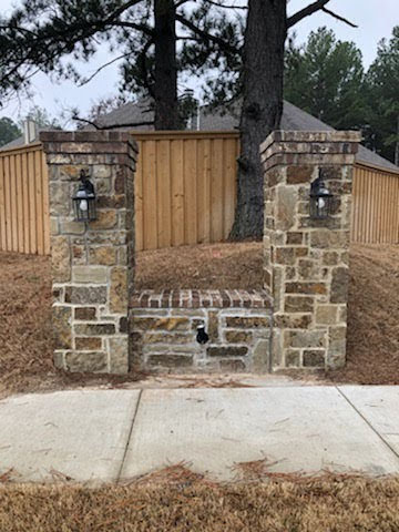
What would you do for this monument for a subdivision? The dimensions are weird and it's clear no one thought to involve a sign company until AFTER everything was built. :(:(:(

To me the columns are WAY too thick for the amount of sign area to work with.

Any ideas?

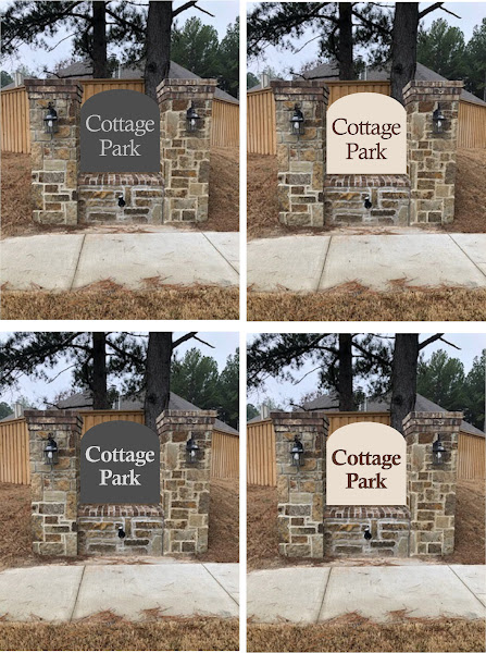
My first thought was a board in between the posts with dimensional letters on it.
8Aa2FtS3bu_AcoaRX893laVA_fQDBgtGBCFIronG6939FzBZ5G6EYzoDHnt9i-119mYiJzwS2UHPqQLbM_HGUfYLtmGqt84TXdd4H2pRrd1Ph0uVLQMcSGReYZZ1OJpmjPNcR36jdRw=w447-h600-no

EoEAaucBpvaqloWTShbZjnasZPrHuRzb_2LO2DIOS9EaXEqvdUpuniECG0UoE4xN0pyMv9yiG-4wEWdT2518fZ2rWN2KfzY5thtxKEdyTB7SByv6a15WAmwMXAZ2TUEFkRBv1jVfXfU=w360-h480-no
 
Last edited:

MikePro

New Member
what's that thing in the middle? uplighting?
agreed, they went overkill with the masonry, I'd have at least made it a bit wider.... panel between the columns seems legit. right option, 1/2" PVC letters & add a border, call it a day.
 

Texas_Signmaker

Very Active Signmaker
The tombstone is supposed to be dark mocha colored.. If I add a border the other one looks like a piece of toast...

lvVVRg-LU8RQxVV49I1t-bHHIbZ_-HGKc8baOBwhQuUrfAljw0Bnn-_cIOQnsmEHVks3w7YIa2xef0rX0R3kliJFA_4O3o0hTpUShrgYoRhkiKVDVip1HUZFQSAw6z4y0p-YRwF6TZM=w447-h600-no
 

bannertime

Active Member
As a customer would probably say "I think the top needs a bit more pizazz. You know?" Maybe shape the top to be like a peak of a cottage.
 

visual800

Active Member
aluminum framing skinned with max metal and raised dimensional lettering. Nothing you can do about the gigantic mini masonry
 
Top