-
I want to thank all the members that have upgraded your accounts. I truly appreciate your support of the site monetarily. Supporting the site keeps this site up and running as a lot of work daily goes on behind the scenes. Click to Support Signs101 ...
You are using an out of date browser. It may not display this or other websites correctly.
You should upgrade or use an alternative browser.
You should upgrade or use an alternative browser.
What you think PROS?
- Thread starter Turn2Designs
- Start date

Stealth Ryder
New Member
Looks good to me
Pat Whatley
New Member
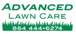
Needs some serious kerning between the AW and between VA
Is the first A italicized? Shouldn't be.
Why a brown and white leaf for a lawn care company? If nothing else at least make the leaf look green and alive.
Also, posting the design on a black background isn't a real good idea.
Is the first A italicized? Shouldn't be.
Why a brown and white leaf for a lawn care company? If nothing else at least make the leaf look green and alive.
Also, posting the design on a black background isn't a real good idea.
Fred Weiss
Merchant Member
All critique is offered with the best of intentions so you can improve and your friend will have a better "logo".
1. Brown outline is poor color choice and reduces legibility. It looks like you used an outline because you could and for no other reason because it does nothing but detract from the layout.
2. The size and color choice for the "A" overpowers the logo. The slanting of it adds nothing to what the logo should be communicating. You would be better off to reduce the height to match "Lawn Care" and then set the height of "DVANCED" to match the X height of Lawn Care.
3. Lawn Care is stretched which looks amateurish. As mentioned, the kerning is awful.
4. Lawn Care is too close to Advanced. Add a bit more line spacing.
5. Choosing a reverse for a sign (the black background) defies the laws of legibility. It may look cool on a website but studies show that with reverses average reading speed is 33% less for white on black as compared to black on white. If your friend ever wants a magnetic sign, the black background will absorb too much heat in the summer and the magnet can melt and/or discolor the finish on the vehicle.
6. The leaf has no relationship to the business. It would if the name was Advanced Lawn and Tree Service ... but it isn't. The only reason I can think of to explain it's presence is so you can call it a logo and not just typesetting.
The attached is my take on a starting point for your friend. One typeface family without modification, one color on a white background and a related graphic element added to make it more interesting and unique.
Attachments
Fred is more generous with his time than I would be. Mosh is spot on.
Your friend ... and this is my opinion... has no eye ... nor artistic talent- that's why he loved it... or is being "kind" to you.
Start again. Think about what he does. Very quickly place a leaf inside a tree with branches sprouting... you get what I mean. Encompass components of what he does, simplify it and turn it into a logo. Light and shade will give you depth, separation, and definition which in turn will give you recognition. That's what a logo does.
Cheers - G
Shovelhead
New Member
Nothing special.
+1
Replicator
New Member
The phone number looks pretty good !
"Deposit Please"
New Member
Pulling my leg ?
Craig Sjoquist
New Member
Welcome to a outstanding forum and people.
Jillbeans
New Member
The colors are off. It is hard to read.
The kerning is poor.
The leaf is overdone (guilty of it myself)
http://www.adlertreeservice.net/
The fonts are all over the place.
Main one is kind of futuristic, secondary is traditional, phone # is just plain blaah.
An old layout trick I like to use is to make the name caps and lower case, the service all caps.
That way your name has a nice resting place against the straight line of the top of the service.
Here's a quick suggestion, with a graphic element which I thought resembled an A. I usually do not add a phone # to a logo.
Love....Jill
Attachments

juststrummin
New Member
Less is more
I see SO many logos that want to have some kind of graphic depicting what they do, when just a simple use of a select font would do. This is one of those. Why have any piece of clipart, when what you want to convey is that this company has an ADVANCED way of cutting your lawn (sounds strange, but that's marketing).
I used periods to separate the numbers, because the 4's look strange and also hard to read with hyphens. Also lends a little more to the ADVANCED name.