-
I want to thank all the members that have upgraded your accounts. I truly appreciate your support of the site monetarily. Supporting the site keeps this site up and running as a lot of work daily goes on behind the scenes. Click to Support Signs101 ...
You are using an out of date browser. It may not display this or other websites correctly.
You should upgrade or use an alternative browser.
You should upgrade or use an alternative browser.
yard sign
- Thread starter HDvinyl
- Start date

Less is more always works. The key is making sure all the right info is there and it has a call to action. This sign has a touch of mystery, which my be in itself a call to action because people will want to know what it is.
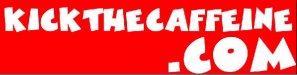
Initial thought, health related/quitting caffeine. What is the purpose of this sign; to increase web traffic so customer goes to website to find out more/ sign up?
Also, is it for a 24x6inch coroplast "rider" used with a step stake?
Initial thought, health related/quitting caffeine. What is the purpose of this sign; to increase web traffic so customer goes to website to find out more/ sign up?
Also, is it for a 24x6inch coroplast "rider" used with a step stake?

I usually keep it simple... sometimes i would add some borders like that.
Like! That adds a good attention grabbing effect.
I would definitely produce with digital print/direct print and not cut vinyl lol.
Craig Sjoquist
New Member
I would reverse that & use red background for main copy & use white border & outlines if ya must, white background for .com copy.
Unless the banner will be going in front of a dark area
Unless the banner will be going in front of a dark area


kickthecaffine.com should be all the same size, but keep the font the same. This makes it easy to read. Marlene makes a good point about first case caps.
The stroke is very distracting. So you can keep it all white, under the red BG, and then alternate it with white bg bottom and red email address.
The stroke is very distracting. So you can keep it all white, under the red BG, and then alternate it with white bg bottom and red email address.
J Hill Designs
New Member
they are all equally dull.

Craig Sjoquist
New Member
Next I would just use red banner.. name.com only... also with red background white letters only if outline white outline outside letter, much thinner would read better.
Beside if you go to the website further info can be sought after, the point is ya gotta get them there 1st.
Beside if you go to the website further info can be sought after, the point is ya gotta get them there 1st.
2B
Active Member
Next I would just use red banner.. name.com only... also with red background white letters only if outline white outline outside letter, much thinner would read better.
Beside if you go to the website further info can be sought after, the point is ya gotta get them there 1st.
this
the E-mail is pointless if they are already being directed to the URL
PS: the font on the current URL is hard too read
J Hill Designs
New Member
hoping this is a joke thread now...