-
I want to thank all the members that have upgraded your accounts. I truly appreciate your support of the site monetarily. Supporting the site keeps this site up and running as a lot of work daily goes on behind the scenes. Click to Support Signs101 ...
Search results
-

Small setup for printing Vinyl decals
Roland Versacamm or Mimaki CJV.- Bretbyron
- Post #2
- Forum: Labels and Decals
-
-

Permits for sign installation
Even sandwich boards, banners and window graphics need to be approved in our little town of pop. 4,000.:frustrated: Window graphics or signs need to be 9" or more away from the inside of the window to not need approval.- Bretbyron
- Post #25
- Forum: Installation Equipment & Techniques
-
XC540 - Help needed- Changed 2 print head and now it is printing like the attached...
If you swapped the Yellow cable and it started doing what the black is doing and then you switched it back and it stopped, I would have another look at the Black cable and switch it. -
Wasted an hour going through a couple of thousand fonts. Anyone else done that before
An Hr.? More like, Days.:banghead:- Bretbyron
- Post #4
- Forum: Fonts and Typography
-

-
Font Help please
What's the name of the digitized font?- Bretbyron
- Post #4
- Forum: Fonts and Typography
-

Ink bleeding, shadowing...help!
You can see the deflected nozzles in the test print. Some go high, some go low and some go left or right. Overnight head soak maybe. -
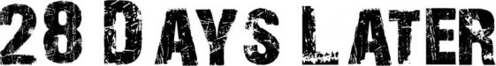
28 Days Later base font?
Here is the edited spike version compared to the modified Context Reprise version which was about half of the work:- Bretbyron
- Post #22
- Forum: Fonts and Typography
-
28 Days Later base font?
When you outline that for cut and bleed it will spike all over and need editing. This is what I ended up with: The blue line is my cut line.- Bretbyron
- Post #20
- Forum: Fonts and Typography
-
28 Days Later base font?
That is exactly what I was trying to do. Context Reprise Extra Blk was the closest I could find and still had to node many #'s and a few letters. After outlining a few numbers from scratch it looks like some one off race type font.- Bretbyron
- Post #17
- Forum: Fonts and Typography
-
28 Days Later base font?
It looks good, but I have 10 names and numbers plus a different design for the coaches shirts. I got this by stretching Context Reprise Extra Black and it's a little quicker and smoother. Still going to have to node a couple letter, was just hoping to do it quicker.- Bretbyron
- Post #14
- Forum: Fonts and Typography
-
Need help deciding on which machine to choose.
Not sure. I'm not a Mac user, sorry.- Bretbyron
- Post #6
- Forum: New Member Introductions
-
Need help deciding on which machine to choose.
Some of these machines do more than it sounds like you need. Optical registration will cost more and be useless unless you have a wide printer. Get the Roland GS Camm 1 and call it a day. I believe most here will agree. I think they have a three year warranty also. I have a CG130 SR III...- Bretbyron
- Post #4
- Forum: New Member Introductions
-
Need help deciding on which machine to choose.
Roland Camm 1?- Bretbyron
- Post #2
- Forum: New Member Introductions
-
28 Days Later base font?
The "Q" is unique. Without the scratchiness, does anyone recognize the "Q"- Bretbyron
- Post #12
- Forum: Fonts and Typography
-
28 Days Later base font?
Yep, that's the one I was attaching w/ thumbnails. The customer drew it all up with that font and I have a copy, but when I contour it spikes everywhere and is taking forever to clean up and still looks horrible.- Bretbyron
- Post #11
- Forum: Fonts and Typography
-
28 Days Later base font?
I'm trying to create a smooth contour/outline around the scratchy font for cutting. I am sure it is based on one of the basic fonts that you mentioned and I have tried several. So far Context Reprise Extra Black is the closest, but the "C" and "M" are off. I might just have to stick w/ Context...- Bretbyron
- Post #9
- Forum: Fonts and Typography
-
28 Days Later base font?
The "C" is w/o returns and the "M " doesn't go all the way down.- Bretbyron
- Post #7
- Forum: Fonts and Typography
-
28 Days Later base font?
I wish. It' basically all of it, Front name of team and back names and #s.:frustrated: Context Reprise Extra Black is really close w/ the "R" and the #'s, but the "M" isn't supposed to come all the way down.- Bretbyron
- Post #5
- Forum: Fonts and Typography
-
28 Days Later base font?
I have been doing that in Corel, but it adds so many spikes that clean-up is taking forever and not yielding great results. A version of Context Reprise might be my only hope. I'm spending Hrs. on what should be a simple print and cut job for jerseys.- Bretbyron
- Post #3
- Forum: Fonts and Typography