-
I want to thank all the members that have upgraded your accounts. I truly appreciate your support of the site monetarily. Supporting the site keeps this site up and running as a lot of work daily goes on behind the scenes. Click to Support Signs101 ...
Search results
-
Poor bevel effect
I'm actually not cutting this out, I'm just trying to recreate a logo into a vector one. Well, I might just have to freehand draw this. Just thought there might be a feature I'm missing. Another problem with freehand though is--- the light direction. Eg. at the bottom of a curve it might be... -
-
Poor bevel effect
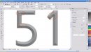
Sarge-didn't see your post. The effect is not quite as pronounced with this font, but take the "1" for example. The middle, or TOP, of the bevel at the top of the 1 should be a straight line, just like the 1's outline. Instead it starts halfway into a curve, if you get my meaning. -
Poor bevel effect
I thought of manually creating a bevel, and even tried, but was too much work (especially in the curves). Perhaps I wasn't doing it the easy way (just by freehand). How would I use it as a template? -
Poor bevel effect
I did this in X4, but am not completely pleased with the result. You can see in the picture the bevel is rounded where it should be straight, like in the corners. I've seen users that had the opposite effect, 'straight' bevels (node-to-node) where a curve was supposed to be, but not this. Does... -

Maxx2 banding problem
Classical Dot / GerberTone / GerberTone Fine / GerberTone Long / Spiral Dot / Stochastic and for images, GerberTone Photo / GerberTone STC Photo and GerberTone Artwork. There's a few of 'em! After reading the maual and looking at some of Gerber's Fastfacts, my conclusion was that I should... -
Maxx2 banding problem
Hi folks-- We're having problems with the Maxx -- the picture below pretty well says it all. I've played around quite a bit with various halftone types/LPI's, but with a lower halftone, 40 lpi or lower, image is too coarse for something that will be viewed fairly close. With a higher (from 50... -
Corel Capture "problem"
I know this is not related directly to CDraw, but hopefully someone can give some advice here. When running Corel Capture (X4), every time the computer "locks" -- I have to start the Task Manager (Ctrl+Alt+Del) to 'unlock' it. When I start my capture (default - F7) for a rectangular area... -
GSPPlot shuts down randomly!
Well, I have another Gerber problem here. When outputting a job from Composer (2.6), GSPPlot starts to open, then shuts down with the usual message, "GSPPlot has encountered an error and needs to close". This has just started happening, and it is COMPLETELY random. Sometimes it will close on the...- meltsner
- Thread
- Replies: 1
- Forum: Gerber Omega, Graphix Advantage & MacImprint
-
Omega 3.0
All the printers. :smile: No, actually concerned most about the wide format photo printers (Epson 7800/9800) and wide format solvent printers (Mutoh). Never really looked into them in detail, but we might need to soon as our Maxx2 is getting older (and outdated)!! Our paper (laser) printers are...- meltsner
- Post #29
- Forum: Gerber Omega, Graphix Advantage & MacImprint
-
Refresh problems (Omega & Corel)
That would make sense. Without looking at the settings (not at that computer right now), I'm thinking it is set to max or near max (quality, at least. Not sure about hardware acceleration) Honestly, I can't imagine it would be a memory issue (on second thought, I believe it is either 3 or 4gb)...- meltsner
- Post #6
- Forum: Gerber Omega, Graphix Advantage & MacImprint
-
Refresh problems (Omega & Corel)
Not sure, but it's at least 2gb. Also, using XP Pro.- meltsner
- Post #3
- Forum: Gerber Omega, Graphix Advantage & MacImprint
-
Refresh problems (Omega & Corel)
I'm having a rather bad problem with screen refreshing problems. I'm not exactly sure when or where it started, but we recently got a bigger computer (with a GeForce 8600 video card), so that may be it. All of a sudden, Omega will refresh the workspace, and most often it messes things up...- meltsner
- Thread
- Replies: 5
- Forum: Gerber Omega, Graphix Advantage & MacImprint
-
Omega 3.0
Hi, kind of late on the bandwagon here, just now noticed the new 3.0 on GSP today. Love what I see in the new features, would love to upgrade!! (using 2.61 now) We understood that the new version would include support for more printers and plotters. Is this true, and what are the models...- meltsner
- Post #26
- Forum: Gerber Omega, Graphix Advantage & MacImprint
-
Cutting Alignment
Al, It's possible, but you would have a very small section to work with inside the page, especially if you use reg. marks. -
Gerber Maxx 2
Different opinion from an actual OWNER Would've responded this morning but didn't have time. We are the owners of TWO Maxx 2 printers. Only one operates, the other is used for parts (the extra six cassettes make it exactly twice as convenient though!). Here is our honest opinion that is "tried... -

Easy, but cant find it! Help!!
Just looked--definitely Bookman Bold.- meltsner
- Post #3
- Forum: Fonts and Typography
-
Wacom in Corel Draw?
Getting a tablet will not be disappointing at all. It is simply a photography editor's dream, and even with any editing program you have greater control over your "mouse". There is one obvious disadvantage to be noted though: With the screen flipped down, you will need an external keyboard... -
Wacom in Corel Draw?
I use X4 with a Wacom tablet. Although haven't had much experience with it (the combo, that is), I like it so far and would say it's a little more worthy than to be a table leveler!!!!! -

Needing dogwood clipart
Hi, We're needing a clipart of a dogwood flower (see attached picture, sorry for the poor quality!) that our customer wants matched exactly. Does anyone know where we could find this exact clipart? Vector would be ideal, however we could make do with a picture. Even if it's not exactly same...- meltsner
- Thread
- Replies: 2
- Forum: Clipart, Vehicle Templates and Digital Files
-
Creating oulines in X4
Thanks for the reply, I actually found the icon a bit later. In order to outline selected objects, the objects must be ungrouped. I had them grouped which was why it didn't appear.