-
I want to thank all the members that have upgraded your accounts. I truly appreciate your support of the site monetarily. Supporting the site keeps this site up and running as a lot of work daily goes on behind the scenes. Click to Support Signs101 ...
Search results
-

Potential or Trainwreck?
tiki's version looks too much like "fine point" to me though.... saw that like 3x looking at it. I kind of like the different slant - adds a warm feeling to the image - but would be enhanced by bending the "t" inwards a little bit. would frame it out- JTBoh
- Post #32
- Forum: Logo Design
-
-

-
Some people have nerve....
we had one this week- it's for one of those "independant" power companies. They wanted us to design a trifold 2 sided brochure, essentially from scratch, with very little info on what they wanted listed as their services. The basis for this design was another "independant" power...- JTBoh
- Post #16
- Forum: General Signmaking Topics
-
Printing on Lam
Also - for a cool *** effect, try printing single strike on lam, and then applying to brushed or patterned aluminum - metallic ink analog with a nice texture. Can also be used to create (kinda) color matched brushed aluminum logos/text.- JTBoh
- Post #15
- Forum: Digital Printing
-
nice signs in Kennebrook maine
did some work for a zumba store in this area - it's essentially a franchise, and they are all required to use certain fonts/colors. Unfortunately, the franchise owners are sent (by corporate?) to some crap "sticker" place with some of the worst vinyl I've ever installed.- JTBoh
- Post #6
- Forum: General Chit-Chat
-
Will vinyl adhere to galvanized steel?
galv steel is hard as hell to paint due to the coating on it, can't recall what it is - need to buy a special primer just to have a chance at that. I'd have concerns about that. -
LOGO help
1st - too distressed, and slanted 2nd - too plain 3rd - not enough contrast 4th - best- JTBoh
- Post #2
- Forum: Logo Design
-

Chiroprator Sign Layout
Down the road from my old house, there's a 3-D spine for a chiropractor, about 12' tall and 3' wide. Kinda terrifying seeing that on top of a 15 foot pylon. Hey maniac - nice looking sign, but why the lightning?- JTBoh
- Post #15
- Forum: Designs & Layouts
-

-

Not much of a wrap but great car, and great guy.
Looks good - you could've put a flat black down first, contoured, to make a 1/4" stroke around the hole thing - would have eased into the transition better I think.- JTBoh
- Post #16
- Forum: Portfolio Board
-
"The DJ Corner"
Buddy of mine is a DJ, also is running a corner of his family's electronics store, and calling it "The DJ Corner". I've ran thru like 15 rough designs for the logo, but none of them are really working, unfortunately we're deisgning around an existing sign which happens to be 4' x 4'. Mine...- JTBoh
- Thread
- Replies: 4
- Forum: Designs & Layouts
-
Screw you 3M.
Not quite.... they're also advertising at the top of this page, lol- JTBoh
- Post #880
- Forum: General Signmaking Topics
-
-
Parking Signs
Carrie* Also, you can buy "no parking" signs from grimco for pretty dirt cheap, and its reflective.- JTBoh
- Post #2
- Forum: Entertainment, Humor and Spoofs
-
Considering the VS540
There's ways around the metallic/white "leak" issue, btw ;) -

Weird Band Name Logo In Canada
I feel like I was just subliminally forcefed something religious... that face is terrifying imo. He'll swallow your soul, he'll swallow you're soul!- JTBoh
- Post #11
- Forum: Logo Design
-
-
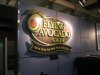
The Flying Avocado
Their logo came that way ;) We noticed it too, but figured it was that way for a reason. We used 3/4" thick comacel all the way, about half a board total - had it routed by the supplier. Really liked how the letters came out - the vinyl actually has a drop shadow on it below the letters as...- JTBoh
- Post #21
- Forum: Portfolio Board
-
The Flying Avocado
This was a fun job - first time we've done mixed media work with multiple layers. 3 layers deep, 1st is only an oval, 2nd is the inner oval, and third is the avocado and the banner. Put additional support under the banner and avocado. We used gloss vinyl with lam for the graphics, joined the...- JTBoh
- Thread
- Replies: 21
- Forum: Portfolio Board
-
Lamination
yea, clearshield for us, on the rare occasions we liquid lam anymore... sometimes it gives a good texture effect to graphics.- JTBoh
- Post #13
- Forum: Newbie Forum