-
I want to thank all the members that have upgraded your accounts. I truly appreciate your support of the site monetarily. Supporting the site keeps this site up and running as a lot of work daily goes on behind the scenes. Click to Support Signs101 ...
Search results
-

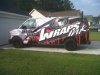
Some Recent Wrap Designs - Kickin' it old school; Simple & Clean
Been very inspired by some late 80's and early 90's SignCraft articles, which had the works of some insanely talented lettering artists. These guys were big on 'supergraphics' - easy to read, bold, and minimal copy. And being all about the brand. Guess that's why historically, I've shunned...- Dan Antonelli
- Thread
- Replies: 64
- Forum: Vehicle Wraps
-
-

-

Bicycles...............
My team has a saying. 'In order to race fast, you need to also go slow.' So true. Good luck Gino! Be safe out there; lot of morons. Colin can attest to that. So funny, some days I feel safer racing inches apart from 40 other guys going 30mph than I do riding on the shoulder by by myself.- Dan Antonelli
- Post #69
- Forum: General Chit-Chat
-
Bicycles...............
Don't forget Gino, you'll need to set aside money for the razors to shave your legs. Again, invest in quality ones as cheap ones will leave you nicked up. Trust me.... :)- Dan Antonelli
- Post #49
- Forum: General Chit-Chat
-
Bicycles...............
My current bicycle was $6500. I race pretty seriously (although not very well hah). Here's a video of me racing - I'm in the blue and white uniform - you can see me at :11 seconds in - moving up on the right side of the guy taping. This race was last Sunday (I got 21st out of 66 guys)...- Dan Antonelli
- Post #17
- Forum: General Chit-Chat
-

Critique/Help
+1 SignManiac- ON yours, convert to greyscale and you'll see what the issues are from a distance legibility standpoint. Always be mindful of laying down primary copy on a panel that is equal or greater value than itself. You are using the outline/drop to try and account for this, which doesnt...- Dan Antonelli
- Post #16
- Forum: Logo Design
-
Websites on iPad
We stopped using Flash about a year and a half ago, and 95% of the time we're substituting where we used to use it with Jquery. However, some clients still insist on it - so in those instances, we use browser detectors and just send them to the non-flash version if on Apple mobile devices. If...- Dan Antonelli
- Post #42
- Forum: Website Design
-
Designers Needed
Here's a couple hundred samples of our work- http://www.graphicd-signs.com/portfolio-logo-branding- Dan Antonelli
- Post #13
- Forum: Logo Design
-

Logo help, please!
I think its a good start but perhaps not iconic enough and I think will ultimately suffer from distance legibility. Try with heavier strokes if possible and be sure to visualize the implementation.- Dan Antonelli
- Post #13
- Forum: Logo Design
-
Ugh...can't get this :( Bevelled Font to match customers.
Wow... all my fonts apparently. Simple google search and presto. Lovely. Guess I wont be releasing my next font either.:frustrated:- Dan Antonelli
- Post #13
- Forum: Adobe
-
Ugh...can't get this :( Bevelled Font to match customers.
Hmm - what did I miss - somebody stealing the font named after my wife? Its stuff like this which make me have serious reservations about my next book being an e-book. Somebody uploads it to torrent or whatever and then what - a years worth of work down the drain.- Dan Antonelli
- Post #12
- Forum: Adobe
-
Something everyone should read..
Therein lies the opportunity, or ease in which one who excels can really stand out. Least that's one way to look at it.- Dan Antonelli
- Post #7
- Forum: Designs & Layouts
-

Neon Wrap Layout
Don't cry. And for laughs I should post my work from 20 years ago. We all start somewhere. Let he who once didn't suck themselves cast the first stone. Work on getting better than you were the day before is the best advice I can offer.- Dan Antonelli
- Post #10
- Forum: Designs & Layouts
-
Neon Wrap Layout
Brand, brand, brand. It all starts from there. If the current one is weak in foundation, it's hard to build anything solid thereafter. Which is one of the reasons why we rarely design any wraps for clients who's brands we don't create. Because in all likelihood, their brand has nothing to build...- Dan Antonelli
- Post #7
- Forum: Designs & Layouts
-

-
new shop van wrap
On a different note, do you think the left vertical stroke on the word 'wraps' seems like maybe it's not leaning left enough? At a quick glance my brain initially wants to read it 'INRAPS' because the W doesn't look enough like a W. Could be just me though!- Dan Antonelli
- Post #7
- Forum: Portfolio Board
-
new shop van wrap
Looks good. My only critique is that I wish the phone number was more legible, and there was a web address. And as stated above the word 'signs' feels a little low on the layout. But otherwise name and brand are legible, and eyecatching. Nice!- Dan Antonelli
- Post #6
- Forum: Portfolio Board
-
-
Crazy concept
He'd probably be amused at the weirdness of the business concept, but happy to quote them on the branding and vehicle wrap design. Soon after that, they'd be amused at the quote, thinking it was ridiculously high. Shortly thereafter, he'd be laughing, although simultaneously saddened, to see how...- Dan Antonelli
- Post #33
- Forum: Designs & Layouts