-
I want to thank all the members that have upgraded your accounts. I truly appreciate your support of the site monetarily. Supporting the site keeps this site up and running as a lot of work daily goes on behind the scenes. Click to Support Signs101 ...
You are using an out of date browser. It may not display this or other websites correctly.
You should upgrade or use an alternative browser.
You should upgrade or use an alternative browser.
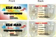
business card layout
- Thread starter signage
- Start date
omgsideburns
New Member
Shovelhead
New Member
The typeface is not appropriate.
James Chrimes
New Member
Perfect! send it.
signmeup
New Member
You are one funny dude. Made my day so far.
signmeup
New Member
Brian,
Don't listen to James. It needs work. It's very hard to tell what the items are in the pictures. I think you need a cleaner less colourful/cluttered design. It's not very professional looking. The customer may be asking for this stuff. If that is the case you have my sympathy. To start, I would ditch the rainbow.
Don't listen to James.
It needs work. It's very hard to tell what the items are in the pictures. I think you need a cleaner less colourful/cluttered design. It's not very professional looking. The customer may be asking for this stuff. If that is the case you have my sympathy. To start, I would ditch the rainbow.
Last edited:
Pat Whatley
New Member
I hate to say it but I would abandon everything you've got there. I think you've gone off in the wrong direction with it. Start over with something completely different and just see where it takes you.

omgsideburns
New Member
the problem with those A/C cutouts is no one will know what they are....... if you're going to put an A/C unit on there, put what everyone see's and recognizes. The colors are not bold enough, if you're going to go rainbow, go full blown rainbow, but you better find some contrast.
Try for something that makes sense. EVERY Heating & Air design I see has the red/blue fade or divide, with icons to symbolize hot and cold. Unfortunately the guys name doesn't give you anything to work off of, so you have to come up with the image on your own, not everyone wants dragons and clouds though.
Sometimes it's best to close the file and start all over again.. maybe sketch something out on paper until you get a new idea. The problem with designing on the computer is UNDO.
I can't give you the ideas, that's your job, but I can help tell you what's wrong.
D&Tgraphics
New Member
Sorry Brian, You need to start over. You must get rid of that cloud and dragon. They're awful. I like the direction signmeup is going. If you need to use pics of equipment, find a pic that doesn't show the guts and put it off to the side, not behind.
Dan Antonelli
New Member
It's a little awkward the presentation, and the typesetting on the rear is also a bit odd. Here's a link to our stationery gallery on our site which may spark some ideas: http://graphicd-signs.com/stationery/gallery/index.htm
SignManiac
New Member
Personally I would have gone with butterflies and fairies just to be different.
As stated already, everyone uses rainbows and dragons.
As stated already, everyone uses rainbows and dragons.
Circleville Signs
New Member

SignManiac
New Member


signmeup
New Member
Sweet! Love the phone number! How about 666-7734? (needs a different 4)As long as we're playing here, completely different direction.