-
I want to thank all the members that have upgraded your accounts. I truly appreciate your support of the site monetarily. Supporting the site keeps this site up and running as a lot of work daily goes on behind the scenes. Click to Support Signs101 ...
You are using an out of date browser. It may not display this or other websites correctly.
You should upgrade or use an alternative browser.
You should upgrade or use an alternative browser.
Do You Kern?
- Thread starter Billct2
- Start date
Billct2
Active Member
Sorry Bob, but I was taught at Butera (founded in 1910 and training ground for 100s of Boston area sign painters, an area known for incredibley high levels of sign skills) that a sign painter (yep painter, sign writers are in the British Isles) is not a typesetter. The skills and rules, though related, are completely different. Mechanical spacing does not constrain a sign designer.
SignManiac
New Member
In truth I always kern, right after waxing, especially on a first date.
J Hill Designs
New Member
I thought a limner was the guy that prunes my trees...
The Vector Doctor
Chief Bezier Manipulator
I must also disagree with Bob. I would like to see his typesetting samples
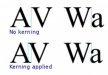
Are you saying that in the attached example, the top one is better? It does not encroach on the letter space of the W. I think the bottom is the better look and doing otherwise is what is wrong with so many designs I see every day
Are you saying that in the attached example, the top one is better? It does not encroach on the letter space of the W. I think the bottom is the better look and doing otherwise is what is wrong with so many designs I see every day
Attachments

2972renfro
New Member
Merely because you can do something does not mean that you should nor does it make it typographically acceptable. Violate the type body at your own peril. Being able to slide characters wherever you want them is not license to do so.
Every time I see one character gratuitously violate the space of another, I cringe. Just like not using a ligature for something like 'ff', 'fi', etc. Bad typography is bad typography.
Merely because it comes out your mouth, does not make it fact. Your opinion is not shared by many. EVERY person in our college design department would have failed you in typo class for your logic especially if you handed in an assignment with what you purport to be true
The Vector Doctor
Chief Bezier Manipulator
http://en.wikipedia.org/wiki/Kerning
I know this is wikipedia which cannot always be trusted, but I also learned of kerning in my typography class way back in the late 80's (before the digital movement). At that time I recall them mentioning how they had special letters that were notched to allow for better letterspacing. Kerning at that time was not blessed with the advantages we have now. They were limited by the space taken up by lead type and it was not possible to have the correct spacing for every letter combination
Ligatures are a beautiful thing but in some cases it does in fact look odd at display (large) sized type. Many people are not accustomed to seeing them and in body copy it goes unnoticed but when set large you often get comments wondering what those 2 letters are. Some of them are elegant but unexpected
Kerning was typically reserved for Headline type and not body copy where it would be less noticeable
Last edited:

GAC05
Quit buggin' me
Cringe away.
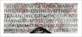
Here we see a section of Emperor Trajan's column with the interesting bits circled. Apparently they were a little more flexible with their kerning in the second century.
Is that written in Canadian?
Aside from the odd kerning I can't understand any of it.
wayne k
guam usa
signmeup
New Member
Yeah...... that's it.... Second Century Canadian.Is that written in Canadian?
Aside from the odd kerning I can't understand any of it.
wayne k
guam usa

bob
It's better to have two hands than one glove.
Merely because it comes out your mouth, does not make it fact. Your opinion is not shared by many. EVERY person in our college design department would have failed you in typo class for your logic especially if you handed in an assignment with what you purport to be true
Kid, when I give an opinion it is clearly labeled as an opinion. When I state a fact, I'm pretty damn sure it's a fact or I would qualify it.
I was setting type and doing typography, properly I might add, when your parents and the parents of the staff of your college design department were making in their pants. I have been along for the ride from hand set and hot type, through photo typesetting, along to digital type. I know from whence I speak and I care not a whit for what some academic or another might think.
While a sign writer isn't a typesetter, it most certainly is a typographer. There are rules, you can break and bend them in various special cases if you know what you're about. But for the vast majority of typography, follow the rules and you'll have legible text, don't and you'll foment chaos. The rules are broad and sufficiently rich to allow for almost infinite variation, but they still exist.
Much like writing a piece of music. Follow the rules and you have music, ignore them and you have noise.
2972renfro
New Member
Kid, when I give an opinion it is clearly labeled as an opinion. When I state a fact, I'm pretty damn sure it's a fact or I would qualify it.
I was setting type and doing typography, properly I might add, when your parents and the parents of the staff of your college design department were making in their pants. I have been along for the ride from hand set and hot type, through photo typesetting, along to digital type. I know from whence I speak and I care not a whit for what some academic or another might think.
While a sign writer isn't a typesetter, it most certainly is a typographer. There are rules, you can break and bend them in various special cases if you know what you're about. But for the vast majority of typography, follow the rules and you'll have legible text, don't and you'll foment chaos. The rules are broad and sufficiently rich to allow for almost infinite variation, but they stillexist.
Much like writing a piece of music. Follow the rules and you have music, ignore them and you have noise.
You sound like a bitter 70 year old man. Funny how when someone else has an "opinion" that differs from yours, they are "idiots". You put down everyone who disagrees with you. Fact.... my professors are probably nearly as old as you are but they supposedly don't know what they are talking about. Amazing Bob, you seen to be an expert at absolutely EVERYTHING.
What you are an expert at, is the English language.
Where is the rule written that you cannot have lettering encroach on the "space" of another? Oh I suppose every logo that has touching letters - blasphemy! So unless it is a script, letters cannot touch and should rarely invade each others' space?
Last edited:

Fanaticus
New Member
Wooosaaaa...
It's all theory. Depending on one's personal style and liking that theory can be ignored or have elements changed.
As with most things in life the "proper" methods are to follow the theory. Why? Because the majority of people will find it pleasing.
This doesn't mean everything else is wrong, it just means it won't be attractive to the majority. There are always target audiences and groups of people who still like it and will think it's wonderful. The minority. Sometimes you need to change elements to target a specific minority.
Using the example of Bob, Music, follow the theory and you'll have a wonderful piece of music that the majority of people will like (different styles even follow the theory.. rock, metal, classical.. etc.
Some music doesn't follow the theory, I can't think of any..... maybe because the majority won't buy it? All I can think of off the top of my head is the music you hear while watching a news clip about a skinhead rally and that really sucky band is playing their hate music out of key and with no melody.... some people think it's great, but the vast majority thinks it stinks.
Same goes with colors and art.... follow the theory and people will call you an artist, just throw some colors down and unless your lucky most people will say you drew a picture.
There are no rules or laws, just theories that contain rules and laws that one can choose to follow or not.
bob
It's better to have two hands than one glove.
Wooosaaaa...
It's all theory. Depending on one's personal style and liking that theory can be ignored or have elements changed...
...massive display of complete ignorance of the notion of a 'theory' mercifully deleted...
A theory is a sufficiently tested hypothesis that serves to explain some phenomenon or another. 'Theory' does not equal 'rules'. Moreover a theory must be stated in such a way that anyone might understand it, confirm it, or falsify it. If a theory is not falsifiable, it's not a theory. It's nonsense.
Or do you hold that the bishop moves on the diagonal on a chessboard is merely a theory? That two type characters cannot occupy the same space at the same time is but a theory?
astro8
New Member
We've been through this before bob and you are still confused...
"The word kern is a cognate of corner. In the days when all type was cast metal, a corner was notched to a consistent height on one or both sides of a letter-piece. Such notched pieces were only set against one another, not against unnotched ones, which had straight sides. The corner allowed for a character's features to reach into the area normally taken up by the next character, for example the top bar of the T, or the right diagonal stroke of the V to hang over the bottom left corner of an A."
"The word kern is a cognate of corner. In the days when all type was cast metal, a corner was notched to a consistent height on one or both sides of a letter-piece. Such notched pieces were only set against one another, not against unnotched ones, which had straight sides. The corner allowed for a character's features to reach into the area normally taken up by the next character, for example the top bar of the T, or the right diagonal stroke of the V to hang over the bottom left corner of an A."
Attachments
bob
It's better to have two hands than one glove.
We've been through this before bob and you are still confused...
"The word kern is a cognate of corner. In the days when all type was cast metal, a corner was notched to a consistent height on one or both sides of a letter-piece. Such notched pieces were only set against one another, not against unnotched ones, which had straight sides. The corner allowed for a character's features to reach into the area normally taken up by the next character, for example the top bar of the T, or the right diagonal stroke of the V to hang over the bottom left corner of an A."
True, with some fonts in some faces. Almost always in larger point sizes of Roman faces and more of a rarity than common place, I can't recall when last I saw a type drawer with notched characters. Other than some with extreme extensions of such elements as the tail on a 'Q', the leg of an 'R', the descender on a 'g', etc.
Those decorative items notwithstanding, I recall the notching accommodated serifs top and bottom sharing a bit of real estate, it did not allow slanted verticals to overlap, as in the ever popular "AV" example. Nor did it allow lower case characters to slide under or over right slanted verticals of upper-case characters.
In the site from which you copied and pasted your information [shame on you for not including a proper attribution],
http://www.bookrags.com/wiki/Kerning
look down at the three examples of the word 'WAR' Note that the middle example merely sharing serif space is probably the most visually pleasing. The top is too wide and the bottom too close in. You could get away with using either the top or the second examples, but the bottom is bad typography. Not only is it bad typography, it looks bizarre if not awful.
In general, there is no typographical objection to some characters sharing horizontal serif space. Serifs can be just another flavor of extension. Contrariwise and again in general, there is an objection to having the bodies of two characters sharing the same space.
For what it's worth....I'd just like to point out that Illustrator offers three kerning modes:
Auto - which I always assume will kern typographically correct in accordance with Bob's opinion, or at least in accordance with the designed characteristics of the font, whether they be correct or not
Optical - which will provide a more visually pleasing kerning
Manual - which of course will allow you to kern as you wish