• I want to thank all the members that have upgraded your accounts. I truly appreciate your support of the site monetarily. Supporting the site keeps this site up and running as a lot of work daily goes on behind the scenes. Click to Support Signs101 ...

Food Truck Layout

jc1cell

New Member
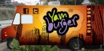
Hey guys. Here's a layout I'm working on for a local food truck. The first layout is the original concept I had come up with. He decided he wanted it in black so I modified it and came up with the last two layouts after some additions he requested.

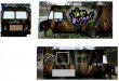
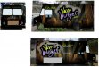
The first one of the black version has the logo small on the passenger side. He doesn't want it to break when the window is open while he's working. I suggested the second version since the promo that will be working the most while he's pared is the one on the driver side. Then while driving, the passenger side will have the same impact.

The actual theme was something he mentioned while discussing his concept. He wanted a skyline and showed me something someone else had done for him. I decided to use this faux 3d skyline rather than the standard flat skyline seen normally. He also requested the standard facebook and twitter colors rather than the original style I used.

He's a "too hands on" type of client so, while I always appreciate your comments and suggestions, I'm not certain they will be applied. I do my best to steer clients in what I think is the right direction, but some have no power steering available. :banghead:

The logo was provided by him.

jc
 

Attachments

  • Yamburger_Color1.jpg
    Yamburger_Color1.jpg
    65.8 KB · Views: 100
  • Final Yamburger Layout_rev3.jpg
    Final Yamburger Layout_rev3.jpg
    65.6 KB · Views: 85
  • Final Yamburger Layout_rev4.jpg
    Final Yamburger Layout_rev4.jpg
    67.4 KB · Views: 85

Sticky Signs

New Member
the first orange version is so much more appealing and screams for attention. The other 2 look good also but they just don't grab my attention like the orange one does. I really dig your skyline.
I'd try to convince him to stick with the high visibility orange.
 

Gino

Premium Subscriber
Nothing seems to blend. It all looks as if you just placed it on there to fit and not follow any particular theme and ended up with a discombobulated appearance.
 

mrfern

New Member
the first orange version is so much more appealing and screams for attention. The other 2 look good also but they just don't grab my attention like the orange one does. I really dig your skyline.
I'd try to convince him to stick with the high visibility orange.

I like the first one as well.

mrfern :notworthy:
 

jc1cell

New Member
Yamburger is a a combination of his real name and burger. He will be selling burgers there. The theme is really not related to it, but it's what he wanted.

The skyline I downloaded from this site:
http://www.snap2objects.com/2007/11/15/30-free-vector-skylines-vector-pack-03/

I personally like the first concept as well. I didn't develop further since he requested a change to black. Once he requested this, I realized he wouldn't consider the brighter color.

I appreciate your comment Gino. While I don't think it's discombobulated, I know it could be better. I don't feel I have the skills to improve it much more. I'm pretty sure others on the site can improve on this greatly, I try and do my best with my limited skills.

jc
 

Mike F

New Member
Am I the only one who thought yamburgers was something similar to a veggie burger?

Nice design by the way.
 

Pat Whatley

New Member
I can't be the only person sitting here thinking of a big slab of sweet tater stuck in a bun and thinking that it sounds pretty disgusting.
 

shakey0818

New Member
I don't think it looks good good at all!.I would make the truck look as colorful and appealing as possible,maybe some pictures of how delicious a yam burger could taste like.Pictures of food some description of what the hell ya got in the food truck.
 

deadman

New Member
my eye likes the first one better, but the colors throw me on the actual product. the name says burger, the colors same fruit, juice, or popcicles.

nice work though, i like it.
 

GoodPeopleFlags

New Member
I can't be the only person sitting here thinking of a big slab of sweet tater stuck in a bun and thinking that it sounds pretty disgusting.

You're not the only one. I like the layout but not for this product / company. They really need something that distinguishes what a Yam Burger is.
 

Billct2

Active Member
Sounds like a customer who knows better than you. Sometimes you just have to hold your nose and collect the check.
 

WrapperX

New Member
I don't think it looks good either. The Yamburger logo doesn't seem to fit AT ALL with the background. The pastel lettering with no centers annoys my eyes and plays with my brain. And the colors don't sit well with the skyline. It just doesn't sit with me and I'll +1 on the Yambuger name. It doesn't sound appetizing - Makes me think of Spamburger or what Pat was saying - a slab of sweet potato on a bun - YUCK! Clever trying to combine his name with hamburger - not really - but it doesn't make me want to approach his truck and buy food from him.
 

njsigns

New Member
Skyscrapers, green, purple and black... doesn't make me hungry. I'd try some red (or at least your original color palette) if you're interested in helping him make money, or if you're looking to build a relationship with his business.

Or give him what he asks for and collect the funds.

Just my .02
Gene
 

jc1cell

New Member
Billct2 said:
Sounds like a customer who knows better than you. Sometimes you just have to hold your nose and collect the check.

Hit the nail on the head.

Logo was provided by the client. In spanish, the name is not that bad. had shown him other colors for the logo to fit better, but he didn't want it changed.

The floating numbers are his decision as well. The idea behind the layout also his but I dont mind ít not being so direct.

As was stated, collect and go type of client.

Appreciate all the conments. Thank you.

Jc
 

signswi

New Member
There's a reason you don't use dead flesh and bacteria colors for someone selling meat. Are zombies the customer base?
 

Gino

Premium Subscriber
Out of curiosity.... if you sport an attitude like... oh well, I'll just do what the customer wants, take his/her money and produce a rather unappetizing lousy designed wrap for someone.... how do you expect to have future customers when they see that thing coming down the street ??

Here's hoping you have some other avenues open to get additional business, because putting that thing out on the street is not going to do you any good whatsoever.
 

jc1cell

New Member
I get what your saying gino, I truly do. I'm no guru, but I've had some layouts clients have loved and been approved here as well.

Have you ever spoken with clients and during the conversation realized how your relationship will be? This has happened to me often. This is a client that likes to drive.

I feel I have reached his vision of what he wanted. Especially since he tweaked it several times.

I probably would have taken it in a different direction. With a fiery grill of some sort, as tastefully done as I can. And then get suggestions here.

But I think some clients simply like to drive the design stage and dont budge.
 

Gino

Premium Subscriber
Those are clients you walk away from. Read Book Yourself Solid by Michael Port.


Exactly. If you're in it, just to get paid..... you'll be out of business before too long.

If you're just gonna be someone's doormat.... let the next guy do it, unless you're really hurting for money.

Sure, some bad ones slip through and go out the door, but to already know it and just give up makes no sense... especially if like you said, you're capable of doing better. Don't let the customer dictate YOUR reputation....

Only you can be accountable for your actions and to pass the blame onto the customer tells me something just isn't working on your end.

Even with this being in the totally 'Open Forums'... you could still post up your clients requests, the logo, colors and secondary copy and ask for real help, instead of just lowering your standards and taking a chance of not returning due to lack of customers from a bad reputation.
Try to remember this and word it any way you want...... it takes a long-long time to build a good reputation, but it only takes one lousy job or pissed off customer to ruin what you've spent years or decades on building.


I'm not trying to be a smart-ass or pain in the neck... I'm trying to get you riled up enough so you take a fighting stance towards your own career. Believe me... it works if you fight for your own integrity and don't sell yourself short. There are dozens of ways to tell your clients they're full of chit or have chit taste, but you have to be tactful. Here on s101, we don't have to wear the kids gloves.... we tell it like it is , so you learn better and faster.
 
Top