• I want to thank all the members that have upgraded your accounts. I truly appreciate your support of the site monetarily. Supporting the site keeps this site up and running as a lot of work daily goes on behind the scenes. Click to Support Signs101 ...

Help with this sign layout

p3

New Member
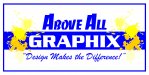
These guys beat on this poor boy so much. A few people have given good constructive criticism. Honestly, before jumping into things, I would do some reading on logo types and other stuff as well. I see a lot of people on here that call themselves "designers." A few things that I do know. The human brain responds to serif text better than sans serif, because you grow up reading it in books all the time and seeing it everywhere. It helps with making out letters. Jills design is nice, however keep in mind, people also prefer to read dark/black text on white, not inverted. It's just not natural. The sizing of the text, you want it big, but you need the negative space around to make it stand out and be legible. Keep spacing between things that are different, like your slogan. If this is a sign, you only have a couple seconds to catch their attention...ditch the "and stuff" What is that? How is it relevant to your customer? Like someone else posted, don't do different messaging on both sides. As your company, your marketing materials should be consistant, otherwise you kill your brand. You appear scattered and you lose mind space with your customer. Colors/graphics should be put below text, just natural in the way a human reads, if you put lines and graphics above the text, by the time you get to that portion of text the persons eye is lost and starts to wondering. For height to width ratio when it comes to logo type, I would probably ditch the slogan all together. The most important thing when starting a logo... Design in black and white. If it works in black and white, it will work in color. Once you get a version nailed down in black and white, pick a color swatch that works with what you are going for. Blue being trustworthy - orange being fun - etc. That way the feeling and emotions can be drawn out in your logo. Really put some thought into it... Also, I know a lot of people are dogging on the name, and to me, I think it should maybe be re-thought. Think of a person that doesn't know your business driving by, they see the sign, when you think graphics people think design. A sign shop does signs, so when someone sees that and needs shirts, they may go straight to a screen printer to find out about getting shirts made, even before coming to you.

Just some things that went through my head when I saw your sign. If you want to design a logo, think of what your company is going to represent and try to illustrate that in a mark (this is what most people consider a "logo") that will become synonymous with your business.
 

Jillbeans

New Member
people also prefer to read dark/black text on white, not inverted
What?
I have always been taught that light letters on a dark background are more legible, that's why I put GRAPHICS in a panel.
 

p3

New Member
When looking at your design, thumbnail and large, what stands out is "all above" not the graphics portion, that kind of blends into the bar. It's just how the brain works. There's a lot of research documents that talk about this and what makes effective advertising. It's just when you are taught to read, it's always black on white, even on this website dark text on a light background. Websites, Print Ads, Billboards etc. have a lower success rate when they are black whit white text, even though you can't get more contrasty. I used to think the same thing, but, the research and studies show the opposite.
 

John Butto

New Member
sameoldsameold

If your going to give advice, either through visual or talking, give something new. The OP is basically has everything for a sign except experience and boarders, triangles different fonts, etc, etc. Y'all need to break out of the box sometimes, and quit telling someone to read a design book, if you give a read selection, at least Voltaire's Candide to get some good insight.
 

John Butto

New Member
....I was just giving a suggestion.
I don't recall playing the old Mastering Layout card today.
So now that I know you have that card, I know you will throw it down at some point in the future. I should draw up a Signs101 card deck, have a joker and a king already drawn, now I need to find an Old Maid.
 

p3

New Member
One of the books I can think of off the top of my head that was a good read, Ogilvy on Advertising:
http://www.amazon.com/Ogilvy-Advertising-David/dp/039472903X

Explains what makes an advertisement successful, backed by research and one of the best advertisers to be in the biz.

As far as examples, my recommendation is to google "signs", "billboards" and other things related to your field. Scroll through them. Make mental notes of ones you like. If you like them because of color or design or whatever. Get off google for a little bit, then this evening try to remember the ones you thought were good, or what ads/signs/billboards you remember, google what you remember, and see what the design looked like. If you remembered it all day, or if you even took it a step further and did it at the beginning of the week, and then tried to remember at the end....take elements from the ones you remember or look at the elements that were in it and see what principles you can apply to your design....has to be ones that make sense, can't apply them all because of course then you end up with a hodge podge mess.

I usually do this. The ones I remember - most of the time - are not the ones with a lot of design elements. When I try to find the ones i'm looking for because of design elements, I find myself not googling the name of the company, but what the sign may have in it, whether its "blue and orange swirl sign" or whatever crazy terms I may think will bring it back. The ones you actually remember the name, will almost always be the most plain and coincide with what their business does.
 

Jillbeans

New Member
I'm just glad you rejoined 101 rather than always emailing me design suggestions.
:)
 

Attachments

  • Untitled-1.jpg
    Untitled-1.jpg
    230 KB · Views: 135

Fred Weiss

Merchant Member
What?
I have always been taught that light letters on a dark background are more legible, that's why I put GRAPHICS in a panel.

The study I read years ago did not specifically find that a reverse is more legible. It found that it appears 25% larger to the eye. But it also found that reading speed is 33% lower. Which makes a reverse good for things like phone numbers, single words and creating separation, but not so good for comprehension ... especially for drive by viewers and on vehicles.
 

Gino

Premium Subscriber
Well, this isn't the place to really do this, but the rest of you have :thread this thread, so I'm gonna add my 2¢.

I think you're all correct to an extent, but relying on statistics and reading someone's theory about reverse vs. plain Jane....... relax.

As mentioned, we all grow up reading text books, magazines, newspapers and all kinds of written information and while reading for speed or comprehension is black/dark on while/light is preferred, it's not necessarily so for making something stand out from the norm.

That's the reason a reverse will stand out. It's says something to the minds eye that this must be important.... the same way capital letters will do.

Whenever one reverses a panel, uses some gimmick or just does outstanding artwork of some sort, it is always going to catch your peripheral vision far faster and effectively, than just dark on white. Our eyes have been trained to read black on white.

  • Why do you think fire engines are bright red ??
  • What makes the yellow pages different ??
  • Why are most ADA signs white on dark backgrounds ??
  • Why is it around the globe, white on green is the best combination for all road signs ??
  • Why are stop signs white on red ??


No, I think it very foolish to say something is not what it seems to be because you read it in a book or just want to be different.

Also, I still think the OP's original posts here have merit. :clapping:
 

JBusch260

New Member
How about something more like this

That's a pretty solid route. It would good for the OP to see that.

To the OP: Have you found anything that has caught your eye yet today? What works and what doesn't for you?

Also, in regards to the slogan, it might just be me, but I'm not crazy about places that advertise having "stuff". It is rather synonymous with junk, or at least something that will not appeal to me, if described more specifically. Is there a better word to describe what else you want to produce? What are other people's thoughts on that detail of services?
 

SignManiac

New Member
The majority of my work is all gimmicks. I love reverse panels and 90% of my portfolio is light on dark. One of these days I'll get better and learn the theoretical design stuff.
 

p3

New Member
Gino, your points are valid, but in the examples of street signs, or ADA signs, it's based off the shapes and colors. These are more elementary than reading text. A stop sign is a big red octagon, yes it has text, but it's the shape/color combo that makes it what it is. A fire truck is a big red truck, now try reading the text on the truck of which fire department it came from. These things are like marks. Like I said before a mark will work, design in black and white, then add color to add that feeling of emotion and what it is about.

Back to signs with text, capital letters do not aid in the reading of text, it actually hinders the effectiveness of what you are trying to read and get across. Plus the jumping up and down in sizes if using caps and no caps creates a wander of the eye thus not fully paying attention or retaining the information.

I did suggest a book. At the end of the day a good sign is one that generates customers and dollars. I simply suggested something for the original poster to maybe look into, along with whoever else to get some insight from a guy that has a tremendous amount of success in creating successful content, whether it's print ads, billboards, logos anything marketing and branding related. A good design isn't one that is the most flashy or has a ton of design elements, it is one that converts into what you want it to do. Which in this guys' case, to get customers in his door. The book I suggested, is pretty good at explaining facts based on research on how to do this. Yes there are a million of them out there and the one I suggested, others may think it is a lack luster read.

I will also suggest to check out Graphic D-Signs' work. Their stuff is really clean, minimal with the info you need right there. Look at the fonts Dan uses, his color pallets and look how they work really well together.

I mainly wanted to give the OP things to think about other than just saying it sucks, start over and just throwing designs as to no reasoning why other than I think it looks better than his.
 
Wow..where do I even start? At the beginning, of course.:smile:

Signosaurus:
don't you think you should make sure you can back it up with a Top Shelf "Above All' designer on your staff?

Who says I don't have top shelf art staff? This is just MY attempt. I know my limitations and have art done by other people when needed.

Visual800:
Thank you.

CPSigns:
Thank You

Vinylman:
Nevermind.

John Butto:
Ummm.....

SignManiac:
Thank you

Marlene:
why? why put this out there when you admit you are no designer and are working with a real designer to develope a logo? why? did you think maybe it was great and we would tell you to forget the real designer? these kinds of posts just make me wonder

I put this on here BECAUSE I know I am not a designer. I wanted to see how far i was off. Sorry if I upset the balance of your day.

SignProPlus-Chip:

Wow dude...the "chip" you refer to in your name must be on your shoulder. Please calm down. Its a bad sign layout...not the end of the world.

Seriously, how in the bloody hell can you, with a straight face, call yourself "Above All" with a tag line that reads "Design makes the Difference" when you cannot live up to those claims even when designing your own logo?

Hey, I may be "Sign Pro Plus" but my partner and myself have about 30 plus years of experience. What make you "Above All"?
First of all the name has a double meaning....I did mean for it to imply "above average" quality but also to refer to my Lord and Savior who came from "above." I never said I was better than you. I am quite sure I am not. But are you so insecure that you must blast somebody trying to market themselves?
Should I be forced to pass some litmus test in order to "prove" I am worthy of using those words in my business name?

Secondly...I've been in business long enough to know that design is what makes the difference. The materials that go into making a sign are basically all the same no matter where you buy your sign. But a good design versus a bad design makes all the difference in the world. I know the value of good designs...that is why I posted a "work in progress" in order to make a bad design into a good one.

if your "above all" you probably should have known that too.
Take my words constructively and not as an attack

Is the above comment not an attack?

Ddarlak:
Thank you for not hating it!

JS:
??? 5th grade art class

??? 5th grade attempt at humor?

Jillbeans:
Thank you for the instructions and the other layout examples. The Senior moment you spoke must be prevalent. People often make that word change.

Salmoneye:
Thanks

Billct2:
Thanks

Gino:
Thank you for your kind comments. I am using two taglines because this would have been a double sided sign on a highway. I wanted to catch people going both ways with different messages.

tsgtsl:
I do eat all day. Does that count?

Pat:
Work out your log with your designer, then design your sign around that.
I intend to do just that. I do wonder what your first UN-edited post said though. Sounds as if you are a man of many talents.

P3:
Thank you for taking the time to write such a lengthy reply. Could you clarify what you meant about the name?
Also, I know a lot of people are dogging on the name, and to me, I think it should maybe be re-thought. Think of a person that doesn't know your business driving by, they see the sign, when you think graphics people think design. A sign shop does signs, so when someone sees that and needs shirts, they may go straight to a screen printer to find out about getting shirts made, even before coming to you.

Then at this point you guys lose me with the talk about background colors, reverse panels and such.....

MikeIFG:
That's probably a good idea. However, when I first started learning production and installs I had to have a few people come along side me and show me some things. That's all I was asking for here.

iegrafixs:
That is pretty cool looking!!! Thanks.

JBush260:
The "stuff" in my tagline is supposed to refer to promotional items such as business cards, ink pens and other imprintable stuff like that. I feel that using promotional items is a touch wieldy for a sign.

John Butto:
You did, in your very first post: "I am currently in talks with a real designer" so that would mean you do not have a top shelf art staff. And if you did, why would you come here for critique, you could just walk down the halls of your design studio, take the elevator down to the floors of the top self art staff and ask their ideas on it.

My top shelf art staff consists of many qualified freelance artists. Some of whom are on signs 101!

Again...thanks for the positive comments. Even with the smart comments...Signs 101 is still an awesome place to learn.
 
Last edited:

John Butto

New Member
Critique

Wow..where do I even start? At the beginning, of course.:smile:
Who says I don't have top shelf art staff? This is just MY attempt.
You did, in your very first post: "I am currently in talks with a real designer" so that would mean you do not have a top shelf art staff. And if you did, why would you come here for critique, you could just walk down the halls of your design studio, take the elevator down to the floors of the top self art staff and ask their ideas on it.
 

Hicalibersigns

New Member
I just love these threads!! I learn so much. So many opinions, good and bad, so many great design ideas. So many ornery curmudgeons. Jillbeans, I always love your work. Iegrafixs, I think that design just exudes class. Now here's the deal. I am a design idiot. Make that a GRAPHICS design idiot, since I have spent many years successfully designing electronic circuits, security systems, and electronic products in general. The nuances of graphic design just elude me. That's why I hired a designer. Sometime, the most valuable skill of all is realizing your limitations.
 
Top