• I want to thank all the members that have upgraded your accounts. I truly appreciate your support of the site monetarily. Supporting the site keeps this site up and running as a lot of work daily goes on behind the scenes. Click to Support Signs101 ...

Landscape Logo input

Stacey K

I like making signs
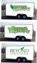
Hi Friends - My sons are starting a landscape company and I said I would help with the logo. It's not my strong point so I also said I would be perfectly fine in finding someone else to create it but I'd take a stab at it.

Here are some details on the application:

2 white pick-up trucks (likely just the doors)
1 white enclosed trailer (probably 12' to 16') (half wrap?)
Business cards
Apparel - for the apparel, a few embroidered polos then plain high viz yellow with black logo large on back, small on front

They will be starting with lawns and working into doing hardscapes such as patios and retaining walls. I tried to incorporate a stone path and some leaves - that didn't work so I used some rocks and leaves.

Again, these are the 3 they chose and they are first drafts. I see off the bat the outlines need adjusting LOL Thank you!!
 

Attachments

  • 1.jpg
    1.jpg
    593.7 KB · Views: 645
  • 2.jpg
    2.jpg
    578 KB · Views: 317

Gino

Premium Subscriber
The easiest one to read is the bottom one. However, it's not as exciting as the other two. The other two have too much fancy-schmancy going on. When you put an outline around a letter, then another one followed by another, it get very hard at a glance to read, as there is just to much mumbo/jumbo happening. Also, the outline and shadow of brown is also making it hard to read, as it closes up a lotta areas on the actual letters. It will look good on the screen, but it won't pass the 'squint test'. I like the one with leaves and rocks the best, just open it up and let it breathe more. :thumb: great start
 

Texas_Signmaker

Very Active Signmaker
I like either the middle trailer or the bottom. Two different looks but both nice. I might suggest thinning the stroke of the outline on the middle one a bit to see what that looks like.. I just feel it's too heavy but it might look better the way you have it.
 

Boudica

Back to "educational purposes"
I generally lean toward clean and simple - but I really like your little pavers. So I like the paver version, but without the outline, and a little more space. Here's a quick visual
BL_Logo_vp.jpg
 
Last edited:

jochwat

Graphics Department
I like the paver / 2-leaf one as well. But I also kinda like the outline -- if it stays on the outside only, around the entirety of the logo. Where it overlaps inside between the words is what really clogs it up. Do the outline around the whole logo as one piece, and maybe add a little more breathing room, and I'd like it even mo!
 

Boudica

Back to "educational purposes"
I like the paver / 2-leaf one as well. But I also kinda like the outline -- if it stays on the outside only, around the entirety of the logo. Where it overlaps inside between the words is what really clogs it up. Do the outline around the whole logo as one piece, and maybe add a little more breathing room, and I'd like it even mo!
BL_Logo_vp-outline.jpg


like this?
 

Gino

Premium Subscriber
The 'B', 'E', 'Y', 'O', 'N' and 'D' are all closed up. From a distance, that outline works completely against you. That outline does not fit. Put the thing into all grey scales in PS and you'll see what I mean. The brown is about an 8 or 9 and the green is about a 5 on a 1 to 10 scale.

Oh, and take the llc off. Not needed for this and just adds to the clutter.
 

Notarealsignguy

Arial - it's almost helvetica
I'm kinda partial to the corpo looking one as well, though I'd opt for something sans serif for the title font.
View attachment 161668
And after inserting gotham in place of whatever seriffy font beyond was in, I realized I reinvented the bed bath and beyond logo subliminally. So now just own it!
View attachment 161667
You need to tighten up that BEYOND, what kind of crap are you making over there?
 

signbrad

New Member
When you put an outline around a letter, then another one followed by another, it get very hard at a glance to read
Outlines, generally, compromise legibility.

Most good logo designs have neither outlines nor shades. Nor gradients, for that matter.
Overlapping elements and lettering can also compromise legibility on a logo, though these things they may look good on a sign layout or a print ad.

A logo should be extremely legible. It should be highly recognizable, even at a distance, and easy to remember. Simple is usually better, but not a requirement. One of the Pentagram designers in NYC once said, "Can you sketch the logo from memory?" He said that's a good thing.
A logo that creates a distinctive silhouette can be effective, which is why I lean away from all caps, though that's not a strict rule. If the top word is upper and lower, not only does it create a distinctive silhouette, but it may also create pockets of negative space that maybe can accommodate the leaf graphic better.

Many of us sign goobers, including me, tend to try too hard to put too much into a logo design (Rob Janoff said this long before I did). We try to achieve a "wow" factor that is unnecessary in logo design. Designing in black and white can help combat that. Color can always be added later. And a B&W version is often needed anyway for single color applications. I also like to create a horizontal version and a vertical, or more vertical, version.

Also—while I'm pontificating—a logo design does not need to "tell a story" or tell what a business does for a living. This is a misconception. A logo does not need to be a design that is a "customer magnet," or convert sales. A logo is is strictly for identity. What makes a successful logo is not so much about the design as it is about effective marketing and advertising of the brand. Generally, a logo does not make a company look good. It's the other way around (Paul Rand said this before I did).

A logo is important, to be sure. But a "great" logo will not save a failing company, nor will a "weak" logo cause a well-marketed company to fail. Logos don't have that much power.

Logo design can be harder than it looks. Most of us sign makers, including me, are not good at it. We struggle, and tend to fall back on embellishments. We add, when often we should be removing. Our logo creations often look like signs rather than logos (not surprisingly).

I know how negative this post must sound. But ineffective design, not just in logos, but in general, is the BIG WEAKNESS in the sign industry.
..................

I like the same version that Gino said is the easiest to read. It looks more like a real logo than the other two. I would start with that and tweak from there.

Brad
 

DL Signs

Never go against the family
I like the concepts, but agree with the majority, no outline. When you start getting into small stuff a logo is used on (business cards, invoices, address labels) it ends up making the text very small to fit it all. I also do newspaper ads on the side, you also have to look at grayscale/ BW uses, and how it'll look, and again with outlines in this scenario, text gets very small and illegible, I end up re-doing a lot of small business logos in ways that will work for small newsprint ads (never ending). The more complex, the harder, and more costly it'll be for screen printing, embroidery, and the harder it'll be to use on different colored backgrounds.

When I do logos, I start most like Signbrad suggests, black and white, then add colors, that way you're covered for just about anything, you'll have a black version (hence a white version), and a color version. I also do versions with alternate colors, or create them with the ability to do a shape file around them, because, say a logo that's mostly red doesn't work good on a red background. There's a lot to think about with logos, most of it is thinking about ways, where, and how they won't work. Instead of having the outline with a stroke, just tighten that shape up a bit and keep it as a shape file to have a simple white outline around the logo for when you need it, watermarking photos of jobs they do, cutting decals that have a white border that can be used on any color and still stand out. You'll be a pro at this in no time.
 

GAC05

Quit buggin' me
I think Brad has it pretty well laid out. But, I would skip the more vertical layout exercise. No landscaper is going to want their logo done in a portrait layout.
 

rjssigns

Active Member
Great initial hit Stacey

Gino is on point with the gray scale and squint test. It is what I tell my students. Weird part is I'm the first one to tell them.

Anyway, here's my take.
I like the basic serif style of the top logo. Clean and easy to read. Psychology wise Roman style font in all caps conveys substance and stability.

If they pick one of the other two be careful with kerning. I'd also lose the paver/stones. Negative space is your friend.
Also try a "cleaner" script with a heavier stroke width. Tartine comes to mind but that may be a tad heavy.

You can also build a "room" for the word Landscape by arcing BEYOND and using drop caps for the B and D.
It's a trick to pull the eye to center and looks great when executed properly.

Outlines and shadows:
Many years ago my wife taught me to place a high contrast pinstripe width stroke on the letter before adding an outline or shadow.
Although it's an added element you gain visual "push".

Last bits to consider is if the logo will play well across all types or output.
Business cards, apparel, web, mobile devices, embroidery etc...
If you design with variable output in mind you will only do it once, not multiple times.
 

Stacey K

I like making signs
Thank you everyone for the positive feedback! I'm going to keep working on these and hopefully update next week!
 
Top