• I want to thank all the members that have upgraded your accounts. I truly appreciate your support of the site monetarily. Supporting the site keeps this site up and running as a lot of work daily goes on behind the scenes. Click to Support Signs101 ...

Logo Critique

Jillbeans

New Member
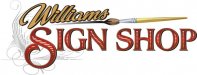
First of all, do you really paint? If so, it's fine to use a paint brush in your logo, and even expected. Change the color of the brush handle to navy blue and the bristles to brown. Make the paint red.
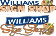
Then try Williams in bright red, no outline. When I do a word with 2 "lls" in a script (like Jill) I always make one "l" slightly smaller. Makes it look more bouncy and fun.
That shadow looks awkward, would it actually make a grey shadow over those black letters? Put it behind them.
Since you like Arthur's fonts, try Wade Dynamic or American Sans (Or Steve C.'s Truckin') for SIGN SHOP.
(You could also make the name blue with blue paint on the brush and a red handle, but I was trying to avoid people saying it looked like a carrot)
Love....Jill
 

Marlene

New Member
When I first started coming to this site I loved it. John told me to check it out and I fell in love. Lately though few if any offer any real advise about how to correct things or how someone may become better. Sometimes this proves wrong, because I have seen other post for ideas and suggestions and ideas are offered. However, it seems to be a clique type environment anymore. As far as John goes, I posted a logo for critique back some time ago that contained a cartoon character and everyone bashed the cartoon. When I reveled that John had done the cartoon, everyone loved it. So... all I am trying to do is get better with my designs. I do have a thick skin. I just wish I could get some good advice like Marlene or like Isign has imputed for me before.

first, thank you.

you are right in that some just post a nasty or what they think is funny comment which bogs down a thread with no real benefit to anyone. most here do try to give a hand by letting the OP know what it is that looks off. as far as the cartoon paintbrush goes, the fonts needed to support that kind of graphic weren't there so it won't be perceived as intended. it kind of like the difference between wearing a sting of pearls with a tee-shirt or a black velvet dress. it's the combined overall look that makes or breaks it. the clique attitude you mentioned is human nature more than a clique. John is a very repected artist and I think that saying you don't like his work when not knowing it is his and then back peddling is a natural thing people do when they do respect some one.

going back to the logo itself, if you want to use the cartoon, you'll need to support that with a font that is cartoon like as what you have now is a nice, formal font for the name with a cartoon and that just doesn't work. your font is a velvet dress and your cartoon is a tee-shirt, you need to pick a look and go for it all the way
 

Williams Signs

New Member
Logo

I have been working on this for a while. I decided to set it out there to get some feedback on. Marlene is this getting better?
 

Attachments

  • logo2.jpg
    logo2.jpg
    40 KB · Views: 87

Malkin

New Member
The red & blue colors combined with the sans serif faces for WILLIAMS sort of reminds me of Sherwin Williams. The big swooshy script helps to offset that that a little. I think I like this one a little better that the first. Different color choices would be of benefit I think.
 

COOKY

New Member
I have been working on this for a while. I decided to set it out there to get some feedback on. Marlene is this getting better?

I like this one. Would muck around with the colours a bit and try and get the Williams more prodominant. Good looking logo.....
 

GoodPeopleFlags

New Member
Do you paint signs? If not, lose the paint brush and paints.

Make "Williams" less prominate.

I don't like the 3D effect on the top on and the script on the bottom is too hard to read. Sorry I don't have anything to say more helpful.
 

Williams Signs

New Member
Learning to do lettering. Two people helping me is friends with Joe Diaz. The other which has been a mentor to me in the biz is a 30 year veteran in the sign biz and is an old letterhead. His name is Bruce Ottway. He is good friends with the editor of Sign Craft. So I am trying but nowhere near where I want to be.
 

carrie222

New Member
Hi! I really like the last design you shared with us. Some suggestions I have are to try "Williams" without the dark background, just dark letters. Perhaps if it were a little smaller and to the left it would balance out the palette better. Also, is it possible to have the brush painting a little of the lettering? It might look more integrated that way. Another idea is maybe use just the brush and that can act as an element that underlines Williams and adds interest with a visual image, but doesn't take away from the lettering. Hope this helps! :)
 

Gino

Premium Subscriber
Your last proofs have a 50-ish look to them from all aspects. Sign painters don’t use artist palettes for making anything other than pictorial art. Even then, it’s not held in your one hand a dabbed with your other hand holding the brush. It also looks like a makeup brush for blush or something. I’d also lose the star.
 

fmg

New Member
Have to be honest with you.
The brush clip art caricature thingy is absolutely awful and would lose that in a heartbeat. I wouldn't entertain a sign shop with a logo like that if I were in the market for a sign. It says Chintz to me.
If you are a classic kind of sign shop then yes I can see where you are coming from with these script, prismatic typesets.However if not then why don't you try and get a bit more creative and step into the modern world and give yourself a fresh new identity.
I see way too many sign shops out there with the same kind of Branding all over the place and i personally think it is boring!
Just me 2 cents'
 

JR's

New Member
I like post #23 I just don't care for the colors.

JR

P.S whats your logo look like fmg. ?
 

JR's

New Member
post #23 is your logo or your logo is F.M.G. ?
if its #23 I like it. type slow for me please.

JR
 
Top