-
I want to thank all the members that have upgraded your accounts. I truly appreciate your support of the site monetarily. Supporting the site keeps this site up and running as a lot of work daily goes on behind the scenes. Click to Support Signs101 ...
You are using an out of date browser. It may not display this or other websites correctly.
You should upgrade or use an alternative browser.
You should upgrade or use an alternative browser.
My first submission.
- Thread starter razzildazzil
- Start date

razzildazzil
New Member
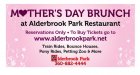
It's a 4x8 banner, or rather 5 of them. Viewed from about 100 feet on a two-lane city street from now until Mother's day weekend.
Thanks for the responses thus far. I wanted to do part of the info in a reverse but it cluttered up the banner to much.
Thanks for the responses thus far. I wanted to do part of the info in a reverse but it cluttered up the banner to much.
Locals Find!
New Member
background is kinda light for a banner being viewed from that distance.
I would probably lose the background and less text for a banner. For a postcard though that would be a good design. Just my 2 cents.
I would probably lose the background and less text for a banner. For a postcard though that would be a good design. Just my 2 cents.
Locals Find!
New Member
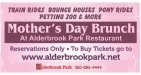
Here's my take....

TwoNine
New Member
Nice, but a little unreadable IMO - I'd take some of Bill's ideas and maybe implement them next time. (Minus the Brush Script - LOL)
I do like your font and color choices. Just a bit wordy IMO - I'd have tried to help the customer see that more isn't always better, and would have 'suggested' a copy change via no designs with all the messy details. But sometimes you have no control over that - I understand.
My 0.02! (In today's market that is equal to about 1 1/2 pesos!)
-Chad
razzildazzil
New Member
I wasn't able to control the copy for the signs... I'm the newest addition to the small shop I work for and the last designer let them get away with all this junk every time they placed an order so I'm stuck with it.
Thanks for the feedback and props!
Thanks for the feedback and props!
Circleville Signs
New Member
4'x8' banner viewed from 100+ feet need much better prioritized copy, and to lose quite a bit of what is on there.
That being said, sounds like you did the best you could with what you had to work with.
That being said, sounds like you did the best you could with what you had to work with.
CheapVehicleWrap
New Member
Some caps or small caps in the URL
SignManiac
New Member
I'll be nice and not hurt your feelings, unfortunate you have no control over this situation.
It needs serious reworking. All I see is letters stuck on a background, that's not what I consider sign design.
It needs serious reworking. All I see is letters stuck on a background, that's not what I consider sign design.
briankb
Premium Subscriber
shouldn't it say "By Reservation Only" or "Reservation Required visit Website"?
Also I would check the URL and if it works without the www prefix I would drop it to clean up and make it more immediately readable. If it doesn't work without the www. that should be fixed by their ISP or Hosting provider.
just my $.02
Also I would check the URL and if it works without the www prefix I would drop it to clean up and make it more immediately readable. If it doesn't work without the www. that should be fixed by their ISP or Hosting provider.
just my $.02
Pixels Are Bad Mmmkay?
New Member
Bill hit the nail right on the head. "Mother's Day Brunch" is easily readable and the eyes are immediately drawn to it on his layout. You left a lot of dead space in your layout and I really don't get what's going on with the inverted triangle. You can prioritize copy and still manage to work it all into a pleasing layout. And as was said already, you really didn't design anything. You took a purple box with some filigree and typed some words over it. You can definitely do a lot more with this.
Marlene
New Member
it's like reading an eye chart where everything kind of tapers off until you can't read another line of letters.
the balance is way off with it being heavy on top and then smaller and smaller. take a look at how Bill broke out the copy and balanced the layout and give it a try.
the balance is way off with it being heavy on top and then smaller and smaller. take a look at how Bill broke out the copy and balanced the layout and give it a try.
