-
I want to thank all the members that have upgraded your accounts. I truly appreciate your support of the site monetarily. Supporting the site keeps this site up and running as a lot of work daily goes on behind the scenes. Click to Support Signs101 ...
You are using an out of date browser. It may not display this or other websites correctly.
You should upgrade or use an alternative browser.
You should upgrade or use an alternative browser.
Need critique on logo
- Thread starter SignManiac
- Start date

James Chrimes
New Member

SignManiac
New Member
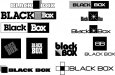
More great ideas! Heath what is that font in your post? I really like it.
TheSellOut
New Member
Somebody else pm'd me about it too...it's Neuropol...not sure where I got it from, but since stumbling upon it for use in your layout, I am definitely bookmarking it for use in a future layout!

TheSellOut
New Member
Nice one Joe!

SignManiac
New Member
Joe that's awesome but the box is purple? I almost think the box has to stay black no matter. Not sure if the font matters much. Still, a nice design.
ddubia
New Member
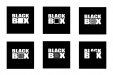
Working on a logo for a company that specializes in making black boxes. I came up with this so far. Any suggestions or critiques?
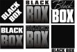
I became obsessed with the "O" in box. The "O" is kinda the opposite of a box (square vs round) so I'm then obsessed with making a square peg work in a round hole. By now I'm as twisted as your avatar. Nonetheless, I came up with some goofy ideas...
Attachments


SignManiac
New Member
Yep, found that earlier in my research.


SignManiac
New Member
An awful lot of good suggestions. Here's where I'm at with the bunch.
I like all of 'um...

bottom right. also the one with back to back B.