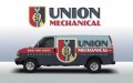
• I want to thank all the members that have upgraded your accounts. I truly appreciate your support of the site monetarily. Supporting the site keeps this site up and running as a lot of work daily goes on behind the scenes. Click to Support Signs101 ...

Need installer for pretty cool wrap design, west coast FL

Dan Antonelli

New Member
Just finished this one. Client has this van, plus box truck, plus a few pickups that all need to be wrapped. Really need an ace installer that I can recommend and trust.

I know there's a few good guys in FL, just always forget who is from where.

Thanks in advance guys!
 

Attachments

  • unionmech.jpg
    unionmech.jpg
    41.2 KB · Views: 88
Salt Water Graphics Installation

Salt Water Graphics Installation

Mica Minero-Daidone
Executive Admin.
(941) 780-5831
micaminero@yahoo.com

Nick Daidone
Owner/Installer
(941) 961-4038
nickdaidone@yahoo.com


A+++ !!

Nick is awesome installer, great with clients and hands down the best I have come across in FL. Love to see him get the project...


Dan just curious, Are you a fan of Sheperd Fairey, The "Obey/Andre the Giant has a posse Guy"..? Always loved his style and your work is as good if not better. Nice Style flow and direct message..... OH yeah colors... It's all about the color combos...
 
Last edited:
shepard fairey prints

Love these...
 

Attachments

  • Bob_Marley_obey_by_Rockerfeller.jpg
    Bob_Marley_obey_by_Rockerfeller.jpg
    56.4 KB · Views: 58
  • images.jpg
    images.jpg
    6.2 KB · Views: 57
  • obey_chihuahua.jpg
    obey_chihuahua.jpg
    82.1 KB · Views: 75
  • OBEY_the_B_I_G__by_artwarriors.jpg
    OBEY_the_B_I_G__by_artwarriors.jpg
    58.8 KB · Views: 69
  • stereo-obey-shepard-fairey-decks-tshirts-1.jpg
    stereo-obey-shepard-fairey-decks-tshirts-1.jpg
    75 KB · Views: 93

Dan Antonelli

New Member
Salt Water Graphics Installation

A+++ !!

Nick is awesome installer, great with clients and hands down the best I have come across in FL. Love to see him get the project...


Dan just curious, Are you a fan of Sheperd Fairey, The "Obey/Andre the Giant has a posse Guy"..? Always loved his style and your work is as good if not better. Nice Style flow and direct message..... OH yeah colors... It's all about the color combos...

Yeh, it was kind of interesting. Jeff and I researched a lot of war posters (WPA) from the 30s and 40s to come up with some ideas and sketches on this retro brand. We kind of zeroed in the hand and wrench concept - as we've definitely been doing a ton of character and mascot based retro brand - so we wanted a fresh approach. Anyway, one of my newer designers sent us the link to Sheperds work and boy his stuff is just crazy cool.

I'd highly recommend some of the war poster/propaganda imagery books if you work in the genre. I just picked up like 4 of them this week to help with this project and they were a huge help. There's also a lot of pro-union posters, which was pretty ironic since this client had that in their name. The posterization techniques these guys employed were just crazy. And man, what a ton of eye candy on lettering techniques for the genre.

For this one, its a font with some effects modded in. Client gave us free reign to go retro, but did like a lot of our previous brands that were character based. But he did a lot of commercial work and the mascot approach felt too slanted towards residential market. So we felt like this was a more 'industrial' look - and therefore more appropriate for the commercial sector.

I will say this is hardest type of branding genre we do. Especially when its a brand/wrap identity build. Because its not only the logo, but equally critical is execution on the vehicle advertising. And the research/sketching involved takes time. I mean I literally spent 7-8 hours on typography research and implementation alone. And there's probably two dozen throwaway concepts with type before I felt like we nailed it.

Thanks for the info on the installer. I'll try and find their web site and check out their work.
 

phototec

New Member
In 2008, Shepard Fairey created the iconic "HOPE" poster, in support of President Obama’s election. Recently Fairey created a graphic in support of the Occupy movement. This graphic and his initial design description sparked a dialogue between Shepard and a representative from the Occupy movement. Subsequently, Shepard revised his original design.

The design on the left is the first version, after dialogue between Shepard and a representative from the Occupy movement, the revised version is on the right.

:omg2:
 

Attachments

  • Occupy_HOPE-500x753.png
    Occupy_HOPE-500x753.png
    192.6 KB · Views: 66
  • Occupy_HOPE.jpg
    Occupy_HOPE.jpg
    44.6 KB · Views: 74
  • Occupy-HOPE-poster-final-rnd2-V2.jpg
    Occupy-HOPE-poster-final-rnd2-V2.jpg
    43.4 KB · Views: 68

Jillbeans

New Member
Wow Dan...a wrap that can be read from a distance?
What are you thinking?
Where's the diamond plate and tru fire?
Love....Jill
 

Dan Antonelli

New Member
Unfortunately - I had to kill the concept. Apparently a few people associated it with white power/naziism/socialism /communism because of fist imagery. And a few went on to say they wouldn't use the company because of the association. So another lesson to learn is sometimes market research may give you insight into something you don't really see yourself. . Sadly 30+ people saw it - including you all - and only two or so had negative connotation - and a few thought they appeared not friendly (mainly women). Also some thought the name "union" coupled with image had a pro-union slant which is not popular in some parts.

I have another unused concept on another retro job which this client loves, so tweaking that.

Oh well - it happens! Funny though most really loved it including me. I'll post round two when its done! For now, this goes to the morgue--- although I still love it. I'll find a way to use it somewhere.
 

Dan Antonelli

New Member
Here's the revised design in case anyone wanted to see what we settled on.
 

Attachments

  • retrohvactruckwrapexample.jpg
    retrohvactruckwrapexample.jpg
    35.6 KB · Views: 66

CanuckSigns

Active Member
You can't please everybody! it's too bad, the first design posted looked great! the revised one is pretty sweet as well though, either way the customer is getting a hell of a wrap!

Unfortunately - I had to kill the concept. Apparently a few people associated it with white power/naziism/socialism /communism because of fist imagery. And a few went on to say they wouldn't use the company because of the association. So another lesson to learn is sometimes market research may give you insight into something you don't really see yourself. . Sadly 30+ people saw it - including you all - and only two or so had negative connotation - and a few thought they appeared not friendly (mainly women). Also some thought the name "union" coupled with image had a pro-union slant which is not popular in some parts.

I have another unused concept on another retro job which this client loves, so tweaking that.

Oh well - it happens! Funny though most really loved it including me. I'll post round two when its done! For now, this goes to the morgue--- although I still love it. I'll find a way to use it somewhere.
 

HulkSmash

New Member
I like it Dan. One thing - The "call" is a bit unreadable...unless that was your intention? It's the dark on dark. Would making it that tan help? overall very nice design.
 

Dan Antonelli

New Member
I like it Dan. One thing - The "call" is a bit unreadable...unless that was your intention? It's the dark on dark. Would making it that tan help? overall very nice design.

It was intentional. In general, I always felt 'Call' in front a phone to be pretty superfluous, however, the period often deployed the 'Call' before a phone. So I wanted it to be there - just not too much in your face, so to speak. But it could probably go both ways too.
 

Gino

Premium Subscriber
I liked the first one, but the negativity hit me right away, also. I’m not sure if it’s a gender thing or an older person thing. Growing up with seeing this shoved in my face many times…. it leaves a kinda burnt image on the brain and when seeing anything related or remotely like it… it sends up some subliminal red flags.

As for the new one, I like it very much, too. My only concern is…. with those red banners sticking out having all the different spacing, tends to make my eye from a distance notice a mis-use of flow or continuity on that portion. The breaks are all over the place and that just says….. I’ll place it anywhere and hope no one notices. Also, I don’t like the letters going over the seam in the front door. They might get lost..... not to mention what might happen on the other side.
 

ddarlak

Go Bills!
i dunno....

it went from a strong design to a dopey looking guy carrying a wrench....

there something to be said about a company that shows strenght and defies the 2% winers.....
 

Dan Antonelli

New Member
i dunno....

it went from a strong design to a dopey looking guy carrying a wrench....

there something to be said about a company that shows strenght and defies the 2% winers.....

Dopey or not, the question is - would you remember it? Even if you remembered them only as the company with the guy with the dopey looking wrench, then I'm OK with it. Because you remembered it.

But upon study of early 30's and 40's icons you'll find a lot of similarity in icon style which is what I was after, which I suppose some might find dopey - I dunno. I didn't really see it that way. The again I didn't see any negative connotation on the last icon so what do I know hahah..... But on the bright side, at least I won't have anyone accusing me a promoting a socialist agenda in my branding work with this new character!

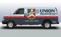
IN general, I try and practice the Don Draper school of branding philosophy: Design to stand out, not fit in. When looking at his competitors and literally dozens of their HVAC wraps in the area, none employ this approach. That, in itself, will assure the client of building a brand unlike anything in their market (snowflakes, lame pics of the owner, lame pics of HVAC units, etc). IMportant points are there, are legible, and the approach is unique.

Gino- I see what you mean on the ribbon, but thought I had a pretty good balance between door handles, icon, etc. Funny though, its my favorite part of the design. Getting tired of running angles for so much of our work, and equally tired of straight horizontal bars, so I wanted to break them out.

Second side, for once, has no issues, flip the icon and she's fine. Bullets remain in same location, with air conditioning always in front.
 
Top