-
I want to thank all the members that have upgraded your accounts. I truly appreciate your support of the site monetarily. Supporting the site keeps this site up and running as a lot of work daily goes on behind the scenes. Click to Support Signs101 ...
You are using an out of date browser. It may not display this or other websites correctly.
You should upgrade or use an alternative browser.
You should upgrade or use an alternative browser.
Photography Logo
- Thread starter HaroldDesign
- Start date


Not a thing about that says photography. The concept is there as far as the background being the lens but I had to hunt to figure out that is what that was ... Customers should not have to figure out the logo. Try to talk the guy into something a little more recognizable. The end of a lens is essentially a circle with gradient effects to look like glass. We recently did one similar to this but for a property management company.
HaroldDesign
New Member
I agree. However, I sent him this first to get a feel for what he's thinking, and he said it was far too obvious. I'm still trying to figure out where he's at. That's why I'm posting here - in case I can't figure him out!Not a thing about that says photography. The concept is there as far as the background being the lens but I had to hunt to figure out that is what that was ... Customers should not have to figure out the logo. Try to talk the guy into something a little more recognizable. The end of a lens is essentially a circle with gradient effects to look like glass. We recently did one similar to this but for a property management company.

Attachments

I agree. However, I sent him this first to get a feel for what he's thinking, and he said it was far too obvious. I'm still trying to figure out where he's at. That's why I'm posting here - in case I can't figure him out!
I like that a lot more! It's still not terribly obvious to me though .... hmmmm .... I think you need to convince him that its ok to have an obvious logo. Otherwise he might end up with a cool logo and no business. At the end of the day, as long as he has something nice and professional to represent himself and customers noticing it, then perfect. I guess using anything related to a camera is out? Would that be too obvious?
J Hill Designs
New Member
HaroldDesign
New Member
I like that idea! I'm waiting to see where he stands on the lens idea. If he likes it I will take the time to refine it to look like it should. If not - I'm going to try that!what about using the aperture look instead of just a gradient?
phototec
New Member
Ihe said it was far too obvious.
Obvious, what does he want, a stealth Logo that no one can see, or tell what kind of business it is?
The whole purpose of a logo is design recognition, to quote from Dan Antonelli book on logo design, "is to create an image that is memorable for the viewer, and leaves them with a lasting and memorable impression".
So, I think the logo should be very obvious for the viewer as to what the message is. And looking at the different versions, I don't get that impression, certainly not PHOTOGRAPHY. The first one looks like it could be a stereo speaker, you know like JBL.
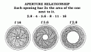
Most photography type logos that look straight on into a lens usually show the aperture diaphragm, which you always see unless the the camera aperture is set to full open.
Also, I think the logo should say PHOTOGRAPHY without having to search for it.
Attachments


Joe Diaz
New Member
Maybe this will help...
http://vector.tutsplus.com/tutorials/illustration/create-an-aperture-style-camera-lens-icon/
Also I like your last attempt the best. But I would try "Photography" in all caps.
Then reduce the spacing between "jdp", Maybe making that type style a bit bolder? I can't put my finger on it, but it's kind of bland as is.
HaroldDesign
New Member
I like where these suggestions are going, and I appreciate the feedback. This is definitely in the "infancy" stages, and I am not about to make numerous revisions until I get a better feel for what will fulfill the customer's wishes and his actual needs. Much of what I do I do not post here, because I can't. When I can, however - THIS is the place to do it!
Joe Diaz
New Member
As the various lens/camera icons have likely been done to death, why not just try a signature type of logo?
True, camera imagery have been done to death. but so have signature logos.
The main difference between the two is only one is helping communicate what service is being offered through imagery. The other relies solely on whether that persons name carries any weight. So the question would be: When people see this photographer's name, is he established in his area and famous enough that his potential clients know what services are being offered just by reading his name?
Rick
Certified Enneadecagon Designer
A logo does not have to be "obvious" to be memorable....
I agree with Colin.. much like construction company's have little houses on their logos and beauty shops have bad Nagel knock off image on it, photographers have lots of iris, shutter and camera images on them. Colin's idea semi-reminded me of this site... http://www.dansidorphotography.com/ done by Honest Bros.... if you go to their site, you will see the identity design. http://www.honestbros.com/ (second row down, 4th image from the left)
I think the actual term I would be using is "literal" logo design. Literal logo design is a sign shop specialty. Literal logo design but does not always make for clever or memorable logo design. If you are gonna do it, make it clever.
I tell clients if I have to slap an icon by logotype there is either something wrong with the business name, their clients or them.... this is a no brainer... if a person can not read "photography" and figure out what they do, do they really want them as a client?
You might be wasting a lot of your clients time. (and the forums time) You might want to think about a deign brief, instead of designing by hurling a design against a wall and seeing what sticks... crap is what usually sticks. Never... NEVER show your client crap. 2 problems may arise.. one is you may look unqualified, the other might be that they pick a crap idea.
Last edited:
SignManiac
New Member
")
HaroldDesign
New Member
A logo does not have to be "obvious" to be memorable....
I agree with Colin.. much like construction company's have little houses on their logos and beauty shops have bad Nagel knock off image on it, photographers have lots of iris, shutter and camera images on them. Colin's idea semi-reminded me of this site... http://www.dansidorphotography.com/ done by Honest Bros.... if you go to their site, you will see the identity design. http://www.honestbros.com/ (second row down, 4th image from the left)
I think the actual term I would be using is "literal" logo design. Literal logo design is a sign shop specialty. Literal logo design but does not always make for clever or memorable logo design. If you are gonna do it, make it clever.
I tell clients if I have to slap an icon by logotype there is either something wrong with the business name, their clients or them.... this is a no brainer... if a person can not read "photography" and figure out what they do, do they really want them as a client?
You might be wasting a lot of your clients time. (and the forums time) You might want to think about a deign brief, instead of designing by hurling a design against a wall and seeing what sticks... crap is what usually sticks. Never... NEVER show your client crap. 2 problems may arise.. one is you may look unqualified, the other might be that they pick a crap idea.
I might still be wasting everyone's time including my own, but I was inspired and came up with this conceptual crap.

Attachments

Rick
Certified Enneadecagon Designer
I might still be wasting everyone's time including my own, but I was inspired and came up with this conceptual crap.
I'm thinking you missed the point....
HaroldDesign
New Member
No, I didn't. I'm sorry if I sounded condescending.I'm thinking you missed the point....

I'm working on replacing my portfolio that was lost to my home fire a couple years ago. I use jobs that may or may not pan out to focus on more as a potential portfolio piece than anything. If a customer is washy about things and extends my efforts beyond what my time or their $ is worth to my "free-time"- I get something in my personal portfolio. This is one of them. I'm trying to improve upon my own design skills and replace what has been lost of my own work, and not that which has come from or is for my day job.

Colin
New Member
I use jobs that may or may not pan out to focus on more as a potential portfolio piece than anything. If a customer is washy about things and extends my efforts beyond what my time or their $ is worth to my "free-time"- I get something in my personal portfolio.
You mean you design logos for customers without a deposit or any agreement?
Rick
Certified Enneadecagon Designer
What the shweeze are you talking about... I was condescending! I think you were being sarcastic... But it's to get you to think.
As I told a few others on here... stick to the "design process"... design is more thinking than pretty pictures... especially logo design. You ask a series of questions to see what might work.... you are designing logos like they are trying on a dress.
On your situation, you might try made up design jobs to show your potential (college student portfolios are almost all conceptual)... try working on designs for newbies on this site for portfolio pieces. But on real work, use the process...