-
I want to thank all the members that have upgraded your accounts. I truly appreciate your support of the site monetarily. Supporting the site keeps this site up and running as a lot of work daily goes on behind the scenes. Click to Support Signs101 ...
You are using an out of date browser. It may not display this or other websites correctly.
You should upgrade or use an alternative browser.
You should upgrade or use an alternative browser.
Photoshop question
- Thread starter Sign Man
- Start date
iSign
New Member
select the stop sign, copy it, open new window, paste it. Go back to photo, go to image menu, to "mode".. change to greyscale. (everything will turn to greyscale) Now change back to RGB (everything will stay greyscale)... now I think the original red stopsign will still be in the clipboard & can now be pasted back, but if not, go to your other window with the pasted red stop sign, copy again, & paste into your photo.
Pro Signs & Graphix
New Member
Beware of doing straight convert to grayscale maneuvers. Sometimes you can lose some valuable contrast using such actions. You can also end up with a grayscale image whose black levels won't be very good when printed either. In general, you're going to get better results printing an image that looks like it is grayscale but has full RGB, CMYK or L*a*b data.
The desaturate command works okay, but is pretty crude overall. Experimenting with the calculations dialog (under the Image menu) can provide more control in creating gray scale images with better contrast. Layering copies of the image, using layer blending modes (and some masking techniques) can help further.
Another tip: if you're scanning in black and white photographs to be digitally printed, scan them in RGB. Your blacks will print better.
Shovelhead
New Member
to obtain more "richness" to greyscale.......
select image....in layers menu...."duplicate" image....select
"multiply" and give it a 35-40 % opacity....I do the same to
color photos also.
select image....in layers menu...."duplicate" image....select
"multiply" and give it a 35-40 % opacity....I do the same to
color photos also.
mbarden
New Member
Hey Sign Man,
If you are who I think you are we have a certain fellow from Springflied, MO in common. I understand he is not doing to well. Keep him in mind in your prayers.
On another note, you''ll find this board and the people associated with it to be first class and a real help to you and your business.
Take Care.
Mike B
Big River Sign Co.
quikseps
New Member
The absolute best grayscale image can only be attained by converting your RGB image to LAB Mode then duplicate the Lightness Channel and use this channel as your gray.
At this point you can then revert back to RGB and simply isolate the stop sign.
The Lightness Channel is "pure" grayscale with excellent tonal range and is used many times within QuikSeps which is a color separation program written by yours truly.
Steve
At this point you can then revert back to RGB and simply isolate the stop sign.
The Lightness Channel is "pure" grayscale with excellent tonal range and is used many times within QuikSeps which is a color separation program written by yours truly.
Steve
Techman
New Member
find a book about using channels. IT will really change your useage of photoshop.
May i recommend
http://www.amazon.com/Photoshop-Channels-Book-Scott-Kelby/dp/0321269063
May i recommend
http://www.amazon.com/Photoshop-Channels-Book-Scott-Kelby/dp/0321269063
Bob Gilliland
New Member
My experience for great Grayscale imaging is inline with Bobby H and quickseps, using L*a*b and/or Calculations.
Techamn,
Scott Kelby’s book is good, however, IMHO, the “best” channels book to date is Photoshop Channel Chops by Biedny, Monroy, and Moody (ISBN-1562057237). Still applicable even today with CS3 released! It took many months and a few bucks, but I finally sourced one a few years ago and have it signed by Bert himself. The Photoshop Channels Bookis a good investment and much easier to obtain then the PS Channel Chops tome. Now, real life seminars, I’d take Kelby over Monroy for “style of instruction” any day of the week; Kelby is just such an infectious, fully energized, over the top kind of instructor.
Techman
New Member
The Photoshop Channels Bookis a good investment and much easier to obtain
YEs, it is, Plus
The biggest factor I think this book is a good one :: It doesn't have gaps in the step by step atricles. The results are repeateble every time.
Too many other tutorials have some strange gap what assumes the user knows what happens next which leaves the user stranded.
Ian Stewart-Koster
Older Greyer Brushie
The simplest way I find of doing what you ask, is to select the stop sign (in colour), with no feathering to the selection.
Then type ctrl-shift-I (invert selection) then type ctrl-shift-u (desaturate) and that's it, done.
Not the best image, but the simplest method.
The duplicating a layer, selecting multiple blending & reduced opacity gives a nice pic, as does the lightness channel of the lab colour- thanks for the ideas!!!
rockz12
Specializing in the strange and unusual
The correct procedure....
If you want to make those cute little pictures that are grayscale with the kid holding a bright red rose do the following..
1. Make Document Grayscale
2. Adjust Brightness contrast to make pleasing.
3. Make document RGB
4. Select your favorite color
5. Select Brush tool / Appropriate hardness and opactiy / Start @ 50% for each you dont need much with certain colors
5. Make transparency Color Overlay for that layer
6. Use your creative skills to paint the color on top of the image. This should be done on a separate layer so if you have to erase you do not erase the image.
BINGO BANGO
That's not the approach I would use. The results end up looking like a colorized black and white movie: pretty fake. It's kind of like trying to use crayons or colored pencils to color in a black and white photo.
The fundamental problem is that shadow and highlight detail are not uniform levels of gray scale. You still have color in shadow and highlight. Photoshop's layer blending modes can help, but they don't fully solve the underlying problem.
The most effective thing to do is start with a full color image. Mask out the areas you want to isolate either by making alpha channel masks or creating vector paths with the pen tool. Copy those isolated elements onto another layer. Then do whatever you feel is best to make the rest of the photo go into gray scale.
Shovelhead
New Member
DESATURATE leads to beter results....
than converting to grayscale.
than converting to grayscale.
toucan_graphics
New Member
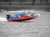
I created this duotone from a full color original (shown side by side)
Basically I duplicated the layer so I had 2 layers of the same image.
desaturate the duplicate layer and delete anything you wish to appear as color.
THe original layer will show through the deleted areas of the duplicate layer.
Flatten the image when done and there you are.
THere are several ways to create a duotone, and this is the one I have always used. It's somewhat archaeic but it's how I do it.
Last edited: