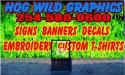
• I want to thank all the members that have upgraded your accounts. I truly appreciate your support of the site monetarily. Supporting the site keeps this site up and running as a lot of work daily goes on behind the scenes. Click to Support Signs101 ...

shop graphics

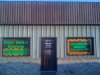
Just moved into a new building located on a very busy road. I looking for ideas to make people look at this building and say WOW. Its a metal building that I put temp signs on the windows as pictured. I am wantinf to see ideas that you have done in regards to all out front build wrap. I will attach a rough idea that I drew up real fast but plan on making changes.

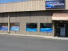
Please attach images of graphic shops you have and how you drew attention to them.

I am also going to wrap my vehicles to match building design. So the Green flames will be the base for my vehicles. I am either using the green flames or I like the Blue lightning background.

Thanks
 

Attachments

  • building.jpg
    building.jpg
    77.5 KB · Views: 151
  • wrap building.jpg
    wrap building.jpg
    54.3 KB · Views: 148

Rick

Certified Enneadecagon Designer
Wow... and not in a good way.

I'm not gonna ask if you want it lubed or unlubed, it's a hideous mess and would not be surprised if there is not a community uproar, picketing, the city makes you take it down.
 
Not the desgn I plan on printing but I want to use survace of building. Their is an aut store in town with a 25 by 80 wall and the whole thng is painted with words and information.
 

MikeSTK

Dawns Vinyl Designs
I am NOT a hater. Those graphics need a volume knob.

My point: Locally there is a beautiful old home on a corner. The owners saw fit to paint it the most horrific shade of prurple I've ever seen. It's SO UGLY, but everyone I know uses it as a landmark for directions.


My thoughts are scrap that and start fresh. Let's see what you come up with and start over.
 

Craig Sjoquist

New Member
Well glad you said temporary ... yes that will get attention.

I do window splash, thats kinda like a building wrap splash, but doubt you can get it bright like that.
Anyway your layout could use some improvement if you not done this wrap,.. for better readability, all this layout does is shout, which ok if it's a 99 cent store, but for a sign shop it would offend in a short time.

Example.... real case here ...A sign shop filled there windows with wrap all messages about services ( 10 at least ) about 8ft X 40ft thinks more but anyway, Lasted about 3 months they took it down now only doors covered (3) and it looks alot more pleasing plus they are busier now....The picture is on there website of it ( they do not know how to layout for advertising ) I regularly get work because of people not wanting there layouts by the way.

I for one believe no more then 70% of the building should be advertising, but also goes true with your frame,.... Exception ...Super Graphic layout... meaning some element(s) goes beyond frame, best way is in a tasteful manner....your case one huge flame combine traditional flame with realist flame put your message within flame or before beginning of flame, but try to get it at a pleasing to the eye size area.
You want attention..if you change it every 3 months, and you do good layout you will have people banging on your door like you the hottest, newest, service within 50 miles.
 

Jillbeans

New Member
The layout in and of itself is very poor.
The balloon font looks cheap, and the phone number is HUGE.
The services look like a run-on sentence and could possibly benefit from bullet points.
Stretching the fonts, outlining the words, doesn't help.
There is little contrast for as loud as it is.
I would re-think your whole idea.
A good layout will sell you far more jobs, with better paying customers, than a hot mess of flames and clashing colors.
Love....Jill
 

Fred Weiss

Merchant Member
We had a 12" stripe across our six front windows that we thought was attractive and effective. After we were robbed, however, we came to realize that visibility into our store from outside was also a consideration. We removed them and had no loss of business.

I would suggest that you invest in a lighted sign higher up on your building with the focus on legibility. Think about losing the Balloon letter style ... at least stop condensing it making it less legible. Keep it simple so that passersby can find you and know you're there. Trying to tell too much of your story on a sign is almost always a mistake. Limit your windows to floating letters that don't block visibility.

Before: shopfrn3.jpg

After: MainSign800.jpg
 

wes70

New Member
Wow... and not in a good way.

I'm not gonna ask if you want it lubed or unlubed, it's a hideous mess and would not be surprised if there is not a community uproar, picketing, the city makes you take it down.

:ROFLMAO:

I remember when I started, I used the "Balloon" font for every heading on every sign... so it seemed. The font was really popular and over used in the late 90's and I was part of the problem. wink!wink!
 

Mikeifg

New Member
Just because you have the Shop and equipment doesn't mean your a designer...I would take the advice your getting here. And maybe hire a designer..
 

SignManiac

New Member
Well I think it shows a bold and brave use of color and everyone knows that color can overcome poor lettering. Unless you happen to be color blind!
 

MikePro

New Member
you should be having way much more fun with the "Hog Wild".
You don't have a logo? no mascot?!?

here's something we did for milwaukee's radio station... 102.9 "The Hog":
Picture 34.jpg
 

Marlene

New Member
have to agree with everyone that idea is pretty awful. if you sell cheap stuff, Calving peeing "stickers" and other dollar store type stuff, this will work as it screams cheap. if that is what you want to say to the world, you have the right design.
 
Top