-
I want to thank all the members that have upgraded your accounts. I truly appreciate your support of the site monetarily. Supporting the site keeps this site up and running as a lot of work daily goes on behind the scenes. Click to Support Signs101 ...
You are using an out of date browser. It may not display this or other websites correctly.
You should upgrade or use an alternative browser.
You should upgrade or use an alternative browser.
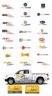
Shop logo attempt
- Thread starter Rocco G
- Start date
You should delete the Simpsons font from your computer to eliminate those late night bad choices.
Deleted. Didn't use it before and won't be using it again!
shoresigns
New Member
I honestly thought you were trolling when you posted it.Looking at my attempt makes me laugh at myself and reminds me to no post after midnight when I'm tired.
Just in case mine was one of the comments you're referring to, I stand by what I said. Don't go messing around with graphic design when you know nothing about it. The best you can do is hurt your own business or whomever you're "designing" for. You wouldn't offer to fix a client's car if you had no idea how. Mastering Layout is a seriously good book and any new or experienced designer can learn a lot from it. So yes, the least you could do is read a book and practice a bit before trying to design a logo for someone.Rocco is looking for suggestions that will help him with his own creativity, not to be pounded in the dirt with comments about not knowing what logo design is.
Rick
Certified Enneadecagon Designer
Sign_noob
Mastering Layout is a great book.... for layout.
Not so great for logo design and building a brand.
You want to know about priority, use of space, negative
space, type, arrangement, color (in grayscale) typography
on signage... then Mike Stevens book is a must. GET IT!
Are these needed in logo design, of course, but logo design
communicates differently that a sign layout.
For logo design and building a small business brand.
Buy all 3 books by Dan Antonelli. If you are short on cash,
then buy the last one, because it's a masterpiece on
how we deal with designing logos and what the client needs to
look at.
http://www.amazon.com/Building-Big-...&qid=1429924765&sr=1-1&keywords=dan+antonelli
You need to learn the process of design, when it comes to
designing logos, you have to learn the who, what, and
why's of designing a logo.. Something lacking in
Mastering Layout. Look at books like:
http://www.amazon.com/Logo-Design-W...8&qid=1429924807&sr=8-11&keywords=logo+design
http://www.amazon.com/Designing-Bra...d_sim_b_7?ie=UTF8&refRID=1WJVSJ0MCFHS05EW35J9
and any Logolounge book. I admire you for showing your idea,
and I agree somewhat with Shore Signs, your messing with
someones livelihood, learn all you can before doing this for real.
Show your idea, learn the principles and then practice them over
and over again! Many times these threads can be rough, but there
usually is some to take from it.
Sign_noob
Many times these threads can be rough, but there
usually is some to take from it.
I always value constructive criticism and I've been around these forums enough to know that you can't let the comments become personal. I have written down each of the books that were mentioned by everyone and I will be looking into them. Of course I'm a noob in all of this but I'm also like a sponge. I appreciate the old timers helping out the younger generation. I'm sure you guys will forget more then I'll ever know and understand but thanks for taking the time to explain your thought process. There are a lot of people that read these forums and I'm sure that I won't be the only one taking something away from this post.
Rick
Certified Enneadecagon Designer
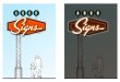
I wasn't gonna play with this, but Jill's logo inspired me to join in.
I really dig the script she used and the retro feel.
Anyway, logos should stand on their own, the "Since 1973" should
probably not be included on the logos I show but being in the business
that long... it's an impressive amount of time.
Design the logo all on it's own. Use the design process... in simple terms...
Define the problem (what was wrong with your original logo, how do you want to be perceived)
Research (collect information, competition, logos that are similar, type, specific look you are trying to do)
Conceptualize (brainstorm and analyze, usually rough ideas)
Develop (Taking the best concepts and refining)
Feedback (get some input from others who are qualified)
Implement (what will it look like on your truck, building, business card, t-shirt, etc)
What I did was a quick study of other sign shops and scrawled out ideas, refined them
and then picked one and implemented it. This was quickie ideas. Not necessarily the solution
but ideas that might carry me to the actual solution.
Attachments
Bretbyron
New Member
I wasn't gonna play with this, but Jill's logo inspired me to join in.
I really dig the script she used and the retro feel.
What I did was a quick study of other sign shops and scrawled out ideas, refined them
and then picked one and implemented it. This was quickie ideas. Not necessarily the solution
but ideas that might carry me to the actual solution.
Rick,
Which programs are you using? Inspiring!
Gino
Premium Subscriber
Nothing wrong with a retro look, but most of what you guys have posted up, look like 40 and 50s stuff. Why would he want to look like he hasn't progressed in the last 40 years ?? However, if you want that look, study the late Betty Willis. Now, there was a good designer. Study her compositions and style...... put some of yourself in it, make it yours and you'll have something.

Rick
Certified Enneadecagon Designer
Nothing wrong with a retro look, but most of what you guys have posted up, look like 40 and 50s stuff. Why would he want to look like he hasn't progressed in the last 40 years ?? However, if you want that look, study the late Betty Willis. Now, there was a good designer. Study her compositions and style...... put some of yourself in it, make it yours and you'll have something.
I think the reason most look retro-ish is because his attempt was.
Unless you know of a book or website where we can study her work, it's
kind of hard to look up Betty Willis (all you really get is the Vegas sign)
or another sign design legend who died the same day as her - Buzz Leming
(He designed many of the strip signs including The Stardust, Barbary
Coast and Westward Ho) Their style at the time - googie - can be studied,
but Googie signs (which normally follow the architecture of a building)
don't always make for a good logo. The one book that comes to mind is:
"Spectacular: A History of Las Vegas Neon" You want to know the intricate
study of signs and how they relate to the era in which they were designed - albeit,
a heavy read: "American Signs: Form and Meaning on Rte. 66"
I think the book (or website) still needs to be written.
My favorite sign by Betty is the Moulin Rouge. Love that flowing script.
Having heard a lecture on that Vegas sign, it was just another sign. It's iconic
value probably has a lot to do with it's simple shapes and arrangement, it was
just far enough from the strip to add to the anticipation of going to Vegas,
but I think mostly, it's been up for so long, that without the sign, you
would not get that same "welcome" Another reason is that... it's low enough to
have your picture taken in front of it compared to the monstrosities that are on
the strip. Somewhere is a pic of my family in front of that sign in the late 70's...
it's always been my quest to design a sign where people want their pic in front
of it or people will take photos of it. I have worked real hard at designing a similar
iconic sign, I have a few nice signs, but nothing close to being in the same
league as anything like the Vegas sign... probably because she didn't have to try
all that hard. Like many of us, she also design thousands of "ordinary" signs day in
and day out. She had a extreme attention to detail, and loved doing it. The Vegas
sign is an "ordinary" sign that hit a nerve with the public. It was a different time
where they lived and breathed their design style. Most design today is mimicking it.
Well anyway, if I retire at the same age she does, I still have 24 years to design
"THE" sign...
EDIT: Another interesting thing about the Las Vegas sign was what inspired her...
The Goodyear logo shape, the stars came from Disney, I don't know if it was a sign
because no main ID had stars, or maybe it was Tinkerbell's Pixie Dust.. so we all
get inspiration from somewhere.
Attachments


Last edited:
Rick
Certified Enneadecagon Designer

grafixemporium
New Member
Rick, you're hired.
OP, scrap everything and hire Rick.
OP, scrap everything and hire Rick.
Rick
Certified Enneadecagon Designer
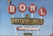
One last post... if the client allows me - I will get inspiration
from signs that would follow the branding, architecture
and hopefully get the attention of potential customers...
Normally, designs don't fall out of my butt, this design is inspired
by Jill's design, If I had not seen Jill's design, this would not have
happened. For the quickie sketch, I used a restaurant sign from where
I grew up and a bowling alley sign I like.
And a wall sign, looks like he's in an industrial area...
If you can't design a logo, get inspiration!
Attachments


grafixemporium
New Member
Rick, the "undislike" was totally unintentional. I must have hit it accidentally when reading the thread on my phone earlier and trying to click on your image attachment. Didn't even know there was such a button. I fixed it ")
Definitely some quality work my man! Nothing but "likes" from me!
Definitely some quality work my man! Nothing but "likes" from me!
Sorry for not responding before this. The spring rush is in mid swing and its been nutty around here.
Thanks for the input folks. I have one or two of the books mentioned and will grab more. I only have time to briefly scan the thread this morning because it's going to be another busy week but will go over the comments in more detail this evening. As I said I hoped to learn something from this.
BTW, i was looking for a retro look/feel but I guess i got carried away playing with the software. Time to go back to pencil and paper I guess.
I'll kick it around later in the week and try to post another updated version.