Hope this ain't cheating
I know I entered, but I thought while I sip my cup of coffee here I'll break down what I think of each logo listed.
#1 It looks clean, but almost clinical. No interesting drawings that make you think of a taxidermy business. A bit of an old fashioned flair, it would be easy to use as a logo as everything is contained.
#2 Interesting design, catches your eye but doesn't hold it well. A little busy and lacks contrast in the right areas.
#3 A bit different, looks stretched though, and needs contrast to make it pop. The poor panda...

#4 Readable for sure, gets the message across quickly, but lacks a bit of creativity. Somewhat simple, and it's BIE, not BEI.
#5 VERY well laid out, it's a great
sign layout. Shows well and screams talent, but totally misses the mark. Very hard to use as a logo, and doesn't say BIE.
#6. Very woodsy feel. Would be very attractive to a hunter, just needs some thicker lines. Good job towards a target market.
#7 The poor doggy... lol. Good fonts, funny cartoon, but laid out in a strange way that is not overly attractive, but it does attract attention.
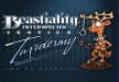
#8 That's just hilarious. Good toon drawing, the name is a bit bland, but it's a good layout. Just struggle using the toon in real life as it's a bit TOO funny.
My $0.02
 (just kidding)