• I want to thank all the members that have upgraded your accounts. I truly appreciate your support of the site monetarily. Supporting the site keeps this site up and running as a lot of work daily goes on behind the scenes. Click to Support Signs101 ...

There's a new Sheriff in town

TMA

New Member
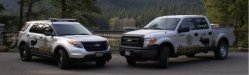
When the newly elected Sheriff of a rural Idaho County assumed office one of his goals was to update the vehicle fleet from worn out Crown Vics to more suitable 4X4s. Along with the update he wanted a bold new graphic that was unique to the area and to police car designs in general. This is what I came up with. I think the black blends well with the body moldings on the vehicle and the green and gold utilize the school colors from the local high school. The reflective door star also incorporates the County Seal rather than the State one. I managed to incorporate the traditional serve and protect logo as well as "for the people" to help bond the officers and the citizens they serve. So far the response from the public has been overwhelming.

What do you guys - experienced professionals think?

The picture isn't that clear as it was quickly snapped with a cell phone as the truck rolled out of the shop but the lettering and graphics are completely clear.
 

visual800

Active Member
I would have done the elk in a dark grey not a stak black. SHERIFF does not look good slammed all the way to the bottom of the door. The layout is blocky and does not flow well. I like the items on it just not how they are arranged
 

Billct2

Active Member
I've never been a fan of law enforcement vehicles trying to look like street racers or commercial vehicles. To me this might make sense for a park ranger, or a hunting shop, not the local sheriff. Around here the cops have gone back to black & white with basic graphics, I heard it had something to do with a uniform marking system for firts responders.
 

rjssigns

Active Member
You designed it, they approved it, you got paid. IMO it fits the area and the response has been positive. That is all that matters. Hopefully it brings more work your way.
 

ddarlak

Go Bills!
honestly, i think it looks ugly and amateurish...

but, if everyone likes it and you got paid, i guess it did it's job.....
 

Gino

Premium Subscriber
Welcome from PA............................


and I agree with ddarlak 110% :omg:
 

Moze

Active Member
I think it fits your locale perfect. Vacationed up your way a few times and hope to move there some day. Maybe when we retire...
 

TXFB.INS

New Member
for your locations seems perfect, reminds me of the movie "moose point"
very unique layout and approach

personally the sheriff is too small and the moose is too big making it the focal point.
 

SignManiac

New Member
I think it's a little busy.... but if it's done it's done. :peace!:

Even if they wanted all that stuff on there I think the placement could have been executed better... like the rear text being aligned properly and moving the "call 911" so that it's just on the front fender.
Ditto on all the comments so far. Font choice, placement, sizes all could have been tweaked a lot. Use these critiques to better your future designs.
 

TMA

New Member
Sheriff

Thank you for all the comments, the design won the National Law & Order Police Car Design Contest for agencies under 25 officers and a picture was featured in the August issue. The contest has resulted in business from as far away as Texas and includes police agencies and a fire department. I was pretty pleased.
 

Attachments

  • Father's day 3.jpg
    Father's day 3.jpg
    13.1 KB · Views: 70

ddarlak

Go Bills!
Thank you for all the comments, the design won the National Law & Order Police Car Design Contest for agencies under 25 officers and a picture was featured in the August issue. The contest has resulted in business from as far away as Texas and includes police agencies and a fire department. I was pretty pleased.


congrats... i think....

just don't let it go to your head, that thing needs help....

if it was cops judging the entries, that would make all the sense in the world, artistically there not the shiniest apples in the basket....
 

Suz

New Member
Congratulations on your win!!!

Personally, I like to see a Police car/vehicle that looks like a Police car. A standard "Police" looking vehicle is fine with me, if the vehicle is being used to control traffic.

I think it does cause people to be more aware when driving and to know that there is a Police presence.

I just like to see them on the road, not disguised.

Again, congrats on your win!
 
Top