-
I want to thank all the members that have upgraded your accounts. I truly appreciate your support of the site monetarily. Supporting the site keeps this site up and running as a lot of work daily goes on behind the scenes. Click to Support Signs101 ...
You are using an out of date browser. It may not display this or other websites correctly.
You should upgrade or use an alternative browser.
You should upgrade or use an alternative browser.
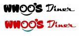
Whoo's diner logo
- Thread starter luggnut
- Start date
SignManiac
New Member
Interesting, but not sure it conveys a diner feel. What does this diner serve? It's clever in an odd sort of way but doesn't seem like it fits the image I envision for a diner.
Pat Whatley
New Member
The style of "DINER" and "WHOO'S" seem to clash to me.
SignManiac
New Member
Have to agree with Pat, the fonts are clashing.

SignManiac
New Member
Thats a big improvement already.

Shovelhead
New Member


Dan Antonelli
New Member
LIke SignBoy said - I think a more retro feel would work better -
You last round was much better than your first draft, however, I'm just not looking at it thinking 'diner'
You last round was much better than your first draft, however, I'm just not looking at it thinking 'diner'


 thought this was for a cabinet
 washingtonsignguy
New Member
I like the latest one you posted and sign boys effect. I see your issue with the rectangular sign, but you posted this as a logo design and you should keep thinking of it as that. pretend they dont have the rectangular constraint, come up with a design and then work it into the existing sign box. thats just what i would do.