-
I want to thank all the members that have upgraded your accounts. I truly appreciate your support of the site monetarily. Supporting the site keeps this site up and running as a lot of work daily goes on behind the scenes. Click to Support Signs101 ...
You are using an out of date browser. It may not display this or other websites correctly.
You should upgrade or use an alternative browser.
You should upgrade or use an alternative browser.
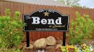
Any thoughts on the design
- Thread starter Texas_Signmaker
- Start date

Gino
Premium Subscriber
The posts do not fit the sign. Personally, I never liked those cones, either. Just cheap Home Depot decor.
Far too much information for on a sign of this nature. Colors are kinda harsh. Border is overbearing. Line spacing is really bad. If you hafta use all that information, the flow of importance seems messed up. Too much of the same type style.
I'm sure I'll think of something else, in the next few minutes.
I am not being condescending or mean, just brutally honest. 
Does the little icon make it hurt less, like some believe ??
Marlene
New Member
Way too much info on the sign. It might be a better idea to have a smaller sign under the main sign with all contact and address info on it. Words like "the" hard to place on a sign and maintain a good balance. I am not a fan of the fonts you used but am OK with the blending it into the word Bend. One special effect like that can work but not so much when it is repeated as in "in Bullard" as it does start to look like a bunch of parts pasted together as mentioned.
Texas_Signmaker
Very Active Signmaker
Johnny Best
Active Member
Texas_Signmaker
Very Active Signmaker
Way too much info on the sign. It might be a better idea to have a smaller sign under the main sign with all contact and address info on it. Words like "the" hard to place on a sign and maintain a good balance. I am not a fan of the fonts you used but am OK with the blending it into the word Bend. One special effect like that can work but not so much when it is repeated as in "in Bullard" as it does start to look like a bunch of parts pasted together as mentioned.
I like your idea of a second smaller sign! Yea I wanted "in Bullard" separate but had to blend in cause I couldn't talk them out of doing away with a lot of the wording.
WhiskeyDreamer
Professional Snow Ninja
I would have cut the posts so they don't go over the top of the sign. You've routed the shape, might as well let it be seen instead of hindered by the ugly posts. I'm not a fan of Rage Italic, so not digging the fonts. Like stated you've got a lot of info on the sign, but I think it could be made to work with a bit of reconfiguring and deciding what is most important. Address at top of sign as people are usually looking for numbers when driving. The managed and maintained line does not need to be that large and could be a simple sans serif font tucked in somewhere. The established would look sharp as a little hanging sign below. Maybe in the shape of a star? Phone number and web on separate lines and centered.
Also, exactly what Marlene said about the double overlap. I'd keep the Bullard part overlapped, but nix the "the" as it can simply be added in at the top without the overlap. Just my two cents.
Also, exactly what Marlene said about the double overlap. I'd keep the Bullard part overlapped, but nix the "the" as it can simply be added in at the top without the overlap. Just my two cents.
Marlene
New Member
I agree with cutting the post off and not having them stick up above the sign. Flat caps or a flat cap with a ball would looked a little better. Also agree with fenris242 about keeping the overlap with the in Bullard and getting rid of the overlap for "the". It is hard working with a customer who wants things done in a certain way.
Texas_Signmaker
Very Active Signmaker
Thanks for the feedback. I was bothered by the posts too and I like your idea of making them smaller and using different caps.

shoresigns
New Member
Your kerning needs a lot of correcting on the script font, as it's disconnected in places where it looks like it should connect. There are a few other kerning issues as well (N. W.P., 20 1 4).
Also, the inside corners of your white border, where the curve at the top meets the horizontal, should be mitred, not rounded. It looks inconsistent and it's the first thing my eyes were drawn to.
Also, the inside corners of your white border, where the curve at the top meets the horizontal, should be mitred, not rounded. It looks inconsistent and it's the first thing my eyes were drawn to.
Texas_Signmaker
Very Active Signmaker
I like the fonts you chose! This looks good.
Your kerning needs a lot of correcting on the script font, as it's disconnected in places where it looks like it should connect. There are a few other kerning issues as well (N. W.P., 20 1 4).
Also, the inside corners of your white border, where the curve at the top meets the horizontal, should be mitred, not rounded. It looks inconsistent and it's the first thing my eyes were drawn to.
I'm sorry but I'm not sure what that means.
Marlene
New Member
I like the fonts you chose! This looks good.
I'm sorry but I'm not sure what that means.
The second "L" in Bullard where it leads into the "a" and the "r" where it leads into the "d" are a couple of places where the font needs kerning as it doesn't look right.
Texas_Signmaker
Very Active Signmaker
Oh I see now! Got it thanks!The second "L" in Bullard where it leads into the "a" and the "r" where it leads into the "d" are a couple of places where the font needs kerning as it doesn't look right.
shoresigns
New Member
It's kerning. Letter spacing (aka tracking) is when you add or remove space between all the letters in a block of text. Kerning is when you adjust the spacing between particular pairs of characters.Letter spacing
Texas_Signmaker
Very Active Signmaker
It's kerning. Letter spacing (aka tracking) is when you add or remove space between all the letters in a block of text. Kerning is when you adjust the spacing between particular pairs of characters.
Thank you for explaining that, I'll pay attention to that when designing.
Well, I'm glad I'm at the level of typical sign... I'll take a "C" over an "F"! I'll work on getting the grade up.
Texas_Signmaker
Very Active Signmaker
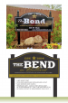
Here's a quick layout with a few suggestions. The last one is more of a pet peeve")
Wow, really like your take on it. The posts caps are subtle and I like what you did about making the border subtle and the compound at the bottom for all that wording. This gives me some good ideas!
This is one that I originally came up with before the customer got involved. Front was a little weird but less wordy.

