-
I want to thank all the members that have upgraded your accounts. I truly appreciate your support of the site monetarily. Supporting the site keeps this site up and running as a lot of work daily goes on behind the scenes. Click to Support Signs101 ...
You are using an out of date browser. It may not display this or other websites correctly.
You should upgrade or use an alternative browser.
You should upgrade or use an alternative browser.
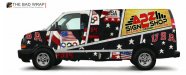
How bad did I do!! Shop van wrap design.
- Thread starter A2Z
- Start date

Biker Scout
New Member
Thanks. It was your mention of the KAWPOW that sparked the idea... "Oh yeah... I know exactly what to do now!"Nice, Biker.
I wasn't even going to reply to this thread if it weren't for your suggestion. I felt compelled to it! :Big Laugh
FrankenSigns.biz
New Member
Heroes is plural, Hero's is several sandwiches...
Rick
Certified Enneadecagon Designer
First thing I thought was "The Partridge Family"
I like the concept, but Biker Scouts looks cleaner...
The logo needs work... it's not attractive and does not convey
positive design skills.
ooops, forgot...
Attachments
FrankenSigns.biz
New Member
A2Z
Signtec 360 LLC
Still have a lot work to do, all of you have helped out a bunch. Does the super hero guy look funny with no face compared to the hot vector chick. Any help with placement of colors would help to. Guys I have no training what so ever in design beside what I can learn on the old interweb. I know I can get someone else to design it but I want the satisfaction of doing it all myself, besides the stock photos. Thanks for all your help!!!

Biker Scout
New Member
OK, here's a super wrapper's tip for ya... when designing the thing, be sure to design the mirror image side. I'm betting your logo will look weird on the right hand side. Like it's going down hill.
Here's something simpler... that still gives a POW!
Sorry, mine was done in only a few minutes... but you can play with the concept. I just kinda threw the logo on the door last minute. But what really needs to stand out is what you are offering. In your case, an impact image that's memorable. You can put a website or phone number on the back door, or under your logo, but that's about it.
Just use this one and get on with it!
Biker Scout's design is so much better to me.
Ask how much he would charge to design the whole thing and consider it money very well spent!
artbot
New Member
just make sure your van doesn't tell your market "Guys I have no training what so ever in design". the difference in a clean pro design that pops and a "fun" design/experiment can mean tens of thousands of dollars in orders per year. keep designing, keep submitting options. but don't let the van be your intermediate designer "portfolio". i believe the master designers on this board are being kind and generous with their softball critiques.
Is it getting better or worse. Should scrape the whole idea and start over. I really want to do it myself. Can't learn letting someone else do it. It's just hard to nail down a good design for a sign shop. For me anyway with limited design skills. Thanks for the help.
Don't practice on your image. It is way too important and has too much potential to make you money or lose you money. Let a pro designer do your truck and image, make tons of cash, get tons of work. It takes time to get good at this stuff.
just make sure your van doesn't tell your market "Guys I have no training what so ever in design". the difference in a clean pro design that pops and a "fun" design/experiment can mean tens of thousands of dollars in orders per year. keep designing, keep submitting options. but don't let the van be your intermediate designer "portfolio". i believe the master designers on this board are being kind and generous with their softball critiques.
Don't practice on your image. It is way too important and has too much potential to make you money or lose you money. Let a pro designer do your truck and image, make tons of cash, get tons of work. It takes time to get good at this stuff.
+1000 x 2
Jillbeans
New Member
It's getting better but the colors really clash.
I'd change the green on the very bottom panel to a charcoal grey.
I'd make the blue panel be red, and lose the mint green behind the lady with the orange shirt. If you can, change her shirt to yellow and the background to orange.
Hate the font on the front panel and the copy needs to be tighter together.
I really hate the A2Z in your logo, too, because it looks stretched.
The idea is good, it just needs some tweaking.
Love....jill
Dan Antonelli
New Member
We never use photos or bitmaps on truck wrap designs. Try doing one without it. If it doesnt work, it means the branding can't support it, in which case you need to solve that problem before making a potentially costly error.
jen.reelez
New Member
Alright let me know how I am doing. This will be my first full wrap. The stock photos will be replaced with paid original's. Never planned on going with a super hero theme for business just how it worked out.
View attachment 96347
It's not bad at all :Big Laugh
Personally, I find it cool..
:U Rock: