-
I want to thank all the members that have upgraded your accounts. I truly appreciate your support of the site monetarily. Supporting the site keeps this site up and running as a lot of work daily goes on behind the scenes. Click to Support Signs101 ...
You are using an out of date browser. It may not display this or other websites correctly.
You should upgrade or use an alternative browser.
You should upgrade or use an alternative browser.
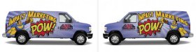
How bad did I do!! Shop van wrap design.
- Thread starter A2Z
- Start date

the graphics co
New Member
Might swap places with the slogan and the website, the website all the way at the bottom will be tough to read on the truck
Dennis422
New Member
Might swap places with the slogan and the website, the website all the way at the bottom will be tough to read on the truck
This!
thinksigns
SnowFlake
Maybe try the tagline in a voice bubble.
Gino
Premium Subscriber
I think it's too chopped up, no continuity and some things don't fit your needs without a gross imagination. Also, the color combination is too far out for my tastes. I know you're digging it, but put your feet in the shoes of possible viewers...... if they have no idea of your subtle hints, what are they gonna see..... yet alone remember ??
I think ya need to think this through a little more. 
SignManiac
New Member
It looks overly complicated and very busy to me. But that's just my opinion. To me all of your graphic elements are overpowering the main message.
nikdoobs
New Member
Its definitely eye catching. I like the concept. The stock photo of the guy doing the Clark Kent pose with your logo is nice, but you may want to consider changing out the other images you have. The picture of the business people shaking hands should look like a comic book art, not a stock photo. Put some half-tone effects on your photos to really drive home the comic-book super hero theme. Throw in one of those Pow! or Kabooms! So far its looking nice, keep adding improvements!
Craig Sjoquist
New Member
Since ya asked, lets go over a few items.
If ya not printed & installed yet some changes maybe in order.
The basic concept is good idea your copy is somewhat readable & understandable & looks modern with colored panels
Lets start at logo the 2 should be a different color at least maybe font also to separate from A & Z thought it was AZZ at 1st
I like the different color panels & ease of reading copy & your superhero icon, but NOT the background of the super hero panel, a much bigger superhero be good since it goes along with tag line.
Agrees copy on bottom of van not the best location bit higher be better.
Then the 2 panels with people in them & the other panel a guy looking with ? would be better served with just color & maybe a effect, why those 2 panels confuse what you are selling & really have nothing to do about anything.
These are the things I saw 1st that struck me odd.
Keep at it your on the right track.
MrSalumi
New Member
Lets start at logo the 2 should be a different color at least maybe font also to separate from A & Z thought it was AZZ at 1st
+1 I thought it said AZZ too
artbot
New Member
reminds me of the calder bmw. i don't think it's going to bring business. your van is branding your business. and since this is comic framed, "tongue in cheek" design, it says to the next client that it's not a serious brand. go with classic, can-read-it-from-three-blocks-away type of design. if "super hero" is going to be the brandable idea, build that into your logo. i could go on... it's just a mish mash of ideas and obliques.
peavey123
New Member
I think the idea is really cool, although does it work for advertising your company? IMHO. Not really...well not easily enough anyways.
It needs to be clear and concise. It's what you are paid to do. To be honest, I'd start with your logo. It makes me dizzy.
My suggestion is put less emphasis on the background and more on the message. Maybe, make one of the cells take up a very large portion of the van. put your logo and tag-line in that. Maybe even a superhero? Then a small portion of the van could be made up of smaller cells of the elements you already have? Just an idea.
Biker Scout
New Member
Design in Black & White first... if it's legible and concise, then add color. If you have your heart content on the comic book theme, then this makes even more sense, as you can use halftones.
Just remember the 3 second rule... a person has about 3 seconds (in traffic) to figure out what your are trying to say. Please don't add to an already growing trend of distracted motorists, as they are trying to read your wrap just to figure it out.
Just remember the 3 second rule... a person has about 3 seconds (in traffic) to figure out what your are trying to say. Please don't add to an already growing trend of distracted motorists, as they are trying to read your wrap just to figure it out.


Billct2
Active Member
Not my taste but I can see it working.
I think the biggest issues are with the basics.
The logo now looks like A22. And why flip the "wings" on the right side of the A2Z. it looks more super hero if they look like wings.
Why the weird WWW in the web addy, for that matter, it's too hard to read, simple is better on the parts you need people to get.
And the "sign super heroes" should look more like it came from a comic book (without using comic sans of course )

Biker Scout
New Member
Here's something simpler... that still gives a POW!
Sorry, mine was done in only a few minutes... but you can play with the concept. I just kinda threw the logo on the door last minute. But what really needs to stand out is what you are offering. In your case, an impact image that's memorable. You can put a website or phone number on the back door, or under your logo, but that's about it.
Sorry, mine was done in only a few minutes... but you can play with the concept. I just kinda threw the logo on the door last minute. But what really needs to stand out is what you are offering. In your case, an impact image that's memorable. You can put a website or phone number on the back door, or under your logo, but that's about it.