-
I want to thank all the members that have upgraded your accounts. I truly appreciate your support of the site monetarily. Supporting the site keeps this site up and running as a lot of work daily goes on behind the scenes. Click to Support Signs101 ...
You are using an out of date browser. It may not display this or other websites correctly.
You should upgrade or use an alternative browser.
You should upgrade or use an alternative browser.
Layout Critique
- Thread starter Replicator
- Start date
Carl Crabtree
New Member
looking good!
SignosaurusRex
Active Member
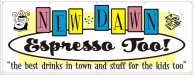
I like it! but not the pastel yellow background running through the sandwich. Whats with you using Microsoft cheesie clip art? At least use clip art pieces of a similar style.
SignManiac
New Member
The only thing that bothers me are the way all of the fonts are bouncing around, the rhythms are all kind of competing with each other. The retro feel is nice. I think the name should be in a different font and not a script. Something romanesque but in a headline style.
Circleville Signs
New Member
Reminds me of a logo I did for a bowling alley recently! Looks good.
Gary
Gary
luggnut
New Member
it is a little bit of a jumbled mess... readability is very compromised. a lot of very casual fonts. and the clipart one has white elements the other transparent? i think the letters new dawn could be white with a blk outline and show up better and maybe make the oval element a little more in the background (no blk outline .. maybe a different color outline?) maybe a different shade of the beige.
Replicator
New Member
Looks Good! But is that the real A&S Rister? or some Veer ripoff version....
When AAG and I bought this business over 5 years ago, the design station computer had lots of fonts that came with the business.
That included about 20 A&S fonts . . . Were they purchased by the original business owner ? I'll never know for sure !
Jillbeans
New Member
While I like the idea and I like the colors, there is just a little bit too much going on.
It does look like a daycare.
Try doing the New Dawn in the Rister and the Espresso Too in the boxes.
Lose the oval and possibly both cliparts.
When using a script I always try to node edit an area like that awkward p and r join so it looks painted.
Love....Jill
ps
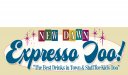
Here's a quickie VERY rough suggestion.
It does look like a daycare.
Try doing the New Dawn in the Rister and the Espresso Too in the boxes.
Lose the oval and possibly both cliparts.
When using a script I always try to node edit an area like that awkward p and r join so it looks painted.
Love....Jill
ps
Here's a quickie VERY rough suggestion.
Attachments

Last edited:
SignManiac
New Member
Wow Jill, I really like what you did there.
JR's
New Member
First off Rep, I like it. And what you could change to make it flow better would be but not limited to.
(New dawn) squish that up a little bit or shrink it so it's more scented.
(Espresso too) bring that up a little higher in the oval so it's not bottom heavy.
(The best drink in town) make the letters a little smaller and follow the curve of the oval.
Just my two cents, but it could pass the way it is.
Replicator
New Member
Thank you all for the comments and suggestions . . . I appreciate the helpful feedback !