-
I want to thank all the members that have upgraded your accounts. I truly appreciate your support of the site monetarily. Supporting the site keeps this site up and running as a lot of work daily goes on behind the scenes. Click to Support Signs101 ...
You are using an out of date browser. It may not display this or other websites correctly.
You should upgrade or use an alternative browser.
You should upgrade or use an alternative browser.
Logo Critique please.
- Thread starter peavey123
- Start date
Marlene
New Member
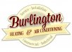
I like it. the colors may look off as I'm seeing this on screen but the main tan color and the yellow in the ribbon seem to clash. the background seems to have more brownish undertones where ribbon seems more yellow undertones. can you make the ribbon color a darker shade of the background?
signgal
New Member
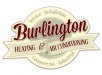
like the newest one much better..
only issue i see, is the negative space below the burlington and below the heat & air..
my eye goes straight there..
i would increase the ribbon and text with heat and air..
just my .02
I was feeling this too. Here's a suggestion. hope I can get it across right. Instead of a straight across (at a slant) ribbon, can you make it fold back on itself and have the "air conditioning" section flow into that negative space and free up more of the "g". I think the g is a nice visual element and negative space in a curve bothers me.
")
peavey123
New Member
I was feeling this too. Here's a suggestion. hope I can get it across right. Instead of a straight across (at a slant) ribbon, can you make it fold back on itself and have the "air conditioning" section flow into that negative space and free up more of the "g". I think the g is a nice visual element and negative space in a curve bothers me.
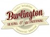
Is this what you meant Signgal?
Attachments
signgal
New Member
Is this what you meant Signgal?
exactly! but now there's a nice gap almost directly in the middle that draws the eye! LOL sorry. but maybe someone else can make a suggestion based off the new design.

laserman70
New Member
love it, nice work
Dennis422
New Member
That "burst" in the back just bothers me a lot.
I thing that you should eliminate those thin "cuts" close to the outside edge. Either make it tighter not yo have those long thin cuts (Just "teeth" at the edge) or have it more noticeable and spread those "rays" a bit more.
Actually, I do not even know how to call that "thing"
I thing that you should eliminate those thin "cuts" close to the outside edge. Either make it tighter not yo have those long thin cuts (Just "teeth" at the edge) or have it more noticeable and spread those "rays" a bit more.
Actually, I do not even know how to call that "thing"
signgal
New Member
That "burst" in the back just bothers me a lot.
I thing that you should eliminate those thin "cuts" close to the outside edge. Either make it tighter not yo have those long thin cuts (Just "teeth" at the edge) or have it more noticeable and spread those "rays" a bit more.
Actually, I do not even know how to call that "thing"
+1 I get what you're saying
OK, I guess this means I gotta go work on mine...
Marlene
New Member
just to put it out there, I love these kinds of design threads as the OP posts a design that is good but just needs a few eyes on it as it is missing little thigns to make it great. the OP takes in the input, makes the changes in his own way in his own style and a design goes from OK to great. it not only makes the design better, I know it helps me hone my skills as I see the issues I can see plus the ones I might have missed that get pointed out by others. love this site
Joe Diaz
New Member
just to put it out there, I love these kinds of design threads as the OP posts a design that is good but just needs a few eyes on it as it is missing little thigns to make it great. the OP takes in the input, makes the changes in his own way in his own style and a design goes from OK to great. it not only makes the design better, I know it helps me hone my skills as I see the issues I can see plus the ones I might have missed that get pointed out by others. love this site

peavey123
New Member
That "burst" in the back just bothers me a lot.
I thing that you should eliminate those thin "cuts" close to the outside edge. Either make it tighter not yo have those long thin cuts (Just "teeth" at the edge) or have it more noticeable and spread those "rays" a bit more.
Actually, I do not even know how to call that "thing"
I'll give that a shot DK.
just to put it out there, I love these kinds of design threads as the OP posts a design that is good but just needs a few eyes on it as it is missing little thigns to make it great. the OP takes in the input, makes the changes in his own way in his own style and a design goes from OK to great. it not only makes the design better, I know it helps me hone my skills as I see the issues I can see plus the ones I might have missed that get pointed out by others. love this site
I enjoyed this thread too Marlene...and not just because of all the compliments I received from the ladies!
hahaKidding aside I learned from the thread as well, which is a good feeling -to know that I improved, even if only slightly. As well as having input from some people who I've followed here over the years and really respect.
 Cheers.