• I want to thank all the members that have upgraded your accounts. I truly appreciate your support of the site monetarily. Supporting the site keeps this site up and running as a lot of work daily goes on behind the scenes. Click to Support Signs101 ...

Need Layout critique "Wall of Fame" for Nursing home

SignsPlus3020

New Member
Hi all, (Newbie on the forum, this is my first post asking for design feedback.)

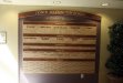
We're working on a job for a nursing home and rehab center - they want to put up a faux 4'x 8' acrylic 'wall' to honor some of their dedicated nurses and patients. The text would be reverse adhered to the back of the acrylic. I've attatched the layout they provided and my first mockup. All feedback and critique welcome!!! Colors and fonts are not certain.

Kelly B:thankyou:
 

Attachments

  • marwood wall of fame mockup.pdf
    45.7 KB · Views: 125
  • marwood wall of fame orig.pdf
    262.7 KB · Views: 126

artbot

New Member
iiiiiiit's pretty bad. is it vinyl? or print? work with massive transparent blocks, do smaller sizes piercing the bigger ones behind. you need mass and interlocking ideas. think of the whole mass of words as a vignette. alternate between translucent and opaque, etc.
 
Better then the original. But impressive, not really. You need some sort of uniformity. Everything is just thrown around and there is not much too it. The quote in the middle should have a better frame around it.
 

Marlene

New Member
so, where do the names of the nurses and patients go? there is no room for anything like that. it is kind of a jumble of unconnected thoughts. do they really need all those words all over it? just the heading, the quote and then the people they are honoring would be enough. Copperplate on a slant just looks more horrid than Copperplate. just because it is one of the most over used fonts around doesn't mean pull it out for everything, even when it doesn't work.
 

SignsPlus3020

New Member
Thanks for all of the feedback thus far. I just found out that the names of 'graduates' who leave rehab will buy a star with their name on it and it the eventual goal is to cover the entire board with colored stars. So none of the original text will even really be visable.

I agree that copperplate isn't the best font. And I'd like to put a different border around the font for sure.

Kelly
 

MikePro

New Member
yuck and double-yuck. looks like something my 4th grade teacher made for our classroom. they may as well just have a dry-erase board with scotch-taped colored paper stars all over it.

i assume they gave you that original version as direction for what they're looking for? throw away your mockup, take the reigns, design something that you'd be proud put up in your own business, and upsell it!
 

SignManiac

New Member
I won't add to the appropriate critiques already given but it lacks a cohesive flow and uniformity to the overall design. It should exude a harmonious balance between the heading and the list of names. It should have a refined and elegant look that honors those whose names will be placed on it. There is no need to trick it out with unnecessary outlines, Aurora fills, or outdated fonts.

Here's a donor board I recently designed and completed. Note that I intentionally incorporated the color pallet of the surrounding elements so it does not look like an afterthought. You should factor that into your design as well. As said, you have an opportunity to upsell. This project was $7k and was slightly bigger than your job.
 

Attachments

  • gulfside-02.jpg
    gulfside-02.jpg
    51.9 KB · Views: 121
  • gulfside-03.jpg
    gulfside-03.jpg
    69 KB · Views: 115

shoresigns

New Member
Pay more attention to details. You misspelled Achievement and Perseverance. I'm sure I don't need to remind you how costly spelling mistakes can be in the signage business (in both materials and your reputation).
 

Angela

New Member
I am no design genius by any means, so sometimes I will go to the web and see other artwork to give me inspiration.
 
Top