• I want to thank all the members that have upgraded your accounts. I truly appreciate your support of the site monetarily. Supporting the site keeps this site up and running as a lot of work daily goes on behind the scenes. Click to Support Signs101 ...

Need Your Tough Love (Input)

tintguy31794

New Member
Hey guys,

I've been around these forums for quite a while now and I've seen many people do what i'm about to do, so I know what follows and I am prepared :D.

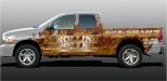
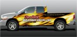
Local restaurateur and friend wants his truck wrapped. (I just happen to have a roland vp 540)... His main thing is fire and visibility... he doesn't even know the text he would think about having on there.

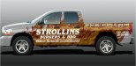
So .. how lame would it be if we just put what I have on here (maybe a little better job on the rear of the truck.

I'm not really in the digital side of the sign making business, but i'm stepping into it here and now. I'm seriously thinking of taking some classes on photoshop (i'm an expert in signlab)

any input on this wrap or design ideas would be great. (not it is not near a final draft and yes I know I misspelled something :D lol thanks)

Also do you guys know of any places similar to Aurora Graphics?
 

Attachments

  • S101.jpg
    S101.jpg
    44.9 KB · Views: 133
  • S102.jpg
    S102.jpg
    45.4 KB · Views: 149

stephenj148

New Member
the one on the left, you can't even tell there is text on it from the thumbnail and its very unreadable even when you click on it. The right one is better. Not sure what kinda promotional advantages you get from "you can smell our butts all over town" but hey, not my company.

Looks good for a start
 

tanneji

New Member
it doesnt say food to me at all. nothing about it makes me want to eat there. you need to engage senses to sell food
 

speedmedia

New Member
You need to study contrast. The text is really the important part. The other stuff is nice and can be used and utilized if you offset the contrast in the right way. It will tied your entire design much better.

Work on first and foremost getting your test big and bold, don't use a bunch of filters or fancy stuff just text with some outlines on them. If your background is light use a dark outline or vice versa. I would google "vehicle wraps" and look at what some of the others are doing and try to learn from them.

Pro Wraps, K6 Media, Arizona Color Skinz Wraps or 360 wrap among others all have galleries of some very nice work that in most cases features a usable wrap that looks cool but most importantly conveys a marketing message.

If you have the budget for a designer for this project you could always go that routes as well if you do not feel comfortable doing it in-house.

Thanks,
Kurt
 

SignManiac

New Member
The one on the right is a good starting point but I don't care for your text formatting. It looks like you decided to stick words on it as an after thought. Spend a little more time on tightening up the format.
 

RebeckaR

New Member
Don't know where you'd find the art, but it might be more relevant if the flames were coming up through a bbq grill.

Although it's plain and readable, the lettering looks very generic. Maybe it's cuz you've used all caps. Might want to mix it up a little.
 

Ponto

New Member
Way up north here in Canada we don't use an "e" at the end of "famous"...hmmmm...jus' wonderin'

JP
 

SignManiac

New Member
Here's a little quick and dirty based on your initial idea but you get the point with the text. I think you could go off in other directions and come up with something more conducive to BBQ. I'm not a wrapper either but I'm sure those that do it all the time could do a lot better.
 

Attachments

  • Strollins.jpg
    Strollins.jpg
    141.4 KB · Views: 94
Last edited:

Marlene

New Member
it doesnt say food to me at all. nothing about it makes me want to eat there. you need to engage senses to sell food

agree with that. there's a lot of fire but nothing to make me want to go there at all. a juciy steak on a grill, a big burger, etc. yes, lots of fire, no. that tagline is horrid! who the heck wants to eat at a place that has a tagline like that? if the customer insists on having it, that is when you include it but downplay it big time.
 

Gino

Premium Subscriber
Hate to tell ya, but that saying on the back of the bed looks like their butt is spread all over the truck. Those flames need some serious attention if you're gonna keep as is.
 

jfiscus

Rap Master
- black background on the entire wrap.
- yellow/orange lettering with a black glow & possibly a (muted) gradient effect on the text.
- Different font or use their logo for brand consistency. (or come up with a better logo & sell them a sign also?)
- better flames?
- prominent address, if that's their main sales avenue (versus phone)
 

BrianKE

New Member
If the tag line "You can smell our butts all over town" is something the restaurant has been using for some time and it has recognition then keep it. However, when I first read it I immediately thought of cigarettes, maybe a good tag line for a smokers shop.

And I agree with others about the background, it really doesn't represent burgers, BBQ or cooking. Maybe show a grill with the flames licking through the grates.
 

Techman

New Member
tag lines are not meant to be catchy phrases.

they are meant to cause conversation. It says who you are with just a line or two. This tag line says you are a butt.
 
Top