-
I want to thank all the members that have upgraded your accounts. I truly appreciate your support of the site monetarily. Supporting the site keeps this site up and running as a lot of work daily goes on behind the scenes. Click to Support Signs101 ...
You are using an out of date browser. It may not display this or other websites correctly.
You should upgrade or use an alternative browser.
You should upgrade or use an alternative browser.
Office entry sign
- Thread starter synergy_jim
- Start date

synergy_jim
New Member
the sign was 4' x 8' and the wall is 15' x 10' tall.
It fit well.
It fit well.
synergy_jim
New Member
4.5" thick
its 2" off the wall, then a layer of 1/4" double sided frosted , then a 1" thick divided PVC layer that has the 2 colors of LED's attached inside. Then 1 layer of 1/8"
clear plexi attached to the back of the dibond to hold the centers of the letters. The dibond attaches to the frosted via 6 - 1" stand offs.
There was no sign white harmed in the making of this sign....
The sign had to be low profile and height was decided by the client. as for the blocks on the end, its glare from the window behind me.
here it is with the lights off.
Attachments

skyhigh
New Member
a layer of 1/4" double sided frosted , then a 1" thick divided PVC layer that has the 2 colors of LED's attached inside. Then 1 layer of 1/8"
clear plexi attached to the back of the dibond to hold the centers of the letters. The dibond attaches to the frosted via 6 - 1" stand offs.
Can't say I"m a fan of the "lighting" (or unlit) effects. The red looks washed out......And, was the "halo" effect on the sides (only) intentional?
Unlit, the sign looks worse.
All in all Jim, its a decent looking sign (although I agree with others, its too large).
I think you need a few 'fabrication" tips & tricks to make this type of sign a little more professional looking.
the sign was 4' x 8' and the wall is 15' x 10' tall.
It fit well.
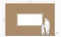
If that were a blank wall (unused), I think you could have gotten away with the placement. What you have now, is a lamp overlapping the sign (and anyone's head sitting in the 36 inch tall chair). From top to bottom, the sign is centered on the wall? (4ft tall with 3ft above and 3ft below?).
Just one foot higher would have looked better.
Rick
Certified Enneadecagon Designer
Can't say I"m a fan of the "lighting" (or unlit) effects. The red looks washed out......And, was the "halo" effect on the sides (only) intentional?
Unlit, the sign looks worse.
All in all Jim, its a decent looking sign (although I agree with others, its too large).
I think you need a few 'fabrication" tips & tricks to make this type of sign a little more professional looking.
If that were a blank wall (unused), I think you could have gotten away with the placement. What you have now, is a lamp overlapping the sign (and anyone's head sitting in the 36 inch tall chair). From top to bottom, the sign is centered on the wall? (4ft tall with 3ft above and 3ft below?).
Just one foot higher would have looked better.
I agree, I can also see a little of the white light bleeding into the red, a baffle would take care of it. Hot spots on the white, I also would have intentionally halo illuminated it or baffled the lighting. The light leaking on the sides looks like a mistake or accidental effect...
The other thing is ADA... yeah there is a code requirement... technically it's a 1/2" too thick.... with the furniture there it not a big issue.... just the code.
http://publicecodes.cyberregs.com/icc/ansi/2003cc/a117p1/icc_ansi_2003cc_a117p1_3_par033.htm
It is a nice looking sign, but I had to draw the wall and sign out to see the proportion, I always do this and stick a scale person on it. IDK, to me, it looks big....
Attachments
synergy_jim
New Member
Can't say I"m a fan of the "lighting" (or unlit) effects. The red looks washed out......And, was the "halo" effect on the sides (only) intentional?
Unlit, the sign looks worse.
All in all Jim, its a decent looking sign (although I agree with others, its too large).
I think you need a few 'fabrication" tips & tricks to make this type of sign a little more professional looking.
If that were a blank wall (unused), I think you could have gotten away with the placement. What you have now, is a lamp overlapping the sign (and anyone's head sitting in the 36 inch tall chair). From top to bottom, the sign is centered on the wall? (4ft tall with 3ft above and 3ft below?).
Just one foot higher would have looked better.
Its great that the red looks washed out.... That means the ORANGE LED's are going their job. The customer wanted light bleed and blending in the background, otherwise we would have made a light box.
ADA on a wall where there are two waiting chairs and an end table is a non issue. not a traffic area.
I think I'm done posting portfolio work here...
nikdoobs
New Member
I think I'm done posting portfolio work here...
Haha. I don't blame you.
Looks good man.
Rick
Certified Enneadecagon Designer
I wouldn't take it so hard...
one thing is... you know the whole story, we don't, so when
we observe something, it might not be true... AND/OR
...it might be for your and others benefit.
I know how you feel, I just got handed my are by 5 big wig
property management/architects/interior designer/environmental
graphic designers on 5 interior signage concept... they hated them...
all of them hated them, not one person could find anything they liked.
It's a huge project and we really wanted it bad..
I've never suffered that kind of rejection... well except from women
but that's a whole other story...
I hope you keep posting. I wish I had something to post that was similar.
Right now I'm in ADA interior signage hell.
SignManiac
New Member
Nice looking job! I'm dying to try something like that myself. thanks for the inspiration!
k.a.s.
New Member
I think it looks good. Keep posting, your stuff is really nice.
Sometimes people don't get that certain things are a matter of opinion, sure there are general rules and we would all agree that there are plenty of BAD signs. But sometimes things are maybe not how you would have done it, but that does not make them bad.
Kevin
Sometimes people don't get that certain things are a matter of opinion, sure there are general rules and we would all agree that there are plenty of BAD signs. But sometimes things are maybe not how you would have done it, but that does not make them bad.
Kevin
skyhigh
New Member
I have been thinking as this post went down the drain... HEY... get off his back. I love seeing your work, Jim-
don't quit posting it please. Gene
?????????? If this critique caused the thread to go "down the drain".....my apologies. That was not my intent....nor did I take anyone else's comments as anything but constructive.
All in all Jim, its a decent looking sign (although I agree with others, its too large).
I think you need a few 'fabrication" tips & tricks to make this type of sign a little more professional looking.
Its great that the red looks washed out.... That means the ORANGE LED's are going their job. The customer wanted light bleed and blending in the background, otherwise we would have made a light box.
Red, Orange, Green or Blue......whatever the color, I didn't realize you were attempting to "blend" the color into "highs and lows" using LED's. As KAS said "Sometimes people don't get that certain things are a matter of opinion" Now that you've explained the technique you were shooting for, I would say you nailed it perfectly. Still not a fan of the results you achieved.
Jim, you do whatever you want. You and I both know that I have complimented you a number of times on your cnc, painting and design work.I think I'm done posting portfolio work here...
I'm sorry you can't take a little constructive criticism along the way.

HulkSmash
New Member
Hey Jim. Nice Job. You and I are very much alike. You do what the client wants, and get paid. That's how we operate as well.
You can suggest as much as you want, but in the end you give the clients what they want. I bet they were very happy. It looks like the craftsmanship is excellent.
People here have no idea what the specs for the job were. I bet if you were able to take a pic of the entire wall it would work find. But since the picture is so close, it's going to look big for the space. I get it.
There is no Ego in business. The sooner people realize this, the sooner they'll make more money.
synergy_jim
New Member
I may have been a little testy last night. Just brought the wife home with our new little girl. In the end, I love the sign and so does the customer. I know this because I have a nice size check in my hand.
Criticism has its limits. I'll take it constructively after questions are asked and a person understands the job parameters.

Criticism has its limits. I'll take it constructively after questions are asked and a person understands the job parameters.